World Food Books' programme is largely produced on Kulin Nation land. We acknowledge the Wurundjeri people of the Kulin Nation as the first and continuing custodians of this land, and pay respect to their Elders past, present, and emerging.
World Food Books is an arts and special interests bookshop in Naarm / Melbourne. Founded in 2010, World Food Books is devoted to the presentation of a rotating, hand-selection of international art, design, literary and counterculture publications with an emphasis on the anti-traditional, the experimental, the avant-garde, the heretic, the marginal.
Presenting new titles alongside rare and out-of-print books, catalogues and journals spanning the fields of modern and contemporary art, design, photography, illustration, film, literature, poetry, cultural theory, philosophy, sexuality, popular and underground culture in its many radical forms, World Food Books wishes to encourage adventurous, thoughtful and open-minded reading, looking, writing, and exchange of publishing and ideas, both current and historical.
As well as our bookshop, located in Melbourne's historical Nicholas Building, all of our inventory is available internationally via our online mail-order service.
World Food Books semi-regularly co-ordinates "Occasions", a programme of exhibits and events at the bookshop and in partnership with other hosts (such as museums and art galleries) that develop out of the activities, relationships and content of the bookshop itself.
World Food Books
The Nicholas Building
37 Swanston Street
Room 5, Level 6
Melbourne 3000
Australia
SHOP HOURS:
W—F 12—6 PM
Sat 12—5 PM
WEB-SHOP OPEN 24/7.
World Food Books
Postal Address:
PO Box 435
Flinders Lane
Victoria 8009
Australia
Art
Theory / Essay
Architecture / Interior
Graphic Design / Typography
Photography
Fashion
Eros
LGBTQ+
Fiction / Poetry
Weird / Speculative / Science Fiction / Horror
Transgressive / Visceral / Abject
Symbolism / Decadence / Fin de siècle
Film / Video
Painting
Sculpture / Installation
Performance / Dance / Theater
Drawing
Sound / Music
Curatorial
Group Shows / Collections
Periodicals
Out-of-print / Rare
Posters / Ephemera / Discs
Signed Books
World Food Books Gift Voucher
World Food Book Bag
Australian Art
Australian Photography
Japanese Photography
Conceptual Art
Minimal Art
Dada
'Pataphysics / Oulipo
Fluxus
Concrete Poetry
Pop Art
Surrealism
Arte Povera
Arte Informale / Haute Pâte / Tachism
Nouveau Réalisme / Zero / Kinetic
Situationism / Lettrism
Collage / Mail Art / Xerox Art
Art Brut / Folk / Visionary / Fantastic
Illustration / Graphic Art / Bandes Dessinées
Furniture
Italian Radical Design / Postmodernism
Textiles
Ceramics / Glass
Counterculture
Protest / Revolt
Anarchism
Socialism / Communism / Capitalism
Literary Theory / Semiotics / Language
Feminism
Fetishism / BDSM
Drugs / Psychedelia
Crime / Violence
Animal Rights / Veganism
Occult / Esoterica
Ecology / Earth / Alternative Living
Whole Earth / Crafts
All prices in AUD (Australian dollars)
Pick-Ups
Please note: The bookshop is closed until February 1, 2024.
Pick-up orders can be collected in our bookshop during opening hours after this date. Please collect any Pick-up orders within 3 weeks of ordering as we have limited storage space. Orders will be released back into stock if not collected within this time. No refunds can be made for pick-ups left un-collected.
Return Policy
All sales are final. We do accept returns (for refund, exchange) for items received in error. All our orders are packed with special care using heavy-duty padding and cardboard book-mailers or bubble mailers (for smaller books), using reinforcement where required. We cannot take responsibility for any lost, stolen or damaged parcels.
Insurance
Should you wish to insure your package, please email us directly after placing your order and we can organise this at a small extra expense. Although all standard/express tracked packages are very safe and dependable, we cannot take responsibility for any lost, stolen or damaged parcels. We recommend insurance on valuable orders.
Interested in selling your old books, catalogues, journals, magazines, comics, fanzines, ephemera? We are always looking for interesting, unusual and out-of-print books to buy. We only buy books in our fields of interest and specialty, and that we feel we can resell.
We base these prices on desirability, market value, in-print prices, condition and our current stock levels. We offer cash, store credit, and can take stock on consignment. All
about 25% of the price we expect to get when we sell them, or 30% in store credit. We base these prices on desirability, market value, in-print prices, condition and our current stock levels.
Sell your books any day of the week. You can drop them off and return later. If you have a lot of books, we can visit your Sydney home.
We buy books that we feel we can resell. We offer about 25 % of the price we expect to get when we sell them, or 30% in store credit. We base these prices on desirability, market value, in-print prices, condition and our current stock levels.
Philadelphia Wireman
03 August - 01 September, 2018
World Food Books is proud to announce our next Occasion, the first presentation of sculptures by Philadelphia Wireman in Australia.
The Philadelphia Wireman sculptures were found abandoned in an alley off Philadelphia’s South Street on trash night in 1982. Their discovery in a rapidly-changing neighbourhood undergoing extensive renovation, compounded with the failure of all attempts to locate the artist, suggests that the works may have been discarded after the maker’s death. Dubbed the "Philadelphia Wireman" during the first exhibition of this work, in 1985, the maker’s name, age, ethnicity, and even gender remain uncertain. The entire collection totals approximately 1200 pieces, all intricately bound together with tightly-wound heavy-gauge wire (along with a few small, abstract marker drawings, reminiscent both of Mark Tobey and J.B. Murry). The dense construction of the work, despite a modest range of scale and materials, is singularly obsessive and disciplined in design: a wire armature or exoskeleton firmly binds a bricolage of found objects including plastic, glass, food packaging, umbrella parts, tape, rubber, batteries, pens, leather, reflectors, nuts and bolts, nails, foil, coins, toys, watches, eyeglasses, tools, and jewellery.
Heavy with associations—anthropomorphic, zoomorphic, and socio-cultural responses to wrapped detritus—the totemic sculptures by Philadelphia Wireman have been discussed in the context of work created to fulfil the shamanistic needs of alternative religions in American culture. Curators, collectors, and critics have variously compared certain pieces to sculpture from Classical antiquity, Native American medicine bundles, African-American memory jugs, and African fetish objects. Reflecting the artist’s prolific and incredibly focused scavenging impulse, and despite—or perhaps enhanced by—their anonymity, these enigmatic objects function as urban artefacts and arbiters of power, though their origin and purpose is unknown. Philadelphia Wireman, whatever their identity, possessed an astonishing ability to isolate and communicate the concepts of power and energy through the selection and transformation of ordinary materials. Over the course of the past two decades, this collection has come to be regarded as an important discovery in the field of self-taught art and vernacular art.
Presented in collaboration with Fleisher-Ollman Gallery, Philadelphia, and Robert Heald, Wellington.
Susan Te Kahurangi King
02 February - 10 March, 2018
Susan Te Kahurangi King (24 February 1951 - ) has been a confident and prolific artist since she was a young child, drawing with readily available materials - pencils, ballpoint pens and felt-tip markers, on whatever paper is at hand. Between the ages of four and six Susan slowly ceased verbal communication. Her grandparents William and Myrtle Murphy had developed a special bond with Susan so they took on caring responsibilities for extended periods. Myrtle began informally archiving her work, carefully collecting and storing the drawings and compiling scrapbooks. No drawing was insignificant; every scrap of paper was kept. The King family are now the custodians of a vast collection containing over 7000 individual works, from tiny scraps of paper through to 5 meter long rolls.
The scrapbooks and diaries reveal Myrtle to be a woman of great patience and compassion, seeking to understand a child who was not always behaving as expected. She encouraged Susan to be observant, to explore her environment and absorb all the sights and sounds. Myrtle would show Susan’s drawings to friends and people in her community that she had dealings with, such as shopkeepers and postal workers, but this was not simply a case of a grandmother’s bias. She recognised that Susan had developed a sophisticated and unique visual language and sincerely believed that her art deserved serious attention.
This was an unorthodox attitude for the time. To provide some context, Jean Dubuffet coined the term Art Brut in 1945 to describe work created by self-taught artists – specifically residents of psychiatric institutions and those he considered to be visionaries or eccentrics. In 1972 Roger Cardinal extended this concept by adopting the term Outsider Art to describe work made by non-academically trained artists operating outside of mainstream art networks through choice or circumstance. Susan was born in Te Aroha, New Zealand in 1951, far from the artistic hubs of Paris and London that Dubuffet and Cardinal operated in. That Myrtle fêted Susan as a self-taught artist who deserved to be taken seriously shows how progressive her attitudes were.
Susan’s parents Doug and Dawn were also progressive. Over the years they had consulted numerous health practitioners about Susan’s condition, as the medical establishment could not provide an explanation as to why she had lapsed into silence. Dawn educated herself in the field of homeopathy and went on to treat all twelve of her children using these principles – basing prescriptions on her observations of their physical, mental and emotional state.
Doug was a linguist with an interest in philosophy who devoted what little spare time he had to studying Maori language and culture. To some extent their willingness to explore the fringes of the mainstream made them outsiders too but it was their commitment to living with integrity and their respect for individuality that ensured Susan’s creativity was always encouraged.
Even though Susan’s family supported her artistic pursuits, some staff in schools and hospitals saw it as an impediment to her assimilation into the community and discouraged it in a variety of ways. Her family was not always aware of this and therefore did not fully understand why Susan stopped drawing in the early 1990s. However, rather than dwell on the challenges that Susan faced in pursuit of her artistic practice, they prefer to highlight her achievements. In 2008 Susan began drawing again in earnest, after an almost 20 year interruption, and her work is now shown in galleries around the world.
Susan grew up without television and has been heavily influenced by the comics she read as a child. She is absolutely fearless in the appropriation of recognizable characters, such as Donald Duck and Mickey Mouse, in her work. She twists their limbs, contorts their faces, compresses them together, blends them into complex patterned backgrounds - always imbuing them with an incredible energy. Although Susan often used pop culture characters in her work they are not naive or childlike. These are drawings by a brilliant self-taught artist who has been creating exceptional work for decades without an audience in mind.
Mladen Stilinović
"Various Works 1986 - 1999"
02 February 16 - September 10, 2016
Various works 1986 - 1999, from two houses, from the collections of John Nixon, Sue Cramer, Kerrie Poliness, Peter Haffenden and Phoebe Haffenden.
Including: Geometry of Cakes (various shelves), 1993; Poor People’s Law (black and white plate), 1993; White Absence (glasses, ruler, set square, silver spoon, silver ladel with skin photograph and wooden cubes), 1990-1996; Exploitation of the Dead (grey and red star painting, wooden painting, black spoon with red table, red plate), 1984-1990; Money and Zeros (zero tie, paintings made for friends in Australia (Sue, John, Kerrie), numbers painting), 1991-1992; Words - Slogans (various t-shirts) - “they talk about the death of art...help! someone is trying to kill me”, “my sweet little lamb”, “work is a disease - Karl Marx”; Various artist books, catalogues, monographs, videos; Poster from exhibition Insulting Anarchy; "Circular" Croatian - Australian edition; Artist book by Vlado Martek (Dostoyevsky); more.
Thanks to Mladen Stilinović and Branka Stipančić.
Jonathan Walker
Always Will Need To Wear Winter Shirt Blue + Ochre Small Check Pattern
21 August - 21 September, 2015
Untitled
I am not a great reader of poetry but I always return to the work of Melbourne poet, Vincent Buckley (1925- 1988). Perhaps I find his most tantalising piece to be not a finished poem but a fragment left on a scrap of paper discovered on his desk after the poet’s death.
The poetry gathers like oil
In the word-core, and spreads
It has its music meet,
Its music is in movement.
This fragment is more the shell left behind from a volatile thought than a finished poem. I find the last two lines honest but awkward whereas the first two lines work like an arrow. Most likely he could not find a resolution so it was left. Still, in its present form, it remains an eloquent testimony to the ultimate failure of a medium to express mobile thought and sensation, in Buckley’s case, through verbal language. It’s an important matter because this is something all artists have to deal with regardless of the medium.
I have never written a poem, however, I am forever copying fragments from books on paper scraps in a vain effort to fix certain notions in my head. At first, they function as bookmarks that are sometimes returned to when I open the book. But before long, as they accumulate, they fall out littering the table interspersed with A4 photocopies, bills, books and medications.
To return to Buckley’s fragment, the first two lines very much evoke how I paint nowadays. As you age, detail diminishes and patches of light become more luminous and float. I feel the most honest way of dealing with this is by smearing the oil paint on the canvas with the fingers and working close-up, blind. Only if the patches coalesce into an approaching image can the work gain a life.
-
Jonathan Walker was born in Melbourne, Australia and brought up on a dairy farm in Gippsland. In the 1970’s he studied painting at RMIT and won the Harold Wright Scholarship to the British Museum, London. During the 1980’s he exhibited at Pinacotheca Gallery, Richmond and had work shown at the NGV and Heidi City Art Gallery. Over the same period he designed the cover for the “Epigenesi” LP by Giancarlo Toniutti, Italy and conducted a mail exchange work with Achim Wollscheid, Germany. The work with artists through the post resulted in an article published in the bicentenary issue of Art and Australia 1988. He showed in artist run spaces such as WestSpace in the 90’s and 2000’s, and until 2012, taught painting at Victoria University, which is where we (Colleen Ahern and Lisa Radford) as organisers of the exhibition, among many others, had the privilege of being his student.
Walker’s knowledge was imparted to students through the careful selection of music, literature, and artists found in books that he himself had ordered for the library. Walker’s strategy was the generosity of sharing his vast knowledge with references specific to each student and their context.
Walker’s paintings share a similar focus and intimacy.
This exhibition presents a small selection of recent paintings alongside a publication that includes Walker’s writing. Observational and analytical, Walker’s work is a type of material notation — the time of day, colour and how it is blended, the both specific and fleeting location of a reflection on lino or the question of whether a chair leg should be included in a painting.
Please join us on Friday August 21 between 6-8pm to celebrate the opening of the exhibition.
Curated by Colleen Ahern and Lisa Radford.
B. Wurtz
Curated by Nic Tammens
March 26 - April 4, 2015
B.Wurtz works from a basement studio in his home on Manhattan’s Lower East Side.
This local fact is attested to by the plastic shopping bags and newsprint circulars that appear in his work. As formal objects, they don’t make loud claims about their origins but nonetheless transmit street addresses and places of business from the bottom of this long thin island. Like plenty of artists, Wurtz is affected by what is local and what is consumed. His work is underpinned by this ethic. It often speaks from a neighborhood or reads like the contents of a hamper:
“BLACK PLUMS $1.29 lb.”
“Food Bazaar”
“USDA Whole Pork Shoulder Picnic 99c lb.”
“RITE AID Pharmacy, with us it’s personal.”
“H. Brickman & Sons.”
“Sweet Yams 59c lb."
Most of the work in this exhibition was made while the artist was in residence at Dieu Donne, a workshop dedicated to paper craft in Midtown. Here Wurtz fabricated assemblages with paper and objects that are relatively lightweight, with the intention that they would be easily transportable to Australia. This consideration isn’t absolute in Wurtz’s work, but was prescriptive for making the current exhibition light and cheap. Packed in two boxes, these works were sent from a USPS post office on the Lower East Side and delivered to North Melbourne by Australia Post.
Wurtz appears courtesy of Metro Pictures, New York.
Thanks to Rob Halverson, Joshua Petherick, Sari de Mallory, Matt Hinkley, Helen Johnson, Fayen d'Evie, Ask Kilmartin, Lisa Radon, Ellena Savage, Yale Union, and "Elizabeth".
John Nixon
"Archive"
December 15 - January 20, 2014
The presentation of John Nixon's archive offered a rare showcase of this extensive collection of the artist's own publications, catalogues, posters, ephemera, editions and more, from the mid 1980s onwards, alongside a selection of his artworks.
Organized by John Nixon, Joshua Petherick and Matt Hinkley.
"Habitat"
at Minerva, Sydney (organised by Joshua Petherick and Matt Hinkley)
November 15 - December 20, 2014
Lupo Borgonovo, Janet Burchill & Jennifer McCamley,
Lewis Fidock, HR Giger, Piero Gilardi, Veit Laurent Kurz,
Cinzia Ruggeri, Michael E. Smith, Lucie Stahl, Daniel Weil, Wols
Press Release:
“...It contained seven objects. The slender fluted bone, surely formed for flight, surely from the wing of some large bird. Three archaic circuitboards, faced with mazes of gold. A smooth white sphere of baked clay. An age-blackened fragment of lace. A fingerlength segment of what she assumed was bone from a human wrist, grayish white, inset smoothly with the silicon shaft of a small instrument that must once have ridden flush with the surface of the skin - but the thing’s face was seared and blackened.”
William Gibson, “Count Zero”, 1986
"Autumn Projects Archive"
Curated by Liza Vasiliou
March 6 - March 15, 2014
World Food Books, in conjunction with the Virgin Australia Melbourne Fashion Festival 2014, presented the Autumn Projects archive, consisting of a selection of early examples in Australian fashion with a particular interest in collecting designers and labels from the period beginning in the 1980’s, who significantly influenced the discourse of Australian Fashion.
Curated by Liza Vasiliou, the exhibition provided a unique opportunity to view pieces by designers Anthea Crawford, Barbara Vandenberg, Geoff Liddell and labels CR Australia, Covers, Jag along with early experimental collage pieces by Prue Acton and Sally Browne’s ‘Fragments’ collection, suspended throughout the functioning World Food Books shop in Melbourne.
H.B. Peace
presented by CENTRE FOR STYLE
November 14, 2013
"Hey Blinky, you say chic, I say same"
Anon 2013
H.B. Peace is a clothing collaboration between great friends Blake Barns and Hugh Egan Westland. Their pieces explore the divergences between 'character’ and ‘personality’ in garments....etc
Special Thanks to Joshua Petherick and Matt Hinkley of WFB and Gillian Mears
and a Very Special Thank you to Audrey Thomas Hayes for her shoe collaboration.
Janet Burchill & Jennifer McCamley
"Aesthetic Suicide"
May 10 - June 8, 2013
The first of our occasional exhibitions in the World Food Books office/shop space in Melbourne, "Aesthetic Suicide" presented a body of new and older works together by artists Janet Burchill & Jennifer McCamley, including videos, prints, a wall work, and publications.
During shop open hours videos played every hour, on the hour.
2015, English
Softcover, 100 pages, 16.5 x 22.5 cm
Published by
Galerie Micheline Szwajcer / Brussels
$40.00 - Out of stock
Atelier E.B is the company name under which the designer Beca Lipscombe and the artist Lucy McKenzie sign their collaborative projects. The group was formed in 2007 by Lipscombe and the illustrator Bernie Reid, who are based in Edinburgh, and McKenzie, who is originally from Glasgow and lives in Brussels. Since 2011 the pair have operated as a fashion label, and this June at Galerie Micheline Szwajcer they present their third collection, The Inventors of Tradition II, for sale direct to the public from a custom-built boutique installation.
Art’s fascination with fashion rarely penetrates beneath its glamorous surface, seemingly content to perpetuate its contradictions without critical analysis. Atelier E.B, by placing both practices on an equal footing, combine art and fashion to explore many complex themes, including alternative forms of commercial production and distribution. Their designs are produced, sold and promoted ethically, yet are too idiosyncratic to be easily marketed as an ‘eco brand’. Ateler E.B recognise that clothes are sophisticated tools for empowerment and pleasure.
Sportswear has been acting as a modernizing influence on fashion since the nineteenth century, and continues to be at the forefront of how people express their cultural allegiances. In 2014, with the referendum to leave the United Kingdom, Scotland was asked to reflect on its identity, and Atelier E.B is the only label explicitly to address this through fashion. For IOT II they combine exquisitely woven or knitted cashmeres and silk lingerie with neo-classical nylon ‘cosplay’ tracksuits. Hand intarsia Scottish football tops in cashmere have nationalist logos appropriated then pixilated. Silk and lace football shorts, oversized polo shirts, a football hooligan paisley shawl, fake Charles Rennie Mackintosh jewellery, counterfeit Bennetton, a trompe-l'œil zip brooch, and fictitious sponsorship from the Clydesdale Bank. Other highlights include a wool mix school-skirt, an Ivan Lendl picnic blanket, the perfect artschool-girl coat, cashmere leisure suits in Black, Derby grey, Blackcurrant and Rum and Eastern European gym shoes.
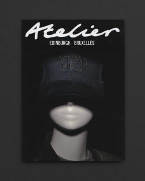
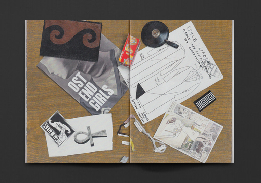
This publication was produced by Atelier E.B. around their "Ost End Girls" collection, featuring garments, texts by Lucy McKenzie, photoshoots and graphic details/textiles/showroom interiors/shop-fronts/ads from the work of Atelier E.B. (and also Marc Camille Chaimowicz), Designed by H I T studio, London.
2020, English
Hardcover, 256 pages, 21 x 29.8 cm
Published by
SFMOMA / San Francisco
D.A.P. / New York
$100.00 - Out of stock
Part artist's book, part exhibition catalog, this book chronicles Tauba Auerbach’s multimedia syntheses of abstraction, science, graphic design and typography.
Tauba Auerbach studies the boundaries of perception through an art and design practice grounded in math, science and craft. Published in conjunction with the first major survey of the artist’s work, this volume, designed by Auerbach in collaboration with David Reinfurt, spans 16 years of her career, highlighting her interest in concepts such as duality and its alternatives, interconnectedness, rhythm and four-dimensional geometry.
Encapsulating Auerbach’s longstanding consideration of symmetry, texture and logic, the title S v Z offers a framework for this volume’s typeface, design and structure. Images of more than 130 paintings, drawings, sculptures and artist’s books created between 2004 and 2020 are mirrored by a comprehensive selection of related reference images, illuminating her multifaceted practice as never before. Essays by Joseph Becker, Jenny Gheith and Linda Dalrymple Henderson provide further context for the work.
The book contains original marble patterns created specially for the book by the artist on both the endpapers and the edges of the book block. The cover is lettered in Auerbach’s calligraphy, applied in black foil on a silver paper. The typeface was designed by David Reinfurt with Auerbach expressly for this publication, and is based on her handwriting.
New York–based artist Tauba Auerbach (born 1981) grew up in San Francisco and graduated from Stanford University in 2003. She apprenticed and worked as a sign painter at New Bohemia Signs in San Francisco. In 2013 she founded Diagonal Press. She is represented by Paula Cooper Gallery, New York, and Standard Oslo.
2018, English
Softcover, 192 pages, 17 x 24 cm
Published by
Quodlibet / Italy
$56.00 - Out of stock
This book by Caterina Toschi reconstructs the development of the Olivetti corporate identity from the early 1950s through the 1970s, as conveyed through spaces for the exposition and description of its products. The display methods and the written, oral, and visual forms of storytelling that brought the highly recognisable Olivetti idiom international success are brought together for the first time in archival documents and photographs, along with images of Olivetti showrooms and stores in cities like Buenos Aires, San Francisco, Chicago, New York, Düsseldorf, Paris, and Vienna. The book celebrates the legacy of excellence that contributed to building the identity of Italian industry.
2018, English
Softcover, 160 pages, 25 x 34 cm
Published by
Koenig Books / London
Stedelijk Museum / Amsterdam
$45.00 $20.00 - Out of stock
The work of Metahaven consists of filmmaking, writing, graphic design, and installations, and is united by interests in poetry, storytelling, digital superstructures, and propaganda. Central to their practice is the narration of technological and political conditions through aesthetically immersive plots. Told through a multitude of languages and genres, their work imagines alternate realities and potential filmmakers and artists who use investigative and speculative methods to pinpoint the urgencies of their time.
Designed by Metahaven and co-edited with curator and critic Karen Archey, PSYOP brings together contributions by many of today's leading practitioners in the fields of contemporary art, music, fashion, film, technology and poetry.
2019, English
Hardcover (w. dust jacket), 340 pages, 17.8 x 24 cm
Published by
The MIT Press / Massachusetts
$76.00 $69.00 - Out of stock
Independent publishing, art publishing, publishing as artistic practice, publishing counterculture, and the zine, DIY, and POD scenes have proliferated over the last two decades. So too have art book fairs, an increasingly important venue-or even medium-for art. Art publishing experienced a similar boom in the 1960s and 1970s, in response to the culture's "linguistic turn." Today, art publishing confronts the internet and the avalanche of language and images that it enables. The printed book offers artists both visibility and tangibility. Publishing Manifestos gathers texts by artists, authors, editors, publishers, designers, zinesters, and activists to explore this rapidly expanding terrain for art practice.
The book begins in the last century, with texts by Gertrude Stein, El Lissitsky, Oswald de Andrade, and Jorge-Luis Borges. But the bulk of the contributions are from the twenty-first century, with an emphasis on diversity, including contributions from Tauba Auerbach, Mariana Castillo Deball, Ntone Edjabe, Girls Like Us, Karl Holmqvist, Temporary Services, and zubaan. Some contributors take on new forms of production and distribution; others examine the political potential of publishing and the power of collectivity inherent in bookmaking. They explore among other topics, artists' books, appropriation, conceptual writing, non-Western communities, queer identities, and post-digital publishing. Many texts are reproduced in facsimile-including a handwritten "speculative, future-forward newspaper" from South Africa. Some are proclamatory mission statements, others are polemical self-positioning; some are playful, others explicitly push the boundaries. All help lay the conceptual foundations of a growing field of practice and theory.
Contributors
AND Publishing, Oswald de Andrade, Archive Books, Art-Rite, Rasheed Araeen, Tauba Auerbach, Michael Baers, Bibi Bakare-Yusuf, Ricardo Basbaum, Derek Beaulieu, Bernadette Corporation, Riccardo Boglione, Bombay Underground, Jorge Luis Borges, bpNichol, Kate Briggs, Broken Dimanche Press, Eleanor Vonne Brown, Urvashi Butalia, Ulises Carrion, Mariana Castillo Deball, Paul Chan, Chimurenga, Arpita Das, Anita Di Bianco, Guy Debord, Constant Dullaart, Craig Dworkin, Ntone Edjabe, Zenon Fajfer, Marina Fokidis, General Idea, Annette Gilbert, Girls Like Us, Gloria Glitzer, Marianne Groulez, Alex Hamburger, Karl Holmqvist, Lisa Holzer, Mahmood Jamal, Tom Jennings, Ray Johnson, David Jourdan, Sharon Kivland, Kione Kochi, Kwani?, Bruce LaBruce, Tan Lin, El Lissitzky, Alessandro Ludovico, Sara MacKillop, Steve McCaffery, Jonathan Monk, Simon Morris, Mosireen, Leon Munoz Santini, Takashi Murakami, Deke Nihilson, Aurelie Noury, Johnny Noxzema, Clive Phillpot, Michalis Pichler, Seth Price, Riot Grrrl, Carlos Soto Roman, Allen Ruppersberg, Joachim Schmid, Oliver Sieber, Paul Soulellis, Matthew Stadler, Gertrude Stein, Paul Stephens, Hito Steyerl, Mladen Stilinovic, Katja Stuke, Temporary Services, Nick Thurston, TIQQUN, Elisabeth Tonnard, V. Vale, Eric Watier, Erik van der Weijde, Lawrence Weiner, Eva Weinmayr, Jan Wenzel, Stephen Willats, Gil J Wolman, zubaan
Copublished with Miss Read: The Berlin Art Book Fair
2017, English
Softcover, 296 pages, 17 x 25 cm
Published by
Occasional Papers / London
$42.00 $25.00 - In stock -
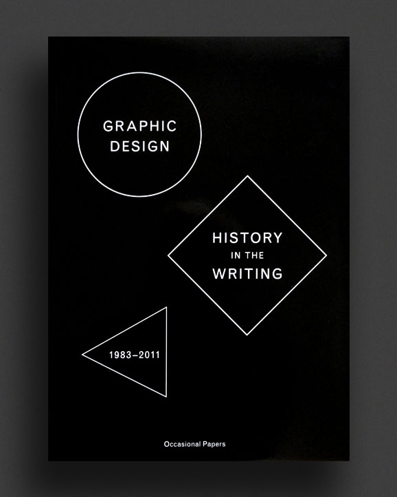
This second print run of About Graphic Design (initially printed in 2012) features a comprehensive selection of writings by renowned graphic designer, graphic design theorist and historian Richard Hollis, this densely illustrated book includes a wide array of interviews, essays, letters, articles and lectures. It covers virtually everything regarding the field and history of graphic design, from Soviet revolutionary posters and designers in Nazi Germany to Penguin book covers, New 'New' Typography, Max Bill and Nicolete Gray. Various texts on Robin Fior, Theo Ballmer, Uwe Loesch and Pierre Faucheux, among many others, add depth to this very thoroughly researched story of graphic design.
2010, English
Softcover, 96 pages, 14 x 23 cm
Published by
Occasional Papers / London
$39.00 - Out of stock
Now it in its third printing (green cover), The Form of the Book Book brings together essential essays on the book – its history, present, and possible futures – by preeminent graphic designers and graphic design theorists/historians including Chrissie Charlton, Catherine de Smet, James Goggin, Jennie Eneqvist, Roland Früh & Corina Neuenschwander, Sarah Gottlieb, Richard Hollis and Armand Mevis. In a nod to Jan Tschichold’s famous collection of essays The Form of the Book, first published in 1975, this book offers in-depth analyses of key moments in the history of book design in order to better imagine the many forms the book will take, and is already taking, in our digital age.
1965, English
Softcover, 84 pages / 88 pages, 15.5 x 15.5 cm
1st US Edition, Out of print title / used / good
Published by
George Wittenborn Inc. / New York
$150.00 - Out of stock
Discovery of the Circle and Discovery of the Square, first 1965 English-language editions, printed in Italy and published in New York by George Wittenborn Inc. The first two volumes (followed a decade later by the triangle) of legendary Italian artist/designer Bruno Munari's visual case studies on shapes. The square, circle, and triangle are the most basic shapes on Earth, supporting structures both synthetic and natural. In the 1960s, Italian artist Bruno Munari explored the visual history of these shapes in three iconic encyclopaedic books, which have become design classics. However, there’s a broader appreciation for this eccentric exploration of the three shapes through Munari’s omnivorous approach. Using examples from ancient Greece and Egypt, as well as works by Buckminster Fuller, Le Corbusier, and Alvar Aalto, Munari never nails down what any of the shapes are, yet looks at every aspect of what they mean, where they appear, and even their significance in language.
Bruno Munari was an Italian artist and designer, who contributed fundamentals in many fields of visual arts (paint, sculpture, film, industrial design, graphics) and non visual arts (literature, poetry, didactic) with the research on the game subject, infancy and creativity.
Both good with some cover and spine wear, general ageing.
1996, English
Softcover, 400 pages, 2.8 x 2.8 cm
1st Edition, Out of print title / used / very good
Published by
Lars Müller / Zürich
$290.00 - Out of stock
First and only 1996 printing of the stunning and very collectible book on the important design history of the incredible ECM record label, "ECM : Sleeves of Desire".
The ECM recording label's contribution to the fields of jazz and contemporary classical music is unparalleled, and its success story has been visually enhanced by the striking covers designed under Manfred Eicher's art direction by Barbara Wojirsch and Dieter Rehm.
A delight for music and design fans alike, the book presents chronologically ordered color reproductions of over 500 covers from the innovative ECM label. Sleeves of Desire also contains a comprehensive picture essay that provides a detailed look at over 100 album covers. Additionally, renowned jazz essayist Peter Ruedi relates the history of the ECM label and designer Lars Muller comments on the evolution of the covers and on ECM's unmistakable aesthetic signature.
Features the cover art of releases by Jan Garbarek, Don Cherry, Nana Vasconcelos, Eberhard Weber, Gary Burton, Meredith Monk, Chick Corea, Wolfgang Dauner, Carla Bley, Keith Jarrett, Paul Bley, Pat Metheny, John McLaughlin, Evan Parker, Annette Peacock, Gary Peacock, Terje Rypdal, Ralph Towner, and so many more.
Very Good, clean copy throughout. A must.
2020, English
Softcover, 100 pages, 10.5 x 14.8 cm
Published by
Self-Published / Melbourne
$20.00 - Out of stock
This book is a collection of images and corresponding texts advertising free items found on Facebook Marketplace during March, 2019. Using location filters the content was sourced from every state in Australia.
Published in Narrm/Melbourne, 2020 in an open edition.
Designed by Dominic Forde.
All publishers proceeds donated to the Victorian Bushfire Appeal.
1970 / 1984, English / German / French
Hardcover (w. dust jacket), 228 pages, 25 x 28 cm
Out of print title / used / fine
Published by
ABC Verlag / Zürich
$140.00 - Out of stock
1984 expanded edition of this important and comprehensive survey of over 2,000 trademarks, brands, logos, symbols, and monograms from around the world, arranged according to subject and published by ABC Verlag, Zürich. A classic volume in the field of graphic design. This iconic and wonderful "Swiss design" visual reference book further provides an analysis of sign competitions and the development of the sign as a universal language. Compiled, edited, and with texts by legendary typographer Walter Diethelm (1913-1986) and further contributions by Eugenio Carmi, Adrian Frutiger, Masaru Katzumie, Hans Kauer, Hans Neuburg, Ryszard Otreba, Paul Rand, and Hans Weckerle.
Over 500 designers are represented including Primo Angeli, Walter Ballmer, Walter Bangerter, Saul Bass, Lester Beall, Felix Beltran, Emil Biemann, Rudolf Bircher, Giovanni Brunazzi, Paul Bühlmann, Chermayeff & Geismar, Seymour Chwast, Wim Crouwel, Alan Fletcher, Adolf Flückiger, Piero Fornasetti, Adrian Frutger, Roger-Virgile Geiser, Robert Geisser, Milton Glaser, Morton Goldsholl, Fritz Gottschalk, Joseph Graber, Jörg Hamburger, Erich Hänzi, Rudolph de Harak, Hans Hartmann, Armin Hofmann, Yusaku Kamekura, Stefan Kantscheff, Tetsuo Katayama, Christian Lang, Raymond Loewy, George Nelson, Rémy Peignot, Paul Rand, Hansruedi Scheller, Anton Stankowski, Henry Steiner, Hans Thöni, Massimo Vignelli, Carlo Vivarelli, Franz Wagner, Hansruedi Widmer, Kurt Wirth, and Marcel Wyss.
All texts in English, German, and French.
Fine copy in Very Good-Fine dust jacket! Beautifully preserved in mylar wrap.
2019, English
Softcover (elastic band bound in bag), 176 loose-leaf pages, 20 x 14.5 cm
Ed. of 250,
Published by
Warehouse / Amsterdam
Onomatopee / Eindhoven
$23.00 - Out of stock
Published in a hand-numbered edition of 250 copies, A Magazine Reader is the result of a workshop in which a fashion magazine is dissected, critically analyzed from various perspectives and put together again in an alternative form. The material from the magazine is used to create a new zine that gives insight into the cultural power and forms of value production that's at the core of fashion media.
A Magazine Reader 03 dissects Harper's Bazaar UK October 2019 and is a collaboration between Warehouse, Zuzana Kostelanská and Onomatopee.
Warehouse is an Amsterdam-based collective existing of Elisa van Joolen, Femke de Vries and Hanka van der Voet aiming to provide a platform for critical fashion practitioners through organizing exhibitions, reading groups, workshops, performances and book presentations among other things, in order to create an engaging environment that facilitates critical dialogue and the creation of an alternative fashion discourse that goes beyond seeing fashion as a commodity.
2019, English
Softcover (elastic band bound in bag), 176 loose-leaf pages, 20 x 14.5 cm
Ed. of 150,
Published by
Warehouse / Amsterdam
$23.00 - Out of stock
Published in a hand-numbered edition of 150 copies, A Magazine Reader is the result of a workshop in which a fashion magazine is dissected, critically analyzed from various perspectives and put together again in an alternative form. The material from the magazine is used to create a new zine that gives insight into the cultural power and forms of value production that's at the core of fashion media.
A Magazine Reader 02 dissects British Vogue November 2018
A Magazine Reader is a Warehouse production initiated by Hanka van der Voet and Femke de Vries as part of their individual researches into fashion media and language in fashion (Press&Fold magazine and Garment Grammar).
Hanka van der Voet is Head of the MA Fashion Strategy at ArtEZ in Arnhem, and works as an independent researcher, writer and curator. Her current research is focused on the editorial practices of niche/independent/alternative fashion magazines. She is the founder of Press & Fold magazine and one of the founders of Warehouse. www.pressandfoldmagazine.com
The content is developed by MA Fashion Strategy students of ArtEZ Gen#28; Emma Disbergen, Laura Lisa Fernandes Januario, Eva Kühn, Boris Kollar, Kartijn Krijger, Nicole Dekkers, Andrea Chehade, Denise Bernts, Bobbine Berden, Mariane Cortez Meirelles. With guest lectures by Elisa van Joolen and Chet Bugter.
This is a Warehouse production For ArtEZ Fashion Masters, MA Fashion Strategy
Designed by Corine van der Wal In collaboration with risowiso & WALTER books
2018, English
Softcover, 208 pages, 21.2 x 15.2 cm
Published by
Valiz / Amsterdam
Istanbul Design Biennial / Istanbul
$44.00 - Out of stock
Why do design? What is design for? These are forward-looking questions for a creative discipline that seems more slippery to define than ever. In a world of dwindling natural resources, exhausted social and political systems, and an overload of information there are many urgent reasons to reimagine the design discipline, and there is a growing need to look at design education. Learning and unlearning should become part of an on-going educational practice. We need new proposals for how to organise society, how to structure our governments, how to live with, not against, the planet, how to sift fact from fiction, how to relate to each other, and frankly, how to simply survive.
The 4th Istanbul Design Biennial—A School of Schools, and this publication, Design as Learning ask: can design and design education provide these critical ideas and strategies?
Editors: Jan Boelen, Nadine Botha, Vera Sacchetti
Contributors: Danah Abdulla, Zeynep Çelik Alexander, Nelly Ben Hayoun, Jan Boelen, Nadine Botha, João Ferreira, Corinne Gisel, Gabrielle Kennedy, Naho Kubota, Peter Lang, Claudia Mareis, Deniz Ova, Nina Paim, Vera Sacchetti
Interviews: Åbäke (Maki Suzuki), Fabb (Burcu Biçer Saner, Efe Gözen), Navine G. Kahn-Dossos, Ebru Kurbak, Prototype Series (Mae-ling Lokko), Studio Folder (Marco Ferrari & Elisa Pasqual), SulSolSal (Hannes Bernard & Guido Gigli), Pinar Yoldaş
Design: Offshore Studio
1977, Japanese
Hardcover (w. illustrated slipcase), 205 pages, 31.4 × 24.6 cm
1st Edition, Out of print title / used / very good
Published by
Kodansha Int / Tokyo
$140.00 - Out of stock
"Graphic Design of The World 3 : Contemporary Posters", was published in 1977 and edited by leading Japanese graphic designers Ikko Tanaka and Tadanori Yokoo. This, the 3rd annual volume of the great "Graphic Design of The World" series, was published in Japan by Kodansha in the 1970s. Each oversized hardcover, slipcased volume was edited by leading Japanese designers and presented a visually explosive international survey of design themes. Profusely illustrated in vivid, saturated colour, "Contemporary Posters" is one of the finest books on the subject. Bringing together the best examples of international modern posters from the end of the war to the early 1970s, including concert, theatre, film, anti-war, tourism, advertising, exhibition, and more. Includes the work of Milton Glaser, Joseph Müller-Brockman, Yoshio Hayakawa, Peter Max, Man Ray, Allen Jones, Maciej Urbaniec, Herb Lubalin, Jan Lenica, Seymour Chwast, Alan Aldridge, Roman Cieslewicz, Jean Michel Folon, Tomi Ungerer, Tadanori Yokoo, Shigeo Fukuda, Akira Uno, Massmimo Vignelli, Raymond Savignac, Push Pin Studios, Roland Topor, Ikko Tanaka, Shigeo Okamoto, Armando Testa, Franciszek Starowieyski, Saul Bass, Hans Erni, Karl Gerstner, Max Bill, Richard Avedon, Herbert Bayer, Alexander Calder, Otl Aicher, Paul Davis, Bob Gill, Hiromu Hara, Gan Hosoya, Robert Indiana, Sam Haskins, Kumi Sugai, Paul Rand, Willem Sandberg, Saul Steinberg, Andy Warhol, Ernest Trova, Pablo Picasso, James Rosenquist, Emil Ruder, Donald Brun, Herbert Leupin, Ryuichi Yamashiro, Franco Grignani, Yusaku Kamekura, Richard Lindner, Yoshitaro Isaka, Kiyoshi Awazu, and so many more! An incredible collection!
Very Good, beautifully preserved copy in Very Good slipcase.
1977, Japanese
Hardcover (w. illustrated slipcase), 205 pages, 31.4 × 24.6 cm
1st Edition, Out of print title / used / fine
Published by
Kodansha Int / Tokyo
$140.00 - Out of stock
"Graphic Design of The World 7 : Graphics in Environment", was published in 1977 and edited by leading Japanese graphic designers Kiyoshi Awazu and Shigeo Fukuda, together with architect Shin Isozaki. This, the 7th (and final) annual volume of the great "Graphic Design of The World" series, was published in Japan by Kodansha in the 1970s. Each oversized hardcover, slipcased volume was edited by leading Japanese designers and presented a visually explosive international survey of design themes. Profusely illustrated in vivid, saturated colour, "Graphics in Environment" brings together examples of "Super Graphics" developed at the scale of the city and architecture, and also ceramics, textiles, playthings and other "graphics" of sizes corresponding to human systems. One of the most generous books on the subject of environmental design in the 1970s.
As new, beautifully preserved copy in Very Good slipcase.
2019, English
Softcover, 408 pages , 11.4 x 19 cm
Published by
Sternberg Press / Berlin
The MIT Press / Massachusetts
$68.00 - Out of stock
In Design by Accident, Alexandra Midal declares the autonomy of design, in and on its own terms. This meticulously researched work proposes not only a counterhistory but a new historiography of design, shedding light on overlooked historical landmarks and figures while reevaluating the legacies of design's established luminaries from the nineteenth century to the present. Midal rejects both linear narratives of progress and the long-held perception of design as a footnote to the histories of fine art and architecture. By weaving critical analysis of the canon of design history and theory together, with special attention to the writings of designers themselves, she draws out the nuances and radical potentials of the discipline—from William Morris's ambivalence toward industry, to Catharine Beecher's proto-feminist household appliances, to the Bauhaus's Expressionist origins, and the influence of Herbert Marcuse on Joe Colombo.
Preface by Michelle Millar Fisher
Foreword by Paola Antonelli
2009, English
Softcover, 112 pages (w. leporello foldout), 34.5 x 24.5 cm
1st Edition, Out of print title / as new
Published by
Dexter Sinister / New York
Roma / Amsterdam
$100.00 - In stock -
The long out-of-print, over-sized Dot Dot Dot compendium catalogue, published on the occasion of an exhibition in Culturgest, Porto. This exhibit provided the seventh occasion for Stuart Bailey to show a group of artefacts whose only shared connection was that they had appeared somewhere in the pages of Dot Dot Dot - a magazine which he has edited since its conception in 2000. The publication plays with the idea of inverting the regular hierarchy of this magazine where texts are generally treated as primary and images secondary. It contains a leporello reproduction of the exhibition wall with all the 43 artefacts, followed by subsequent reproductions of 43 previously published Dot Dot Dot articles, systematically presented as captions of these artefacts.
With texts by Stuart Bailey and Jan Verwoert.
Design: Roger Willems and Sam de Groot.
As New copy.
1985, English
Hardcover (w. dust jacket), 184 pages, 30.5 x 23.9
1st Edition, Out of print title / used / very good
Published by
American Showcase / New York
$120.00 - Out of stock
Wonderful hardcover first edition copy of the great Herb Lubalin monograph, "Art Director, Graphic Designer and Typographer", published in 1985 by American Showcase, New York, printed in Japan.
This exceptional book still stands as the most comprehensive overview of the work of American graphic designer and art director Herb Lublin, with over 360 illustrations and anecdotes that encompass the wealth of output from a true pioneer in the world of design.
Internationally recognised in association with the typeface Avant Garde, which he created for the first of a series of culture-shocking magazines (Avant Garde, Eros and Fact) that he created with editor Ralph Ginzburg, Lubalin was a constant boundary breaker on both a visual and social level. Part of the founding team of the International Typeface Corporation (ITC) and the principal of Herb Lubalin, Inc it was hard to escape the reach of Herb during the 1960s and 70s. His constant search for something new and a passion for inventiveness made him one of the most successful art directors of the 20th century. A graduate of the Cooper Union in New York he spent time as a visiting professor there as well as designed a logo for them. Constantly working and achieving much success throughout his career, at the age of 59 he proclaimed "I have just completed my internship."
"The magnitude of Herb Lubalin's achievements will be felt for a long time to come ... I think he was probably the greatest graphic designer ever." — Lou Dorsfman
A very good first edition hardcover copy with original dust-jacket protected with mylar wrap. A must for any graphic design/typography collection.
2016, English
Softcover, 208 pages, 24.5cm×16.5cm
Ed. of 2000,
1st Edition, Out of print title / as new
Published by
Unit Editions / London
$90.00 - Out of stock
Herb Lubalin claimed not to be a great typographer. ‘In fact,’ he said, ‘I’m terrible, because I don’t follow the rules.’ This new book proves the opposite. On every page it features Lubalin’s typographic genius (logos, layouts, lettering and typefaces), and places him at the forefront of 20th century typographic innovation.
He even had names for what he did: he described it as ‘graphic expressionism’ or ‘conceptual typography’. Using his ability to adapt, merge and create new typographic forms, he was able to enhance and amplify meaning in ways that hadn’t been seen before.
Having published two books celebrating the genius of Herb Lubalin as a graphic designer working in many spheres, this new volume concentrates solely on Lubalin’s typography.
It comes with new texts, new design, new photography, and lots of previously unpublished material.
Edited by Adrian Shaughnessy & Tony Brook
Edition of 2000
Out-of-print
1960, English / Italian / French / German
Hardcover, 244 pages, 230 x 22 cm
1st Edition, Out of print title / used / good
Published by
Editrice L'Ufficio Moderno / Milan
$120.00 - Out of stock
1959-60 edition of the very collectable "Pubblicita in Italia" published by Editrice L'Ufficio Moderno in Milan. The editors for this year's annual included Bruno Munari and Antonio Boggeri. Profusely illustrated throughout in colour and b/w with hundreds of illustrations of late 1950's Italian design. Essay by Italian poet Vittorio Sereni. Text in English, Italian, French and German.
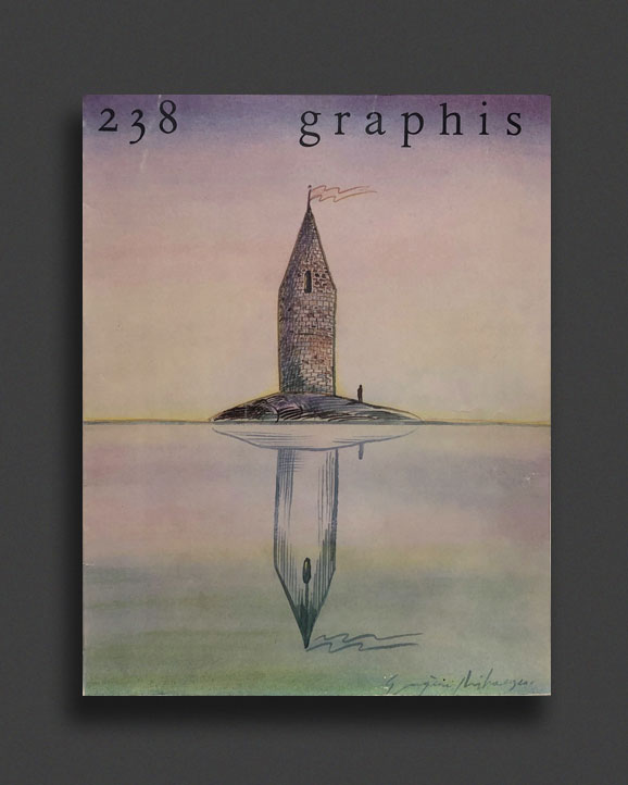
Pubblicita in Italia was an over-sized, hardcover annual that formed a comprehensive survey of contemporary advertising graphics and commercial design from Italy throughout the 1950-1980s, showcasing posters, shop windows, exhibition design, logos/trade-marks, packaging, book and record design, catalogues and brochures, television and film graphics, and so much more. Comparable to the "GRAPHIS" annuals, but exclusively Italian design, making these editions not only more scarce but the content seldom seen outside Italy in the period or anywhere since.
Good copy, with light ex-library markings not affecting content. Tanning/light wear to cloth. Without dust jacket.
1974, English / Italian / French / German
Hardcover (w. dust jacket), 300 pages, 230 x 22 cm
Out of print title / used / very good
Published by
Editrice L'Ufficio Moderno / Milan
$160.00 - Out of stock
1973-74 edition of the very collectable "Pubblicita in Italia" published by Editrice L'Ufficio Moderno in Milan. Cover art and forward by Italian design and architect Franco Grignani. Profusely illustrated throughout in colour and b/w with hundreds of illustrations of late 1970's Italian design. Text in English, Italian, French and German.
Pubblicita in Italia was an over-sized, hardcover annual that formed a comprehensive survey of contemporary advertising graphics and commercial design from Italy throughout the 1950-1980s, showcasing posters, shop windows, exhibition design, logos/trade-marks, packaging, book and record design, catalogues and brochures, television and film graphics, and so much more. Comparable to the "GRAPHIS" annuals, but exclusively Italian design, making these editions not only more scarce but the content seldom seen outside Italy in the period.
Very Good copy, with Good dust jacket preserved under mylar wrap.
1975, English / Italian / French / German
Hardcover, 300 pages, 230 x 22 cm
1st Edition, Out of print title / used / very good
Published by
Editrice L'Ufficio Moderno / Milan
$160.00 - Out of stock
1974-75 edition of the very collectable "Pubblicita in Italia" published by Editrice L'Ufficio Moderno in Milan. Introduction by Guido Montana. Profusely illustrated throughout in colour and b/w with hundreds of illustrations of mid 1970's Italian design. Text in English, Italian, French and German.
Pubblicita in Italia was an over-sized, hardcover annual that formed a comprehensive survey of contemporary advertising graphics and commercial design from Italy throughout the 1950-1980s, showcasing posters, shop windows, exhibition design, logos/trade-marks, packaging, book and record design, catalogues and brochures, television and film graphics, and so much more. Comparable to the "GRAPHIS" annuals, but exclusively Italian design, making these editions not only more scarce but the content seldom seen outside Italy in the period.
Very Good copy but missing jacket.
1982, English / Italian / French / German
Hardcover (w. dust jakcet), 300 pages, 230 x 22 cm
1st Edition, Out of print title / used / very good
Published by
Editrice L'Ufficio Moderno / Milan
$140.00 - Out of stock
1981-82 edition of the very collectable "Pubblicita in Italia" published by Editrice L'Ufficio Moderno in Milan. Cover art by Italian design and architect Franco Grignani and forward by Italian designer Armando Testa. Profusely illustrated throughout in colour and b/w with hundreds of illustrations of early 1980's Italian design. Text in English, Italian, French and German.
Pubblicita in Italia was an over-sized, hardcover annual that formed a comprehensive survey of contemporary advertising graphics and commercial design from Italy throughout the 1950-1980s, showcasing posters, shop windows, exhibition design, logos/trade-marks, packaging, book and record design, catalogues and brochures, television and film graphics, and so much more. Comparable to the "GRAPHIS" annuals, but exclusively Italian design, making these editions not only more scarce but the content seldom seen outside Italy in the period.
Very Good copy, with Good dust jacket preserved under mylar wrap.