World Food Books' programme is largely produced on Kulin Nation land. We acknowledge the Wurundjeri people of the Kulin Nation as the first and continuing custodians of this land, and pay respect to their Elders past, present, and emerging.
World Food Books is an arts and special interests bookshop in Naarm / Melbourne. Founded in 2010, World Food Books is devoted to the presentation of a rotating, hand-selection of international art, design, literary and counterculture publications with an emphasis on the anti-traditional, the experimental, the avant-garde, the heretic, the marginal.
Presenting new titles alongside rare and out-of-print books, catalogues and journals spanning the fields of modern and contemporary art, design, photography, illustration, film, literature, poetry, cultural theory, philosophy, sexuality, popular and underground culture in its many radical forms, World Food Books wishes to encourage adventurous, thoughtful and open-minded reading, looking, writing, and exchange of publishing and ideas, both current and historical.
As well as our bookshop, located in Melbourne's historical Nicholas Building, all of our inventory is available internationally via our online mail-order service.
World Food Books semi-regularly co-ordinates "Occasions", a programme of exhibits and events at the bookshop and in partnership with other hosts (such as museums and art galleries) that develop out of the activities, relationships and content of the bookshop itself.
World Food Books
The Nicholas Building
37 Swanston Street
Room 5, Level 6
Melbourne 3000
Australia
SHOP HOURS:
Thu–Fri 12–6
Sat 12–5
WEB-SHOP OPEN 24/7
World Food Books
Postal Address:
37 Swanston Street
Room 5, Level 6
Melbourne 3000
Australia
Art
Theory / Essay
Architecture / Interior
Graphic Design / Typography
Photography
Fashion
Eros
LGBTQ+
Fiction / Poetry
Weird / Speculative / Science Fiction / Horror
Transgressive / Visceral / Abject
Symbolism / Decadence / Fin de siècle
Film / Video
Painting
Sculpture / Installation
Performance / Dance / Theater
Drawing
Sound / Music
Curatorial
Group Shows / Collections
Periodicals
Out-of-print / Rare
Posters / Ephemera / Discs
Signed Books
World Food Books Gift Voucher
World Food Book Bag
Australian Art
Australian Fiction
Australian Science Fiction / Speculative Fiction
Australian Poetry
Australian Photography
Japanese Photography
Conceptual Art
Minimal Art
Dada
'Pataphysics / Oulipo
Fluxus
Concrete Poetry
Pop Art
Surrealism
Arte Povera
Arte Informale / Haute Pâte / Tachism
Nouveau Réalisme / Zero / Kinetic
Situationism / Lettrism
Collage / Mail Art / Xerox Art
Art Brut / Folk / Visionary / Fantastic
Illustration / Graphic Art / Bandes Dessinées
Furniture
Italian Radical Design / Postmodernism
Textiles
Ceramics / Glass
Counterculture
Protest / Revolt
Philosophy
Psychoanalysis
Anthropology
Anarchism
Socialism / Anarchism / Communism / Capitalism
Literary Theory / Semiotics / Language
Feminism / Women's Studies
Gender Studies / Sexuality
Anthropology
Fetishism / BDSM
Drugs / Psychedelia
Crime / Violence
Animal Rights / Veganism
Occult / Esoterica
Ecology / Earth / Alternative Living
Whole Earth / Crafts
All prices in AUD (Australian dollars)
Pick-Ups
Pick-up orders can be collected in our bookshop during opening hours after order date. Please collect any Pick-up orders within 2 weeks of ordering as we have limited storage space. Orders will be released back into stock if not collected within this time. No refunds can be made for pick-ups left un-collected. If you cannot make it in to the bookshop in this time-frame, please choose postage option.
Return Policy
All sales are final. We do accept returns (for refund or exchange) for items received in error. All our orders are packed with special care using heavy-duty padding and cardboard book-mailers or bubble mailers (for smaller books), using reinforcement where required. We cannot take responsibility for any lost, stolen or damaged parcels.
Insurance
Should you wish to insure your package, please email us directly after placing your order and we can organise this at a small extra expense. Although all standard/express tracked packages are very safe and dependable, we cannot take responsibility for any lost, stolen or damaged parcels. We recommend insurance on valuable orders.
Interested in selling your old books, catalogues, journals, magazines, comics, fanzines, ephemera? We are always looking for interesting, unusual and out-of-print books to buy. We only buy books in our fields of interest and specialty, and that we feel we can resell.
We base these prices on desirability, market value, in-print prices, condition and our current stock levels. We offer cash, store credit, and can take stock on consignment. All
about 25% of the price we expect to get when we sell them, or 30% in store credit. We base these prices on desirability, market value, in-print prices, condition and our current stock levels.
Sell your books any day of the week. You can drop them off and return later. If you have a lot of books, we can visit your Sydney home.
We buy books that we feel we can resell. We offer about 25 % of the price we expect to get when we sell them, or 30% in store credit. We base these prices on desirability, market value, in-print prices, condition and our current stock levels.
Philadelphia Wireman
03 August - 01 September, 2018
World Food Books is proud to announce our next Occasion, the first presentation of sculptures by Philadelphia Wireman in Australia.
The Philadelphia Wireman sculptures were found abandoned in an alley off Philadelphia’s South Street on trash night in 1982. Their discovery in a rapidly-changing neighbourhood undergoing extensive renovation, compounded with the failure of all attempts to locate the artist, suggests that the works may have been discarded after the maker’s death. Dubbed the "Philadelphia Wireman" during the first exhibition of this work, in 1985, the maker’s name, age, ethnicity, and even gender remain uncertain. The entire collection totals approximately 1200 pieces, all intricately bound together with tightly-wound heavy-gauge wire (along with a few small, abstract marker drawings, reminiscent both of Mark Tobey and J.B. Murry). The dense construction of the work, despite a modest range of scale and materials, is singularly obsessive and disciplined in design: a wire armature or exoskeleton firmly binds a bricolage of found objects including plastic, glass, food packaging, umbrella parts, tape, rubber, batteries, pens, leather, reflectors, nuts and bolts, nails, foil, coins, toys, watches, eyeglasses, tools, and jewellery.
Heavy with associations—anthropomorphic, zoomorphic, and socio-cultural responses to wrapped detritus—the totemic sculptures by Philadelphia Wireman have been discussed in the context of work created to fulfil the shamanistic needs of alternative religions in American culture. Curators, collectors, and critics have variously compared certain pieces to sculpture from Classical antiquity, Native American medicine bundles, African-American memory jugs, and African fetish objects. Reflecting the artist’s prolific and incredibly focused scavenging impulse, and despite—or perhaps enhanced by—their anonymity, these enigmatic objects function as urban artefacts and arbiters of power, though their origin and purpose is unknown. Philadelphia Wireman, whatever their identity, possessed an astonishing ability to isolate and communicate the concepts of power and energy through the selection and transformation of ordinary materials. Over the course of the past two decades, this collection has come to be regarded as an important discovery in the field of self-taught art and vernacular art.
Presented in collaboration with Fleisher-Ollman Gallery, Philadelphia, and Robert Heald, Wellington.
Susan Te Kahurangi King
02 February - 10 March, 2018
Susan Te Kahurangi King (24 February 1951 - ) has been a confident and prolific artist since she was a young child, drawing with readily available materials - pencils, ballpoint pens and felt-tip markers, on whatever paper is at hand. Between the ages of four and six Susan slowly ceased verbal communication. Her grandparents William and Myrtle Murphy had developed a special bond with Susan so they took on caring responsibilities for extended periods. Myrtle began informally archiving her work, carefully collecting and storing the drawings and compiling scrapbooks. No drawing was insignificant; every scrap of paper was kept. The King family are now the custodians of a vast collection containing over 7000 individual works, from tiny scraps of paper through to 5 meter long rolls.
The scrapbooks and diaries reveal Myrtle to be a woman of great patience and compassion, seeking to understand a child who was not always behaving as expected. She encouraged Susan to be observant, to explore her environment and absorb all the sights and sounds. Myrtle would show Susan’s drawings to friends and people in her community that she had dealings with, such as shopkeepers and postal workers, but this was not simply a case of a grandmother’s bias. She recognised that Susan had developed a sophisticated and unique visual language and sincerely believed that her art deserved serious attention.
This was an unorthodox attitude for the time. To provide some context, Jean Dubuffet coined the term Art Brut in 1945 to describe work created by self-taught artists – specifically residents of psychiatric institutions and those he considered to be visionaries or eccentrics. In 1972 Roger Cardinal extended this concept by adopting the term Outsider Art to describe work made by non-academically trained artists operating outside of mainstream art networks through choice or circumstance. Susan was born in Te Aroha, New Zealand in 1951, far from the artistic hubs of Paris and London that Dubuffet and Cardinal operated in. That Myrtle fêted Susan as a self-taught artist who deserved to be taken seriously shows how progressive her attitudes were.
Susan’s parents Doug and Dawn were also progressive. Over the years they had consulted numerous health practitioners about Susan’s condition, as the medical establishment could not provide an explanation as to why she had lapsed into silence. Dawn educated herself in the field of homeopathy and went on to treat all twelve of her children using these principles – basing prescriptions on her observations of their physical, mental and emotional state.
Doug was a linguist with an interest in philosophy who devoted what little spare time he had to studying Maori language and culture. To some extent their willingness to explore the fringes of the mainstream made them outsiders too but it was their commitment to living with integrity and their respect for individuality that ensured Susan’s creativity was always encouraged.
Even though Susan’s family supported her artistic pursuits, some staff in schools and hospitals saw it as an impediment to her assimilation into the community and discouraged it in a variety of ways. Her family was not always aware of this and therefore did not fully understand why Susan stopped drawing in the early 1990s. However, rather than dwell on the challenges that Susan faced in pursuit of her artistic practice, they prefer to highlight her achievements. In 2008 Susan began drawing again in earnest, after an almost 20 year interruption, and her work is now shown in galleries around the world.
Susan grew up without television and has been heavily influenced by the comics she read as a child. She is absolutely fearless in the appropriation of recognizable characters, such as Donald Duck and Mickey Mouse, in her work. She twists their limbs, contorts their faces, compresses them together, blends them into complex patterned backgrounds - always imbuing them with an incredible energy. Although Susan often used pop culture characters in her work they are not naive or childlike. These are drawings by a brilliant self-taught artist who has been creating exceptional work for decades without an audience in mind.
Mladen Stilinović
"Various Works 1986 - 1999"
02 February 16 - September 10, 2016
Various works 1986 - 1999, from two houses, from the collections of John Nixon, Sue Cramer, Kerrie Poliness, Peter Haffenden and Phoebe Haffenden.
Including: Geometry of Cakes (various shelves), 1993; Poor People’s Law (black and white plate), 1993; White Absence (glasses, ruler, set square, silver spoon, silver ladel with skin photograph and wooden cubes), 1990-1996; Exploitation of the Dead (grey and red star painting, wooden painting, black spoon with red table, red plate), 1984-1990; Money and Zeros (zero tie, paintings made for friends in Australia (Sue, John, Kerrie), numbers painting), 1991-1992; Words - Slogans (various t-shirts) - “they talk about the death of art...help! someone is trying to kill me”, “my sweet little lamb”, “work is a disease - Karl Marx”; Various artist books, catalogues, monographs, videos; Poster from exhibition Insulting Anarchy; "Circular" Croatian - Australian edition; Artist book by Vlado Martek (Dostoyevsky); more.
Thanks to Mladen Stilinović and Branka Stipančić.
Jonathan Walker
Always Will Need To Wear Winter Shirt Blue + Ochre Small Check Pattern
21 August - 21 September, 2015
Untitled
I am not a great reader of poetry but I always return to the work of Melbourne poet, Vincent Buckley (1925- 1988). Perhaps I find his most tantalising piece to be not a finished poem but a fragment left on a scrap of paper discovered on his desk after the poet’s death.
The poetry gathers like oil
In the word-core, and spreads
It has its music meet,
Its music is in movement.
This fragment is more the shell left behind from a volatile thought than a finished poem. I find the last two lines honest but awkward whereas the first two lines work like an arrow. Most likely he could not find a resolution so it was left. Still, in its present form, it remains an eloquent testimony to the ultimate failure of a medium to express mobile thought and sensation, in Buckley’s case, through verbal language. It’s an important matter because this is something all artists have to deal with regardless of the medium.
I have never written a poem, however, I am forever copying fragments from books on paper scraps in a vain effort to fix certain notions in my head. At first, they function as bookmarks that are sometimes returned to when I open the book. But before long, as they accumulate, they fall out littering the table interspersed with A4 photocopies, bills, books and medications.
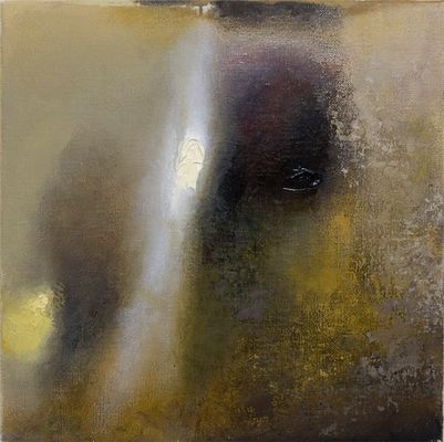
To return to Buckley’s fragment, the first two lines very much evoke how I paint nowadays. As you age, detail diminishes and patches of light become more luminous and float. I feel the most honest way of dealing with this is by smearing the oil paint on the canvas with the fingers and working close-up, blind. Only if the patches coalesce into an approaching image can the work gain a life.
-
Jonathan Walker was born in Melbourne, Australia and brought up on a dairy farm in Gippsland. In the 1970’s he studied painting at RMIT and won the Harold Wright Scholarship to the British Museum, London. During the 1980’s he exhibited at Pinacotheca Gallery, Richmond and had work shown at the NGV and Heidi City Art Gallery. Over the same period he designed the cover for the “Epigenesi” LP by Giancarlo Toniutti, Italy and conducted a mail exchange work with Achim Wollscheid, Germany. The work with artists through the post resulted in an article published in the bicentenary issue of Art and Australia 1988. He showed in artist run spaces such as WestSpace in the 90’s and 2000’s, and until 2012, taught painting at Victoria University, which is where we (Colleen Ahern and Lisa Radford) as organisers of the exhibition, among many others, had the privilege of being his student.
Walker’s knowledge was imparted to students through the careful selection of music, literature, and artists found in books that he himself had ordered for the library. Walker’s strategy was the generosity of sharing his vast knowledge with references specific to each student and their context.
Walker’s paintings share a similar focus and intimacy.
This exhibition presents a small selection of recent paintings alongside a publication that includes Walker’s writing. Observational and analytical, Walker’s work is a type of material notation — the time of day, colour and how it is blended, the both specific and fleeting location of a reflection on lino or the question of whether a chair leg should be included in a painting.
Please join us on Friday August 21 between 6-8pm to celebrate the opening of the exhibition.
Curated by Colleen Ahern and Lisa Radford.
B. Wurtz
Curated by Nic Tammens
March 26 - April 4, 2015
B.Wurtz works from a basement studio in his home on Manhattan’s Lower East Side.
This local fact is attested to by the plastic shopping bags and newsprint circulars that appear in his work. As formal objects, they don’t make loud claims about their origins but nonetheless transmit street addresses and places of business from the bottom of this long thin island. Like plenty of artists, Wurtz is affected by what is local and what is consumed. His work is underpinned by this ethic. It often speaks from a neighborhood or reads like the contents of a hamper:
“BLACK PLUMS $1.29 lb.”
“Food Bazaar”
“USDA Whole Pork Shoulder Picnic 99c lb.”
“RITE AID Pharmacy, with us it’s personal.”
“H. Brickman & Sons.”
“Sweet Yams 59c lb."
Most of the work in this exhibition was made while the artist was in residence at Dieu Donne, a workshop dedicated to paper craft in Midtown. Here Wurtz fabricated assemblages with paper and objects that are relatively lightweight, with the intention that they would be easily transportable to Australia. This consideration isn’t absolute in Wurtz’s work, but was prescriptive for making the current exhibition light and cheap. Packed in two boxes, these works were sent from a USPS post office on the Lower East Side and delivered to North Melbourne by Australia Post.
Wurtz appears courtesy of Metro Pictures, New York.
Thanks to Rob Halverson, Joshua Petherick, Sari de Mallory, Matt Hinkley, Helen Johnson, Fayen d'Evie, Ask Kilmartin, Lisa Radon, Ellena Savage, Yale Union, and "Elizabeth".
John Nixon
"Archive"
December 15 - January 20, 2014
The presentation of John Nixon's archive offered a rare showcase of this extensive collection of the artist's own publications, catalogues, posters, ephemera, editions and more, from the mid 1980s onwards, alongside a selection of his artworks.
Organized by John Nixon, Joshua Petherick and Matt Hinkley.
<a href=http://wfb.public-office.info/artist/john-nixon>All titles by John Nixon
"Habitat"
at Minerva, Sydney (organised by Joshua Petherick and Matt Hinkley)
November 15 - December 20, 2014
Lupo Borgonovo, Janet Burchill & Jennifer McCamley,
Lewis Fidock, HR Giger, Piero Gilardi, Veit Laurent Kurz,
Cinzia Ruggeri, Michael E. Smith, Lucie Stahl, Daniel Weil, Wols
Press Release:
“...It contained seven objects. The slender fluted bone, surely formed for flight, surely from the wing of some large bird. Three archaic circuitboards, faced with mazes of gold. A smooth white sphere of baked clay. An age-blackened fragment of lace. A fingerlength segment of what she assumed was bone from a human wrist, grayish white, inset smoothly with the silicon shaft of a small instrument that must once have ridden flush with the surface of the skin - but the thing’s face was seared and blackened.”
William Gibson, “Count Zero”, 1986
"Autumn Projects Archive"
Curated by Liza Vasiliou
March 6 - March 15, 2014
World Food Books, in conjunction with the Virgin Australia Melbourne Fashion Festival 2014, presented the Autumn Projects archive, consisting of a selection of early examples in Australian fashion with a particular interest in collecting designers and labels from the period beginning in the 1980’s, who significantly influenced the discourse of Australian Fashion.
Curated by Liza Vasiliou, the exhibition provided a unique opportunity to view pieces by designers Anthea Crawford, Barbara Vandenberg, Geoff Liddell and labels CR Australia, Covers, Jag along with early experimental collage pieces by Prue Acton and Sally Browne’s ‘Fragments’ collection, suspended throughout the functioning World Food Books shop in Melbourne.
H.B. Peace
presented by CENTRE FOR STYLE
November 14, 2013
"Hey Blinky, you say chic, I say same"
Anon 2013
H.B. Peace is a clothing collaboration between great friends Blake Barns and Hugh Egan Westland. Their pieces explore the divergences between 'character’ and ‘personality’ in garments....etc
Special Thanks to Joshua Petherick and Matt Hinkley of WFB and Gillian Mears
and a Very Special Thank you to Audrey Thomas Hayes for her shoe collaboration.
Janet Burchill & Jennifer McCamley
"Aesthetic Suicide"
May 10 - June 8, 2013
The first of our occasional exhibitions in the World Food Books office/shop space in Melbourne, "Aesthetic Suicide" presented a body of new and older works together by artists Janet Burchill & Jennifer McCamley, including videos, prints, a wall work, and publications.
During shop open hours videos played every hour, on the hour.
1989, English
Hardcover (w. dust jacket), 174 pages, 19 x 26 cm
1st Edition, Out of print title / used / very good
Published by
University of Missouri Press / Missouri
$450.00 - In stock -
First, only edition of the best and still the most comprehensive book published on pioneering feminist performance/body artist Hannah Wilke, this wonderful monograph was published in 1989 to accompany the exhibition 'Hannah Wilke : A Retrospective' at the University of Missouri, St. Louis, the first and only survey of the influential American artist’s work during her lifetime. Now very collectible, this lovely landscape hardcover volume collects all of Wilke's major bodies of work, heavily illustrated in colour and b/w and chaptered by central themes, alongside Wilke's own writings and an essay by Joanna Frueh. A stunning, intimate and enlightening book that feels almost more like an artist's book than a monograph. Highly recommended.
Hannah Wilke (1940 — 1993) was an American painter, sculptor, photographer, video artist and performance artist. Wilke's work is known for exploring issues of feminism, sexuality and femininity. Wilke first gained renown with her "vulval" terra-cotta sculptures in the 1960s, often mentioned as some of the first explicit vaginal imagery arising from the women's liberation movement. In 1974, Wilke began work on her photographic body art piece S.O.S — Starification Object Series, in which she merged her minimalist sculpture and her own body by creating tiny vulval sculptures out of chewing gum and sticking them to herself — for Wilke chewing gum was "the perfect metaphor for the American women — chew her up, get what you want out of her, throw her out and pop in a new piece.″ She performed live and created videotapes and photography in the early 1970s, often posing as a glamour model or pin-up, wresting the means of production of the female image from male hands and into her own. Her use of the body in her artistic practices was considered controversial by some feminist critics, sighting her beauty as impediment to understanding her work. This changed in the early 1990s when Wilke began documenting the decay of her body ravaged by lymphoma in her last work, Intra-Venus (1992–1993), mirroring her photo diptych Portrait of the Artist with Her Mother, Selma Butter, 1978–82, which portrayed her mother's struggles with cancer. Intra-Venus was exhibited and published posthumously partially in response to Wilke's feelings that clinical procedures hide patients as if dying was a "personal shame." Wilke once answered the critics who commented on her body being too beautiful for her work by saying "People give me this bullshit of, 'What would you have done if you weren't so gorgeous?' What difference does it make? ... Gorgeous people die as do the stereotypical 'ugly.' Everybody dies." During her lifetime, Wilke was widely exhibited, and although controversial, received critical praise. However, until recently, museums were hesitant to acquire work by women artists who, including Wilke, engaged in protests decrying their lack of inclusion during the feminist movement of the 1970s. Wilke's work, with its confrontational use of female sexuality and the fact that it does not fit into a distinct genre or style, was in very few permanent collections when she was alive. Today, however, when theoretical and artistic strategies have changed and when art is increasingly cognizant of social context, Wilke's work has found rightful place among the most important artwork of the past forty years.
Very Good copy in VG dust jacket (preserved in mylar jacket).
1991, Japanese
Softcover (w. dust jacket + obi), 190 pages, 14.5 x 10.5 cm
1st Edition, Out of print title / used / very good
Published by
Futami Shobo / Japan
$70.00 - In stock -
Amazing pocket art book of Bizarre Bondage Fashion, edited by Makoto Ohrui and Japanese novelist Mari Akasaka (both editors of SALE2/Fiction Inc.) and published in Tokyo Japan by Futami Shobo in 1991. Packed cover-to-cover with colour and b/w reproductions of classic artworks by John Willie, Irving Klaw, ENEG, Carlo, Jim, Eric Stanton, E.K., Ruis, Betty Page, and many more garnered from the underground bounty of European and American Fetish and Bizarre publications. Perfectly compiled in the way SALE2 did so well, with elegant scrapbook style, dense with imagery, blown-up, full-bleed reproductions from many publications. Includes a multi-panel double-sided pull-out by John Willie.
Makoto Ohrui founded the publishing house Fiction Inc. (later Radical Silence Production), the magazine SALE2, the gallery THE deep in Tokyo, and the magazine THE International. Ohrui was art director for SALE2, Purple, Rockin' On, and designed many books.
Mari Akasaka (b. 1964) is a Japanese novelist. In 1999 her novel Vibrator was nominated for the Akutagawa Prize, which was adapted into a 2003 film directed by Ryūichi Hiroki. She was again nominated for the Akutagawa prize in 2000 for her novel, Muse, and won the Noma Literary Prize for New Writers for the same novel.
Very Good copy, with obi.
1996, Japanese
Softcover (w. dust jacket and obi-strip), 256 pages, 21 x 14.8 cm
1st Edition, Out of print title / used / very good
Published by
Core Magazine / Tokyo
$110.00 - In stock -
Don't judge a book by it's cover — you've been warned! Straight out of the young nihilist 90s, the second volume of the very short-lived and absolutely demented Seikimatsu Club (End of the Century Club), published in Tokyo between 1996—2000 for a total of only five volumes. This second volume, "Deathtpia in Suburbia", has the feature theme of Horror! Bizarre! Bizarre! Cruelty! and is packed to the absolute brim with "corpses, freaks, spectacles, murders, suicides, autopsies, rapes, sickness, pain, accident, war, religious rituals, violence, forensics, foetuses. A shocking document that eliminates all fiction (all genuine)!"
With contributors to this issue including Masami Akita (Merzbow), Masaaki Aoyama (author), Kiyotaka Tsurisaki (corpse photographer), Suehiro Maruo (ero guro manga artist), Teruo Ishii (ero guro film director), Kotaro Kobayashi (Too Negative editor-in-chief), Trevor Brown (artist), you should know what you are getting yourself into.
Following the trajection of fellow Japanese abnormal subculture magazines such as Kotaro Kobayashi's notorious Too Negative, Ultra Negative, ORG, etc., and in the spirit of a new wave of 90's nihilist publishing around the world (Answer Me!, Killing Times, Fuck!, AMOK, Feral House, etc.) End of the Century Club stares directly into the dark recesses of humanity and presents its viewers with the uncompromising extremes of our global culture. The real stuff. Where Too Negative presents itself as a glossy colour photo/art magazine, End of the Century Club is almost like a Whole Earth Catalog to the authentic macabre. With articles, interviews, reports, catalogues and hundreds of images spanning all manner of medical/autopsy/corpse photography, death journalism, serial killers, formalihide babies, war/shock accident/crime scenes, hara-kiri, murder, rape, slaughterhouse, forensic books, international underground magazines, Photobook of World Diseases, City of Sodom, corpses on the internet, Underground Baby Contest, Atlas of Dermatology, complete guide to Freaks movies, the Garbage Pail Kids, religious ceremonies, animal deformities, Interview with "The King of Cult" ero guro film director Teruo Ishii, bizarro sex, acrotomophila, artist Joel Peter Witkin's world, interview with Masaaki Aoyama, interview with corpse photographer Kotaro Kobayashi (Death, Hardcore Works, Too Negative, Billy, etc.), photography of George Dureau, interview with fetish film director and producer Kaoru Adachi, interview with experimental film director Shozin Fukui (Metal Days, Gerorisuto, Caterpillar, 964 Pinocchio, Rubber's Lover...), article on "Serial Killers & Record Junkies" by Toshihiko Hironaka (of Boris, Balzac, Hellbent fame), and all sorts of other curios from the mondo, bizarro realm.
Includes "gorgeous" 24-page high-quality corpse photo booklet feature and cover art by Trevor Brown.
Not for the fain-hearted. You'll feel like a shower after.
Very Good copy with dust jacket and obi.
1997, Japanese
Softcover (w. dust jacket and obi-strip), 256 pages, 21 x 14.8 cm
1st Edition, Out of print title / used / very good
Published by
Core Magazine / Tokyo
$110.00 - In stock -
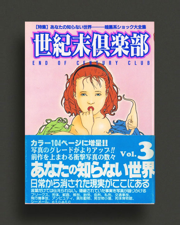
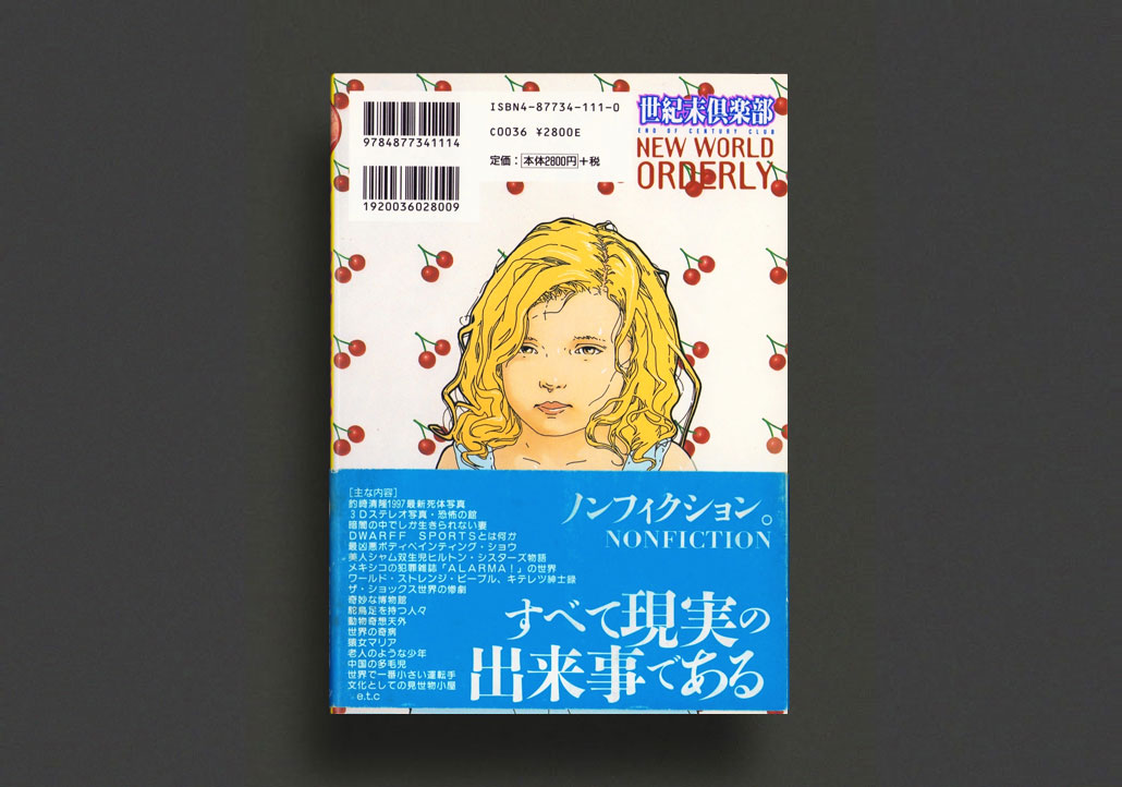
Don't judge a book by it's cover — you've been warned! Straight out of the young nihilist 90s, the third volume of the very short-lived and absolutely demented Seikimatsu Club (End of the Century Club), published in Tokyo between 1996—2000 for a total of only five volumes. This third volume, "The World You Don't Know", has the feature theme of exposing "a reality erased from everyday life", which sums it up... packed to the absolute brim with "freaks, corpses, bestiality, autopsies, fetal executions, lynchings, traffic accidents, plane crashes, amputee, heteromorphic animals, freak shows, corpse museums, shemales, etc. A shocking document that eliminates all fiction (all genuine)!"
With contributors to this issue including Masami Akita (Merzbow), Masaaki Aoyama (author), Kiyotaka Tsurisaki (corpse photographer), Hideshi Hino (horror manga artist / Guinea Pig director), Kotaro Kobayashi (Too Negative editor-in-chief), Trevor Brown (artist), you should know what you are getting yourself into.
Following the trajection of fellow Japanese abnormal subculture magazines such as Kotaro Kobayashi's notorious Too Negative, Ultra Negative, ORG, etc., and in the spirit of a new wave of 90's nihilist publishing around the world (Answer Me!, Killing Times, Fuck!, AMOK, Feral House, etc.) End of the Century Club stares directly into the dark recesses of humanity and presents its viewers with the uncompromising extremes of our global culture. The real stuff. Where Too Negative presents itself as a glossy colour photo/art magazine, End of the Century Club is almost like a Whole Earth Catalog to the authentic macabre. With articles, interviews, reports, catalogues and hundreds of images spanning all manner of medical/autopsy/corpse photography, death journalism, serial killers, formalihide babies, war/shock accident/crime scenes, human intersection, murder art show, lobster boy, 3D stereo photography hall of horrors, donkey fucker (please no!), strange diseases of the world, amputee lovers, siamese twins, deformed children, amazing Photo Press historical stories, animal deformities, huge Hideshi Hino art gallery, book guide and interview, ALARMA! photo gallery, Trevor Brown art gallery, corpse photography, columns and features on and by Kiyotaka Tsurisaki (Death, Hardcore Works, Too Negative, Ultra Negative, Billy, etc.), Father Yod (YaHoWha 13) record guide, Medical Atlas by Naruhiko Tanaka, lots of noise record reviews by Masami Akita (Merzbow) inc. Smell & Quim, M.B., Lustmord, Ramleh, Genocide Organ, Richard Ramirez, Agoraphobic Nosebleed, Whitehouse, Extreme Hair Stench, Genital Masticator, Traci Lords Loves Noise, Morder, etc., interview with artist Wes Benscoter (heavy metal illustrator for Slayer, Mortician, Kreator, Deceased, Cattle Decapitation, etc) on the occasion of his NG Gallery body painting show, complete Freak book library, and all sorts of other curios from the mondo, bizarro realm. Lots of full colour gore.
Not for the fain-hearted. You'll feel like a shower after.
Very Good copy with dust jacket and obi.
2003, Japanese
Softcover (w. dust jacket), 440 pages, 15 x 11 cm
Out of print title / used / fine
Published by
Kyoto Shoin / Tokyo
$55.00 - In stock -
2003 edition of the hefty 440-page pocket version of what is now one of the truely iconic interior "design" books - Tokyo Style. Over a period of two years, Japanese writer-photographer Kyoichi Tsuzuki visited apartments, condos and suburban homes in Tokyo, and documented exactly what he saw in colour photography. First published in 1993 in the larger format, Tokyo Style is a collection of these photographs along with Tsuzuki's texts. Divided into eight sections - Beauty in Chaos, The Fancy Fetish, Artsy Pads, The Traditional Touch, Monomaniacs, Kiddie Kingdoms, Inertial Living and Hermitages - the book shows readers a demystified Tokyo and the ordinary lifestyles of the Tokyo people. No wide-angles or post-production here, just the most amazing compendium of hundreds of tiny Tokyo living spaces, no two alike. Somehow this print format seems all the more appropriate!
NF copy, NF dust jacket.
1961, English
Hardcover (w. dust jacket), 90 pages, 28 x 24 cm
1st Edition, Out of print title / used / very good
Published by
Bodley Head / London
$300.00 - In stock -
Rare first hardcover 1961 edition of this very important book of nude photography by British photographer Bill Brandt, published by Bodley Head, London, with a preface by Lawrence Durrell and an introduction by Chapman Mortimer. Fascinating Braque, Picasso, Dubuffet, Henry Moore, Edward Steichen, Eikoh Hosoe, Kishin Shinoyama, to name but a few, and having a profound influence on nude photography hence-forth, Brandt's nudes are as powerful and beautiful now as they were fifty years ago.
"These startling images rewrote the language of nude photography ... Brandt's approach was primarily formal, but his own sensibilities, combined with photography's tendency to overwhelm form's purity with life's impurities, ensured that his nudes are as interesting for their psychological undertones as for the wealth of unexpected forms he conjured. He did so with a camera that was devoid of a practicable viewing mechanism [a shutterless old Kodak he found in a secondhand shop] and thus reduced him, in effect, to working by blind instinct. ... At close range, his ancient camera yields a Venusian giantism, where sometimes sharply defined, sometimes blurred mountains of flesh loom over the artist/observer." (The Photobook A History Volume I, Parr & Badger)
Bill Brandt, best known for his photographs of London, his landscapes and portraits of celebrities, publishes here, for the first time, a selection of nudes, a subject which has obsessed him since 1945. Brandt used an old wooden camera with a wide angle lens for most of the pictures. Instead of making the camera register what he saw, he let himself be guided by the lens and made use of its acute distortion and unrealistically steep perspective. Thus the camera produced new anatomical images and shapes which his eyes had never observed. The lens helped him 'to get rid of the accepted image and to view his subjects without the cellophane-wrapping of conventional sight'. Chronologically arranged, the photographs record the transition from an early romantic style to more radical themes, ending with the pure form of extreme close-ups, taken on the beaches of East Sussex, Normandy and the Mediterranean. The pictures have fascinated Braque, Picasso, Dubuffet, Henry Moore and Edward Steichen, and had a profound influence on nude photography hence-forth.
Good—Very Good ex-libris copy w. associated markings not affecting content pages. Good dust jacket with light wear and repaired tear, preserved under mylar.
1972, English
Hardcover (clothbound), unpaginated, 28.5 x 22 cm
1st Edition, Out of print title / used / average
Published by
A S Barnes / New York
$250.00 - In stock -
Rare copy of “The Face Of Love”, a seldom seen classic erotic photo book from the 1960s by the remarkable and misunderstood Dutch photographer Sanne Sannes, one of the archetypal visionaries of sixties Amsterdam, who was tragically killed in 1967 in an automobile accident at the age of thirty. A beautiful book of Sannes' experimental heavy grain b/w nude photography, effectively employing blur, bokeh, close-ups, etc. to express the emotional nature of his subjects hidden from view. In the strong contrast between light and darkness, life and death, Sannes' outstanding camera work reveals the fascinating beauty of women with an intimate honesty seldom seen. "The Face of Love" was posthumously published in 1972 and contains about 200 full-page illustrations with accompanying essays by Jim Hughes and Louwrien Wijers.
"Sanne Sannes was the enfant terrible in photography, doing things which are not done; neither sharpness, nor clearness, not one technical axiom in photography meant anything to him. He was an artist at work.
A painter, at first only using black and white, later mixing the colors of his film in an imaginative way. His main subject was the full range of emotions connected with love: the sexy and erotic as well as the desireous and paralyzing love-emotions. His work showed a warm heart for the way women love. He was eager to know their inmost feelings and constantly he tried to hit the source of their emotions."—Louwrien Wijers
"Sanne Sannes did not make easy photographs. Certainly, he did not make pretty photographs. I'm not even sure he made photographs. He made explorations of people, of their outsides and their insides, and sent back picture postcards of their psyches. If you looked hard at some of these, you could make out a scribbled message: "Having a great time. Glad you're here."—Jim Hughes
"Suddenly the subject he often talked about was there. Death obsessed him. Life enthralled him. He played the game of life with insatiable enthusiasm. Laughing defiantly, speaking satirically, moving firmly and working energetically, he proved himself indomitable every moment and in every situation. He was the jolly joker in this game of his. He made all the tricks. Then all of a sudden the winner lost. Sanne Sannes' brilliant mind, moving mastership and inspiring personality were destroyed in a fatal car crash Thursday March 23, 1967, three days after his thirtieth birthday."—Louwrien Wijers
The Dutch photographer Sanne Sannes (Groningen, 1937-1967) is known for his experimental black and white photographs with large film grains and fast shutter speeds. His work is full of erotic and mysterious portraits of women. Sannes, referred to by some as the Marquis de Sade of Holland, was an elusive personality, just like his works, and died at the young age of 30.
Average—Good copy without dust jacket. Some tanning to edges and creasing to some pages, heavy "fan" creasing on one spread with some resultant damage. Otherwise generally Good throughout.
1982, Japanese
Softcover (w. dust jacket), 160 pages, 21 x 14.8 cm
1st Edition, Out of print title / used / very good
Published by
Haga Bookstore / Japan
$60.00 - In stock -
Lovely first 1982 edition of the Japanese photo-book / "Cine Album" dedicated entirely to German actress Nastassja Kinski (b. 1961). Profusely illustrated with film stills, inc. many from Cat People (1982), Tess (1979), Passion Flower Hotel (1978), Stay The Way You Are (1978), One From The Heart (1981)... press photos, behind the scenes shots, and movie posters to accompany filmography and much more, all reproduced in vivid colour and b/w gloss. Published by the great Haga Bookstore imprint.
Fine copy in dust jacket.
1971 / 1998, Japanese / English
Softcover (w. dust jacket), 256 pages, 21 x 15 cm
Out of print title / used / fine
Published by
Haga Bookstore / Japan
$60.00 - In stock -
Lovely 1998 edition of the best Japanese photo-book / "Cine Album" dedicated entirely to French actress Brigitte Bardot (b. 1934), first published in 1971. Profusely illustrated with film stills from all of her film appearances up until the date of first publication, from Le Trou Normand (1952) through to Boulevard du Rhum (1971), inc. Contempt (Jean-Luc Godard – 1963), Viva Maria! (Louis Malle – 1965), And God Created Women (Roger Vadim – 1956), Harley Davidson (François Reichenbach, Eddy Matalon – 1967), The Bear and the Doll (Michel Deville — 1970), and all else, along with press photos, behind the scenes shots, and full filmography and much more, all reproduced in vivid colour and b/w gloss. Small amount of text included is in Japanese. Published by the great Haga Bookstore imprint.
Fine copy in dust jacket.
2017—2018, English
Double-sided poster/announcement + CDG envelope, 42 x 20.4 cm
1st Edition, Out of print title / used / very good
Published by
Comme des Garçons / Tokyo
$35.00 - Out of stock
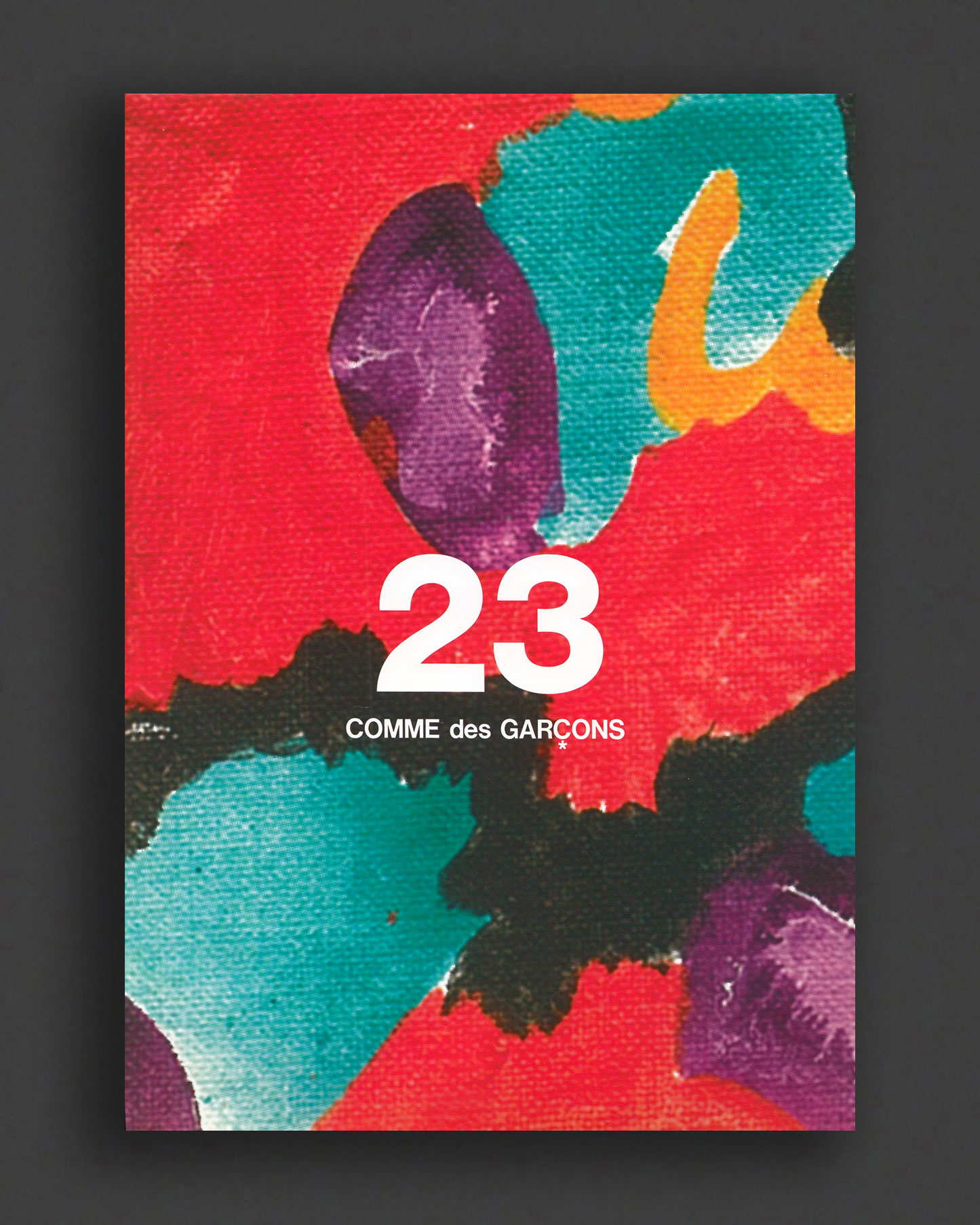
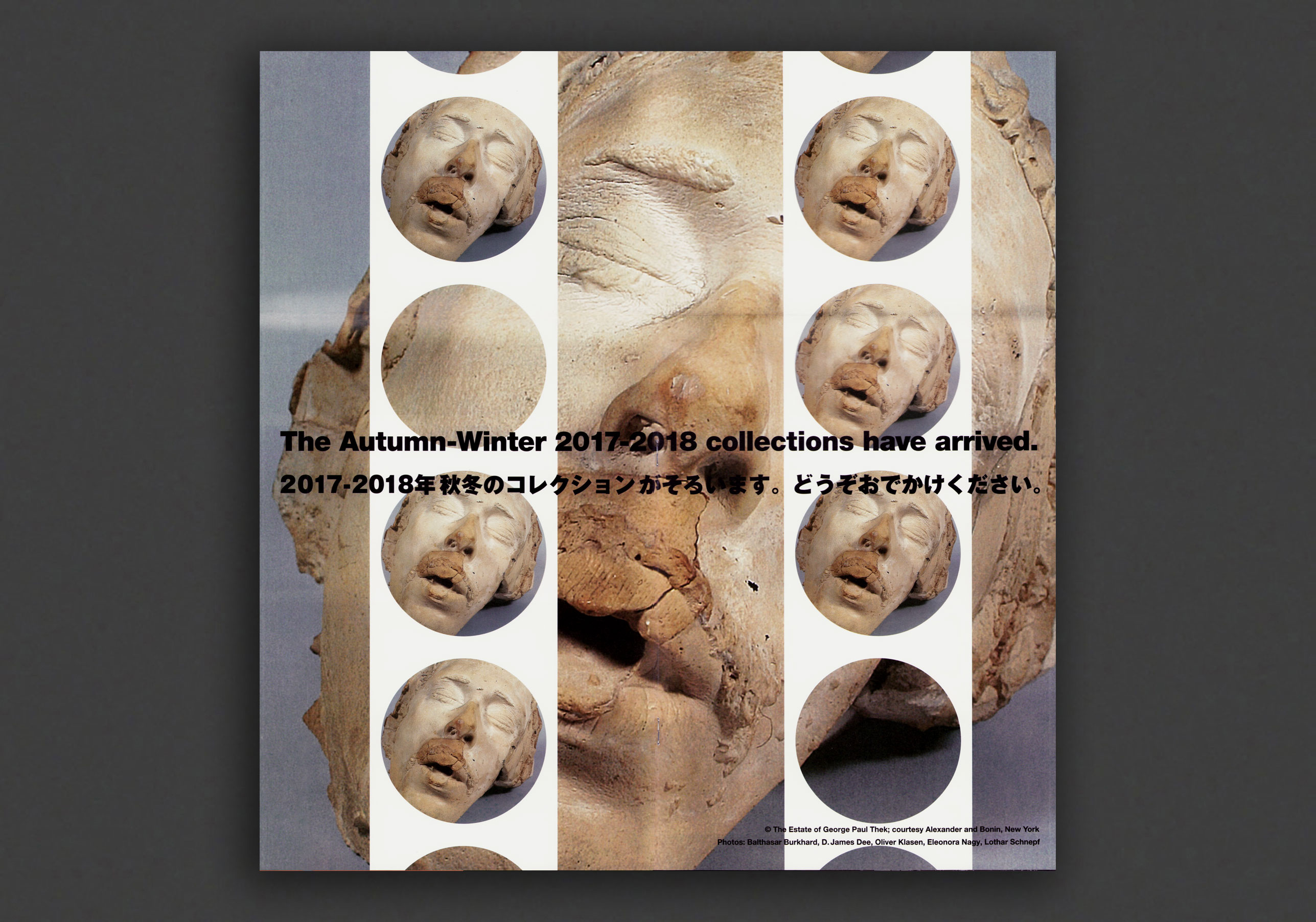
2017 Comme des Garçons sale poster/announcement, no 23 of the collaboration series between Rei Kawakubo's Comme des Garçons and the estate of American artist Paul Thek. Issued as mail-outs privately by Comme to announce the arrival of each of their 2017—18 collections, and not commercially available, these gorgeous, over-sized, elaborate fold-out leaflets designed by CDG showcase Thek's artworks (paintings, installations, drawings, sculptures, photography, etc) in a series of graphic collaged publications, made possible by Robert Wilson's Watermill Centre and Alexander and Bonin. Very Good, preserved copies, issued and collected individually, now very scarce.
This doubles-sided poster is to announce the sale of the 2017 Comme collection and comes with the original b/w CDG mailers/envelope it was issued in (not pictured).
American artist Paul Thek (1933-1988) was an elusive sculptor, painter, and one of the first artists to create environments or installations, who came to recognition showing his sculpture in New York galleries in the 1960s. The first works exhibited, which he began making in 1964 and called “meat pieces” as they were meant to resemble flesh, were encased in Plexiglas boxes that recall Minimal sculptures. At the end of the sixties, Thek left for Europe, where he created extraordinary environments, incorporating elements from art, literature, theater, and religion, often employing fragile and ephemeral substances, including wax and latex. His work was presented at documenta 4 and 5 in Kassel (1968, 1972), the Stedelijk Museum in Amsterdam (1969), the Moderna Museet in Stockholm (1971), and the Kunstmuseum in Lucerne (1973). He was supported in particular by Harald Szeemann and Jean-Christophe Ammann. In 1977, Suzanne Delehanty curated Processions at the Institute of Contemporary Art in Philadelphia, marking the first solo exhibition of Paul Thek's work in an American institution. At the close of the 1970's Thek changed direction, moved back to New York, and turned to the making of small, sketch-like paintings on canvas, although he continued to create environments in key international exhibitions. With his frequent use of highly perishable materials, Thek accepted the ephemeral nature of his art works—and was aware, as writer Gary Indiana has noted, of “a sense of our own transience and that of everything around us.” Following his death in 1988, his work was mainly shown in Europe (Castello di Rivara, Witte de With, etc). In 2008, the ZKM in Karlsruhe programmed Paul Thek Artist's Artist, which also explored how Thek's work has resonated in the contemporary scene. On the other side of the Atlantic, it wasn't until 2010 that the Whitney Museum in New York dedicated a remarkable retrospective to Thek, whose title, Paul Thek: Diver, emphasized the artist's passion for the sea.
Very Good copy.
2017—2018, English
Softcover (staple-bound + fold-out), unpaginated, 42 x 20.4 cm
1st Edition, Out of print title / used / very good
Published by
Comme des Garçons / Tokyo
$55.00 - In stock -
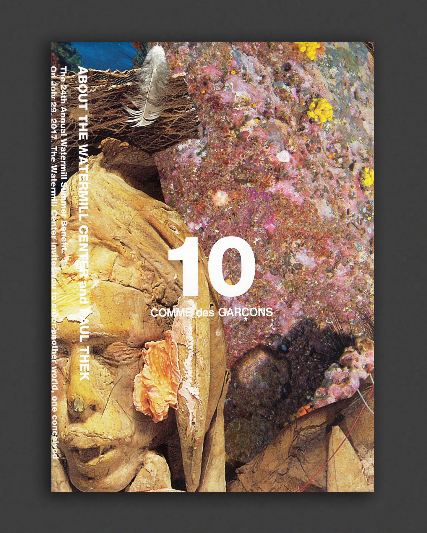
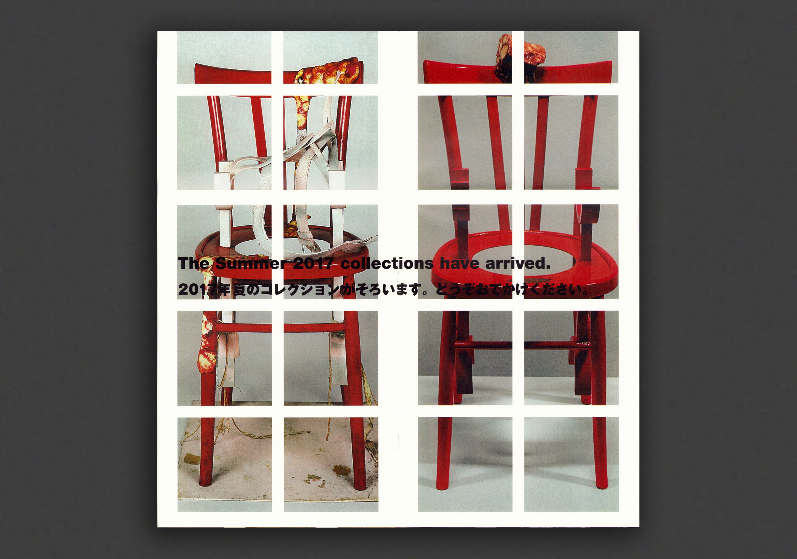
Booklet 10 of the printed collaboration between Rei Kawakubo's Comme des Garçons and the estate of American artist Paul Thek. Issued as mail-outs privately by Comme to announce the arrival of each of their 2017—18 collections, and not commercially available, these gorgeous, over-sized, elaborate fold-out leaflets designed by CDG showcase Thek's artworks (paintings, installations, drawings, sculptures, photography, etc) in a series of graphic collaged publications, made possible by Robert Wilson's Watermill Centre and Alexander and Bonin. Very Good, preserved copies, issued and collected individually, now very scarce.
American artist Paul Thek (1933-1988) was an elusive sculptor, painter, and one of the first artists to create environments or installations, who came to recognition showing his sculpture in New York galleries in the 1960s. The first works exhibited, which he began making in 1964 and called “meat pieces” as they were meant to resemble flesh, were encased in Plexiglas boxes that recall Minimal sculptures. At the end of the sixties, Thek left for Europe, where he created extraordinary environments, incorporating elements from art, literature, theater, and religion, often employing fragile and ephemeral substances, including wax and latex. His work was presented at documenta 4 and 5 in Kassel (1968, 1972), the Stedelijk Museum in Amsterdam (1969), the Moderna Museet in Stockholm (1971), and the Kunstmuseum in Lucerne (1973). He was supported in particular by Harald Szeemann and Jean-Christophe Ammann. In 1977, Suzanne Delehanty curated Processions at the Institute of Contemporary Art in Philadelphia, marking the first solo exhibition of Paul Thek's work in an American institution. At the close of the 1970's Thek changed direction, moved back to New York, and turned to the making of small, sketch-like paintings on canvas, although he continued to create environments in key international exhibitions. With his frequent use of highly perishable materials, Thek accepted the ephemeral nature of his art works—and was aware, as writer Gary Indiana has noted, of “a sense of our own transience and that of everything around us.” Following his death in 1988, his work was mainly shown in Europe (Castello di Rivara, Witte de With, etc). In 2008, the ZKM in Karlsruhe programmed Paul Thek Artist's Artist, which also explored how Thek's work has resonated in the contemporary scene. On the other side of the Atlantic, it wasn't until 2010 that the Whitney Museum in New York dedicated a remarkable retrospective to Thek, whose title, Paul Thek: Diver, emphasized the artist's passion for the sea.
Very Good copy.
2017—2018, English / Japanese
Softcover (staple-bound + fold-out), unpaginated, 42 x 20.4 cm
1st Edition, Out of print title / used / very good
Published by
Comme des Garçons / Tokyo
$60.00 - In stock -
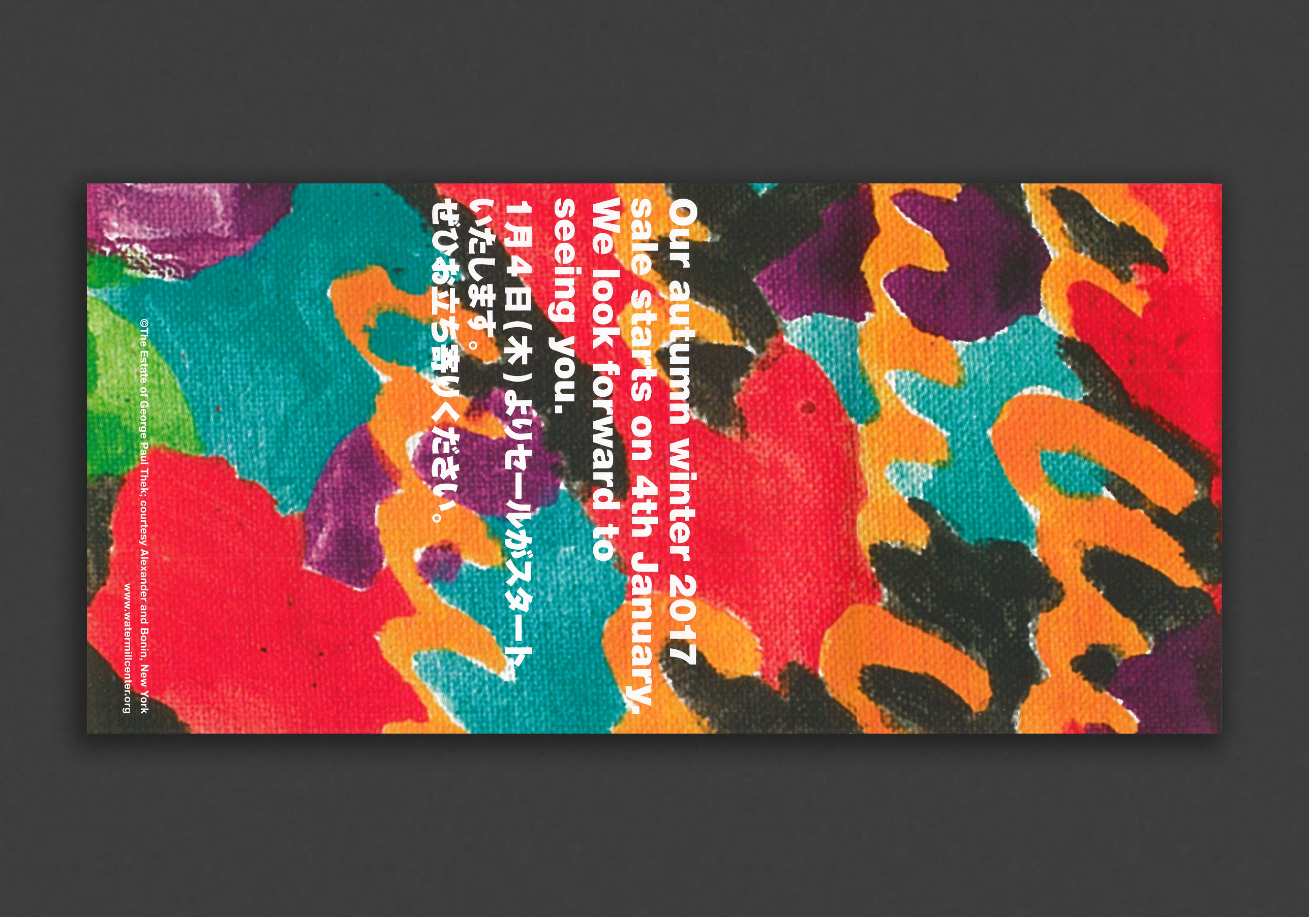
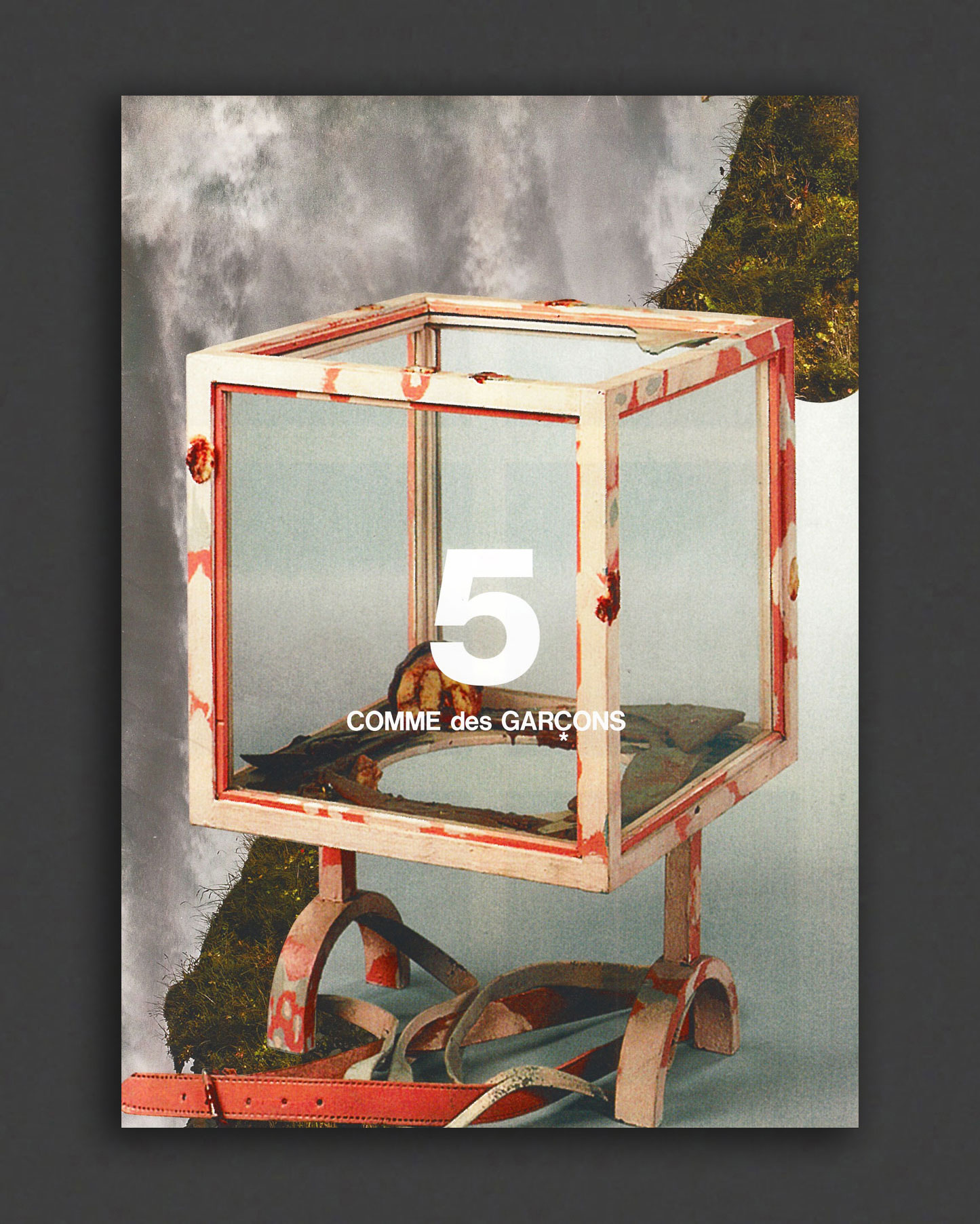
Booklet 5 of the printed collaboration between Rei Kawakubo's Comme des Garçons and the estate of American artist Paul Thek. Issued as mail-outs privately by Comme to announce the arrival of each of their 2017—18 collections, and not commercially available, these gorgeous, over-sized, elaborate fold-out leaflets designed by CDG showcase Thek's artworks (paintings, installations, drawings, sculptures, photography, etc) in a series of graphic collaged publications, made possible by Robert Wilson's Watermill Centre and Alexander and Bonin. Very Good, preserved copies, issued and collected individually, now very scarce.
American artist Paul Thek (1933-1988) was an elusive sculptor, painter, and one of the first artists to create environments or installations, who came to recognition showing his sculpture in New York galleries in the 1960s. The first works exhibited, which he began making in 1964 and called “meat pieces” as they were meant to resemble flesh, were encased in Plexiglas boxes that recall Minimal sculptures. At the end of the sixties, Thek left for Europe, where he created extraordinary environments, incorporating elements from art, literature, theater, and religion, often employing fragile and ephemeral substances, including wax and latex. His work was presented at documenta 4 and 5 in Kassel (1968, 1972), the Stedelijk Museum in Amsterdam (1969), the Moderna Museet in Stockholm (1971), and the Kunstmuseum in Lucerne (1973). He was supported in particular by Harald Szeemann and Jean-Christophe Ammann. In 1977, Suzanne Delehanty curated Processions at the Institute of Contemporary Art in Philadelphia, marking the first solo exhibition of Paul Thek's work in an American institution. At the close of the 1970's Thek changed direction, moved back to New York, and turned to the making of small, sketch-like paintings on canvas, although he continued to create environments in key international exhibitions. With his frequent use of highly perishable materials, Thek accepted the ephemeral nature of his art works—and was aware, as writer Gary Indiana has noted, of “a sense of our own transience and that of everything around us.” Following his death in 1988, his work was mainly shown in Europe (Castello di Rivara, Witte de With, etc). In 2008, the ZKM in Karlsruhe programmed Paul Thek Artist's Artist, which also explored how Thek's work has resonated in the contemporary scene. On the other side of the Atlantic, it wasn't until 2010 that the Whitney Museum in New York dedicated a remarkable retrospective to Thek, whose title, Paul Thek: Diver, emphasized the artist's passion for the sea.
Very Good copy.
1985, English
Softcover (staple-bound), 96 pages, 28 x 20 cm
1st Edition, Out of print title / used / good
Published by
HM Communications / New York
$30.00 - In stock -
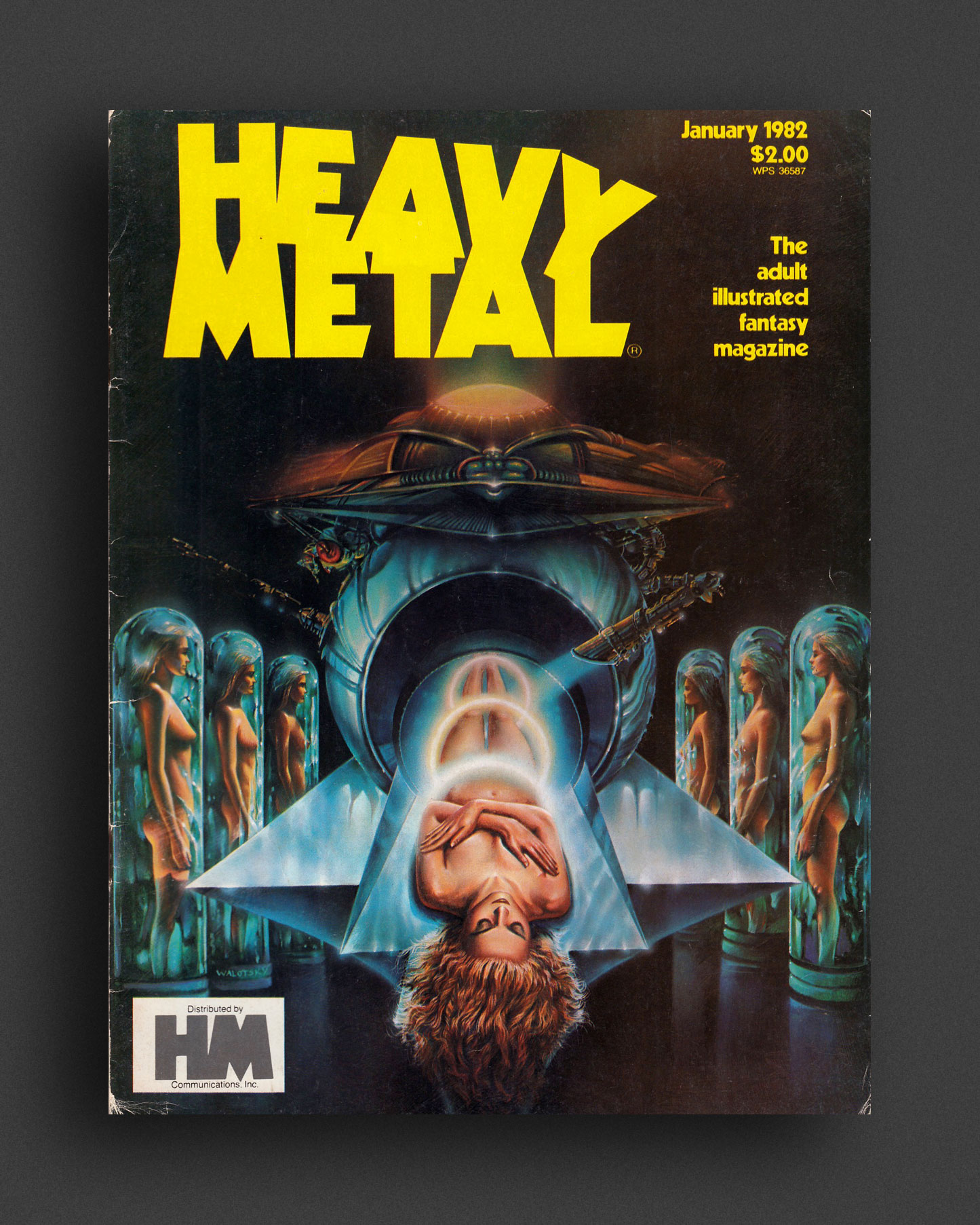
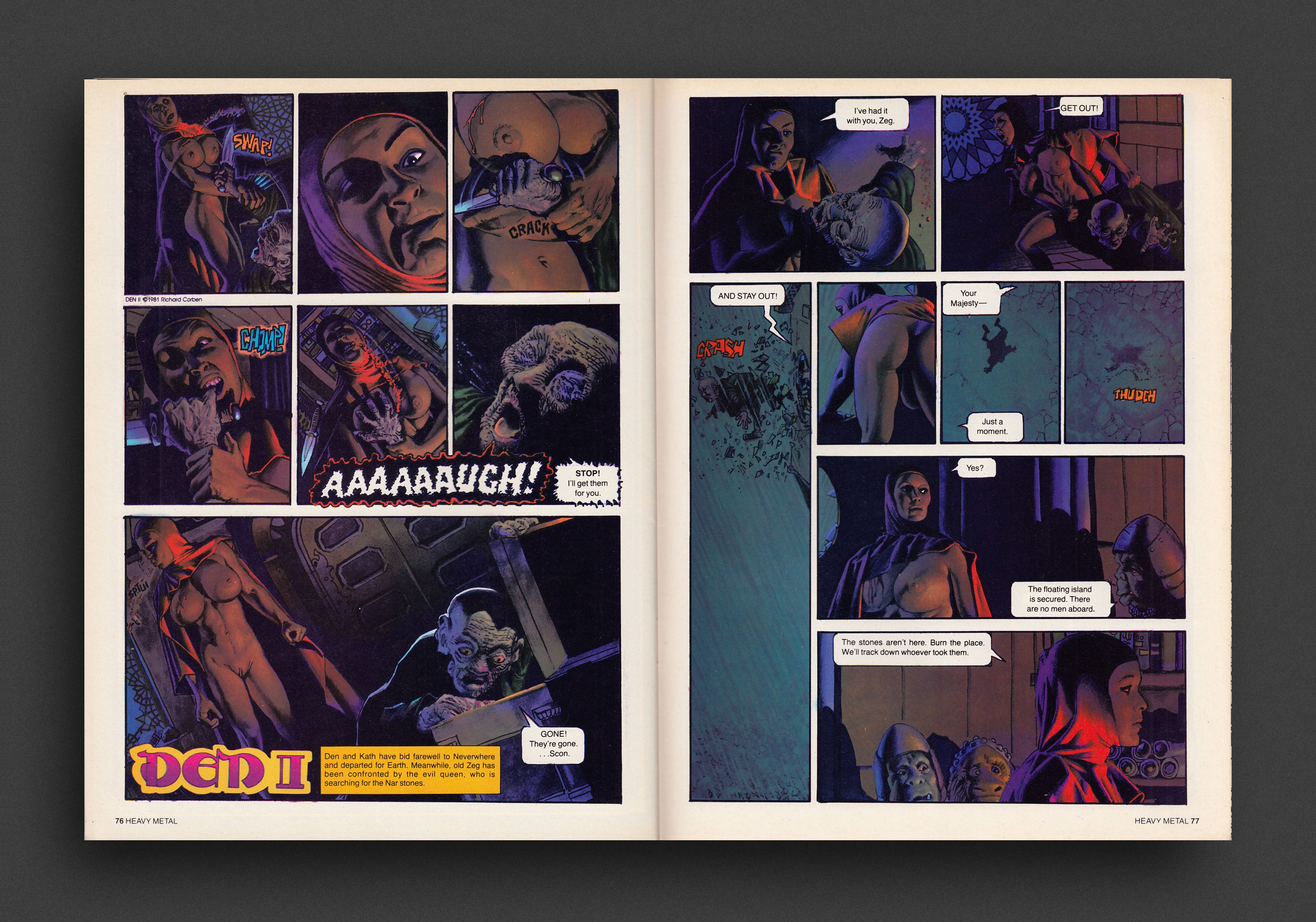
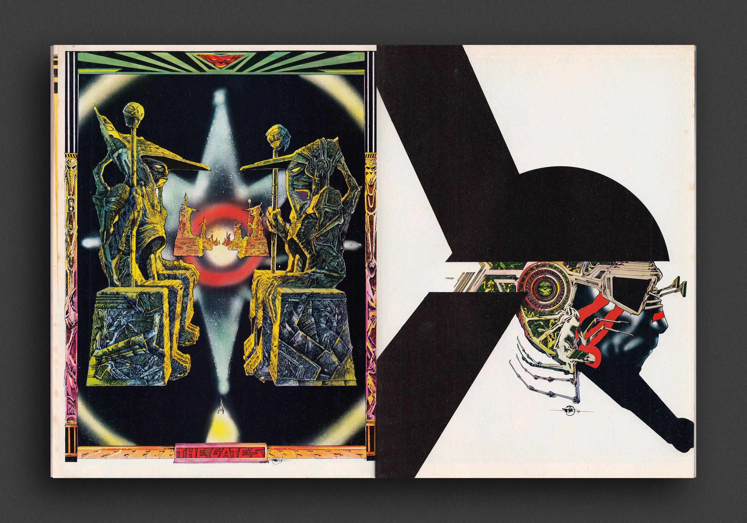
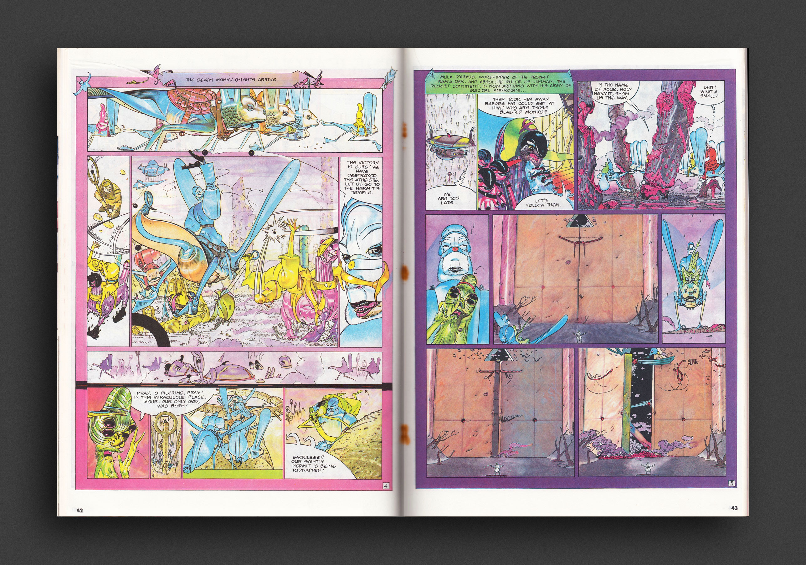
Heavy Metal January 1982 issue featuring comic stories/art by Howard Chaykin and Walter Simonson, Segrelles, Jim Steranko, François Schuiten and C. Renard, Philippe Druillet, Arno, Jacques de Loustal, Voss, Hé, Gillon, Steve Stiles, Richard Corben, Jeff Jones and Paul Kirchner. Also includes “Happy Future: The Autonomous Man” by Daphne Davis, Lance Chudnow and Brad Balfour, illustrated by Michael Gross, and “Mars Attacks!” by Lou Stathis, with illustrations by Rick Lovelace. Cover art by Ron Walotsky (front) and Michael Gross (back).
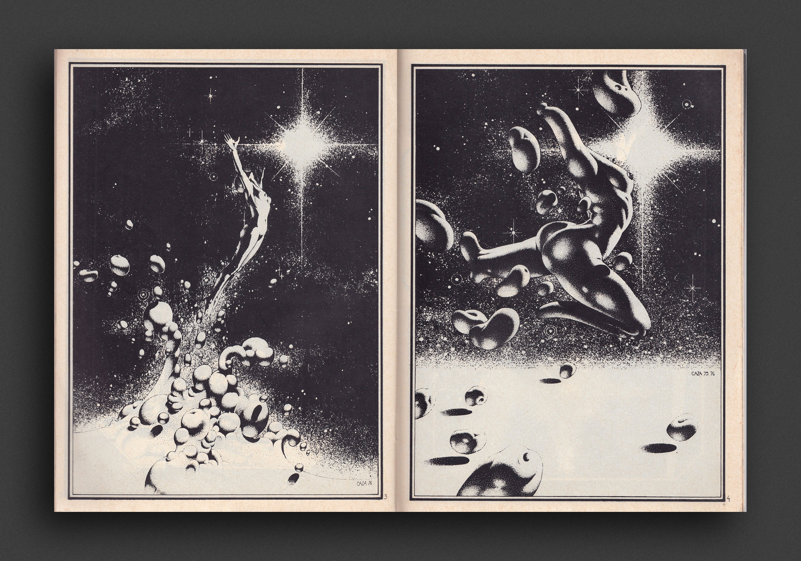
Heavy Metal is an American science fiction and fantasy comics magazine that exploded onto the publishing scene in 1977 and shaped a generation with its blend of dark fantasy/science fiction and erotica. Unlike the traditional American comic books of that time bound by the restrictive Comics Code Authority, Heavy Metal featured explicit content. The magazine started out as a licensed translation of the French science-fantasy magazine Métal Hurlant, including work by Enki Bilal, Philippe Caza, Guido Crepax, Philippe Druillet, Jean-Claude Forest, Jean Giraud (a.k.a. Moebius), Chantal Montellier, and Milo Manara. The magazine later ran Stefano Tamburini and Tanino Liberatore's ultra-violent RanXerox. Heavy Metal gradually evolved into a publication featuring North American contributors like Richard Corben, Matt Howarth, Stephen R. Bissette, Alex Ebel, John Holmstrom, Paul Kirchner, Terrance Lindall, Gray Morrow, Walt Simonson, Dan Steffan, Jim Steranko, John Shirley, Arthur Suydam, Bernie Wrightson, and Olivia De Berardinis.
Very Good copy. Light wear and price markings to cover.
1979, English
Softcover (staple-bound), 96 pages, 28 x 20 cm
1st Edition, Out of print title / used / average
Published by
HM Communications / New York
$25.00 - In stock -
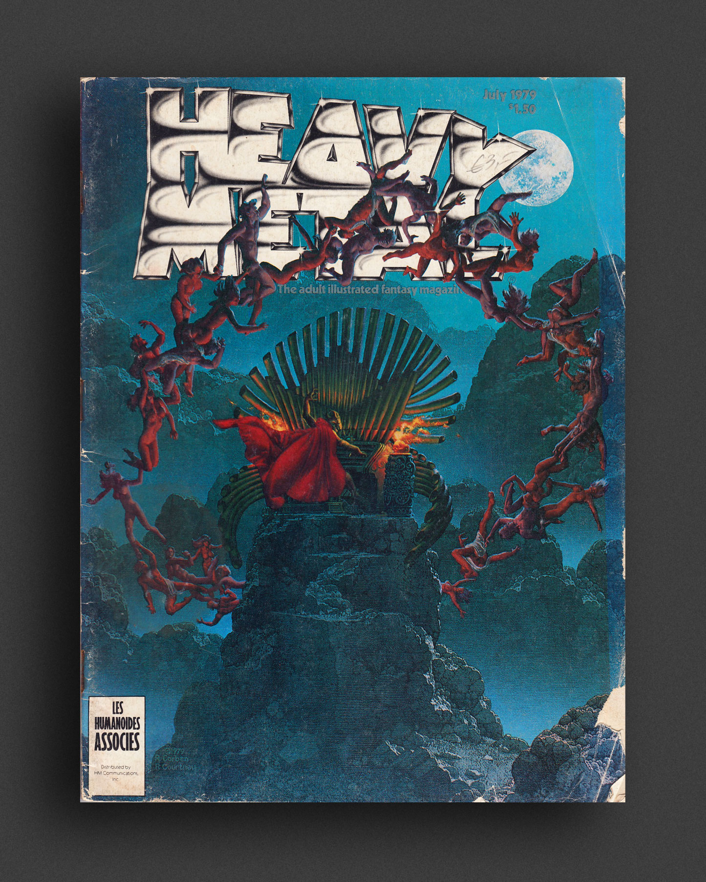
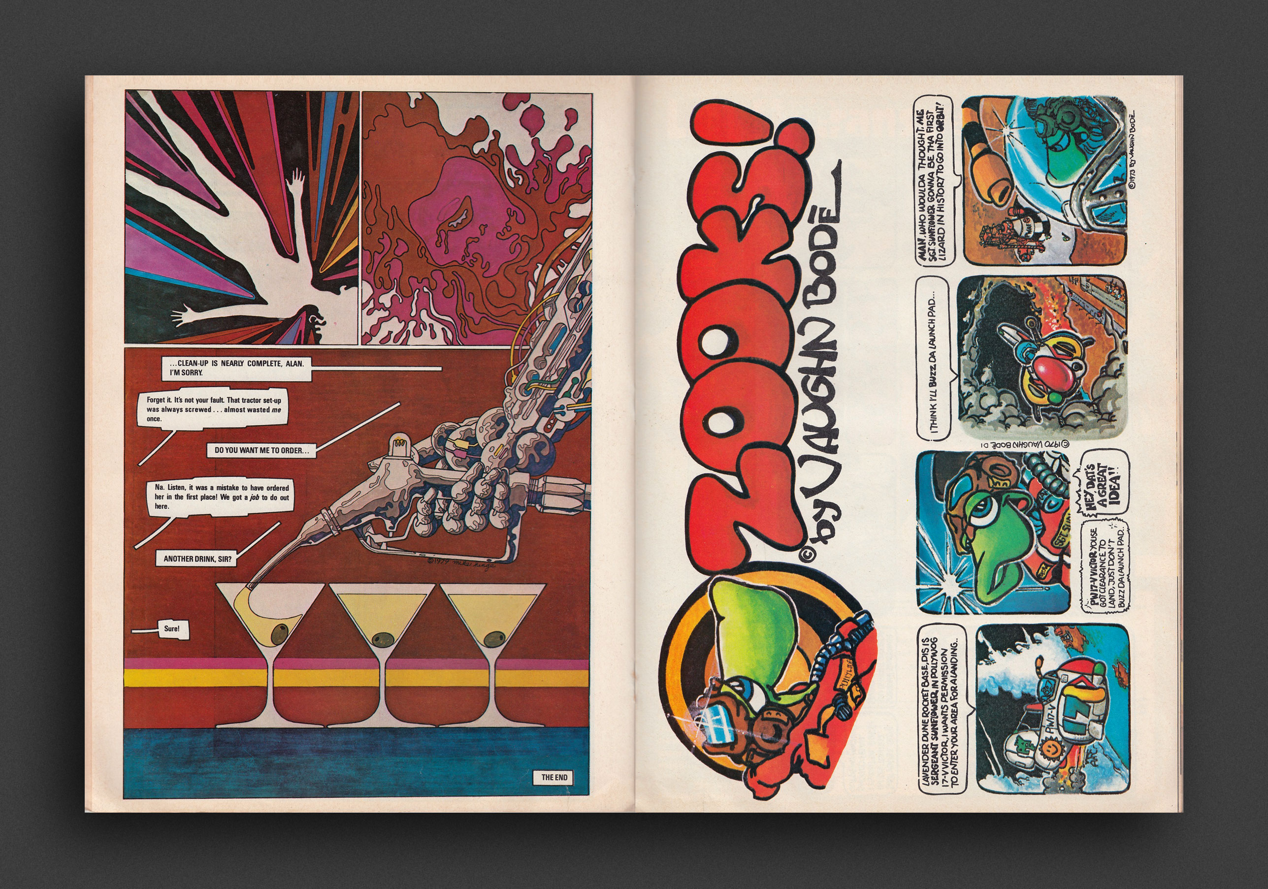
Heavy Metal July 1979 issue, featuring comic stories by Richard Corben and Rick Courtney, Richard Corben and Jan Strnad, Jean “Mœbius” Giraud, Denis Sire, Paul Kirchner, Vaughn and Mark Bodé, John Pocsik and Gil Kane, and Sergio Macedo. Also includes illustrations and short pieces by Jan Duursema, Karl Kofoed, Neal Adams and Roger Stine. Cover art by Richard Corben and Rick Courtney for “Night on Bald Mountain”, back cover by Caza.
Heavy Metal is an American science fiction and fantasy comics magazine that exploded onto the publishing scene in 1977 and shaped a generation with its blend of dark fantasy/science fiction and erotica. Unlike the traditional American comic books of that time bound by the restrictive Comics Code Authority, Heavy Metal featured explicit content. The magazine started out as a licensed translation of the French science-fantasy magazine Métal Hurlant, including work by Enki Bilal, Philippe Caza, Guido Crepax, Philippe Druillet, Jean-Claude Forest, Jean Giraud (a.k.a. Moebius), Chantal Montellier, and Milo Manara. The magazine later ran Stefano Tamburini and Tanino Liberatore's ultra-violent RanXerox. Heavy Metal gradually evolved into a publication featuring North American contributors like Richard Corben, Matt Howarth, Stephen R. Bissette, Alex Ebel, John Holmstrom, Paul Kirchner, Terrance Lindall, Gray Morrow, Walt Simonson, Dan Steffan, Jim Steranko, John Shirley, Arthur Suydam, Bernie Wrightson, and Olivia De Berardinis.
Average–Good copy. Wear/age, some creasing/losses to cover, spine pinching.
1979, English
Softcover (staple-bound), 96 pages, 28 x 20 cm
1st Edition, Out of print title / used / good
Published by
HM Communications / New York
$30.00 - In stock -
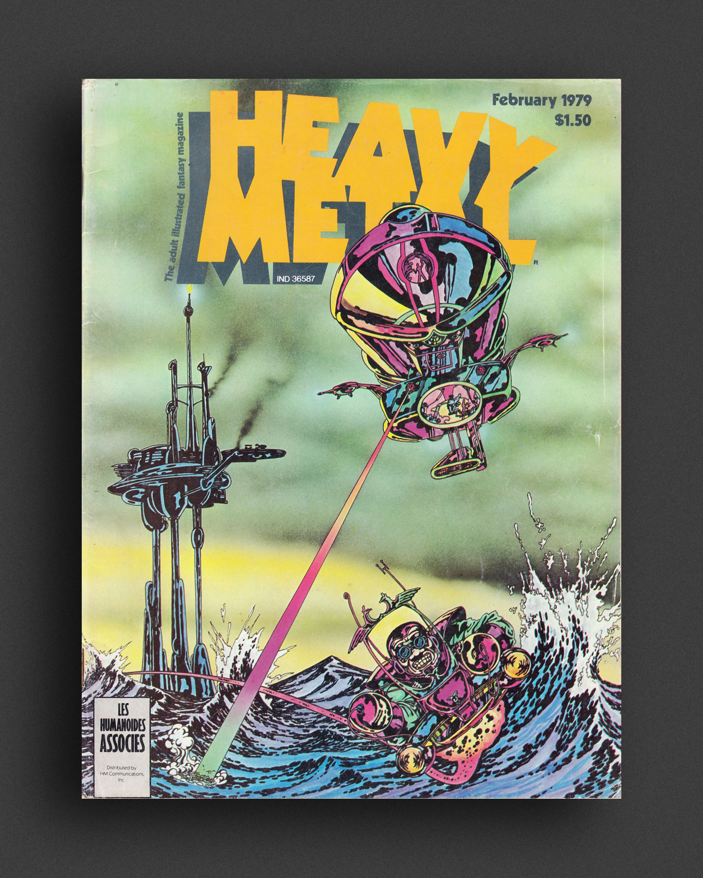
Heavy Metal February 1979 issue featuring comic stories and artwork by Richard Corben, Jan Strnad, Jean “Mœbius” Giraud, Yves Chaland, Sergio Macedo, Enki Bilal, Jean-Pierre Dionnet, Arthur Suydam, Paul Kirchner, Karl Kofoed, Gil Kane, Angus McKie, Chantal Montellier, and many more, plus all the usual fare of sci-fi, movies, music..., with cover art by Derek Rigg (front) and Bob Wakelin (back).
Heavy Metal is an American science fiction and fantasy comics magazine that exploded onto the publishing scene in 1977 and shaped a generation with its blend of dark fantasy/science fiction and erotica. Unlike the traditional American comic books of that time bound by the restrictive Comics Code Authority, Heavy Metal featured explicit content. The magazine started out as a licensed translation of the French science-fantasy magazine Métal Hurlant, including work by Enki Bilal, Philippe Caza, Guido Crepax, Philippe Druillet, Jean-Claude Forest, Jean Giraud (a.k.a. Moebius), Chantal Montellier, and Milo Manara. The magazine later ran Stefano Tamburini and Tanino Liberatore's ultra-violent RanXerox. Heavy Metal gradually evolved into a publication featuring North American contributors like Richard Corben, Matt Howarth, Stephen R. Bissette, Alex Ebel, John Holmstrom, Paul Kirchner, Terrance Lindall, Gray Morrow, Walt Simonson, Dan Steffan, Jim Steranko, John Shirley, Arthur Suydam, Bernie Wrightson, and Olivia De Berardinis.
Good copy. General wear/age, softening at staples.
1980, English
Softcover (staple-bound), 96 pages, 28 x 20 cm
1st Edition, Out of print title / used / average
Published by
HM Communications / New York
$20.00 - In stock -
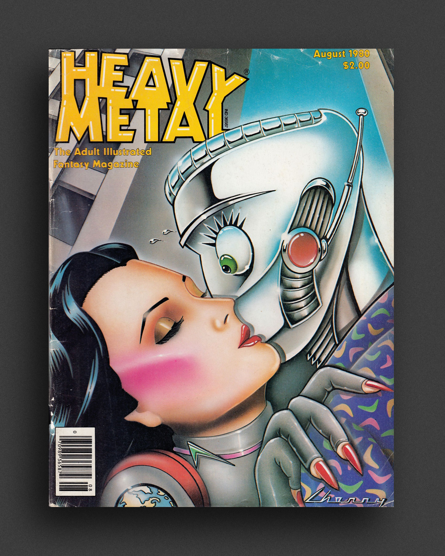
Heavy Metal August 1980 issue featuring an interview with Mœbius conducted by Diana K. Bletter, plus comic stories by Jean “Mœbius” Giraud, Philippe Druillet, Enki Bilal, Pierre Christin, Julio Ribera, Christian Godard, Paul Kirchner, Rick Veitch, Matt Howarth, Steve Stiles and Richard Lupoff. Also includes columns and artwork by Jim Burns, Ted White, Lou Stathis, Jay Kinney, Bob Smith, Bhob Stewart, Steve Brown, Dan Steffan, Maurice Horn, John Workman, Rod Kierkegaard Jr. and Larry Elmore, Cover art by Jim Cherry (front) and Michel Guéranger (back).
Heavy Metal is an American science fiction and fantasy comics magazine that exploded onto the publishing scene in 1977 and shaped a generation with its blend of dark fantasy/science fiction and erotica. Unlike the traditional American comic books of that time bound by the restrictive Comics Code Authority, Heavy Metal featured explicit content. The magazine started out as a licensed translation of the French science-fantasy magazine Métal Hurlant, including work by Enki Bilal, Philippe Caza, Guido Crepax, Philippe Druillet, Jean-Claude Forest, Jean Giraud (a.k.a. Moebius), Chantal Montellier, and Milo Manara. The magazine later ran Stefano Tamburini and Tanino Liberatore's ultra-violent RanXerox. Heavy Metal gradually evolved into a publication featuring North American contributors like Richard Corben, Matt Howarth, Stephen R. Bissette, Alex Ebel, John Holmstrom, Paul Kirchner, Terrance Lindall, Gray Morrow, Walt Simonson, Dan Steffan, Jim Steranko, John Shirley, Arthur Suydam, Bernie Wrightson, and Olivia De Berardinis.
Average copy. General wear/age, softening at staples. One page torn out with some losses, still present.
1985, English
Softcover (staple-bound), 96 pages, 28 x 20 cm
1st Edition, Out of print title / used / average
Published by
HM Communications / New York
$20.00 - In stock -
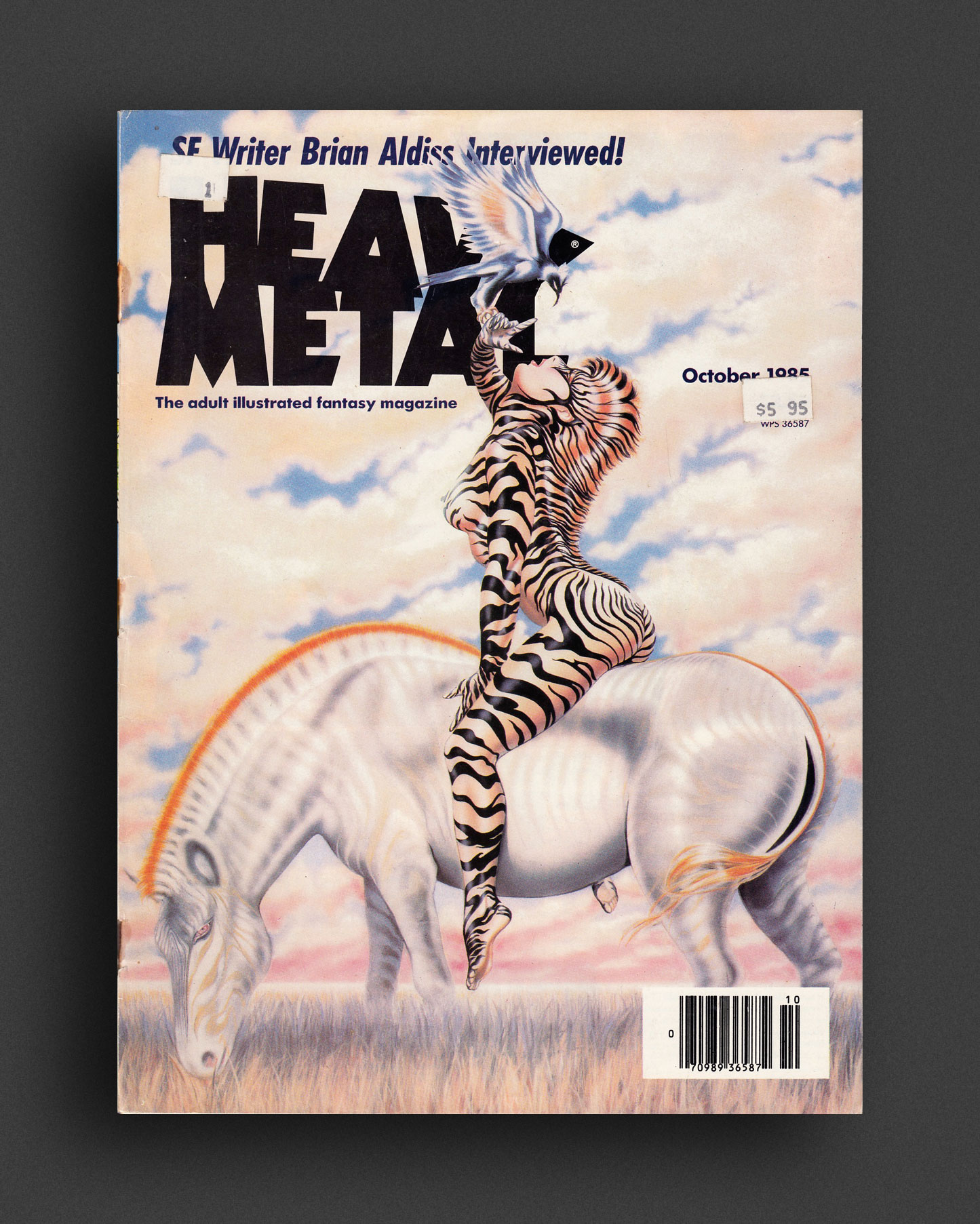
Heavy Metal October 1985 issue featuring comic stories/art by Rod Kierkegaard Jr., Steve Ringgenberg, José M. Bea, Massimo Ghini, Alejandro Jodorowsky, Cadelo, Carlos Trillo, Horacio Altuna, Yves Chaland, Nicola Cuti, Pepe Moreno and Juan Giménez. Also includes “HM’s Hollywood Hell” by Drew Friedman, with cover art by Olivia De Berardinis..
Heavy Metal is an American science fiction and fantasy comics magazine that exploded onto the publishing scene in 1977 and shaped a generation with its blend of dark fantasy/science fiction and erotica. Unlike the traditional American comic books of that time bound by the restrictive Comics Code Authority, Heavy Metal featured explicit content. The magazine started out as a licensed translation of the French science-fantasy magazine Métal Hurlant, including work by Enki Bilal, Philippe Caza, Guido Crepax, Philippe Druillet, Jean-Claude Forest, Jean Giraud (a.k.a. Moebius), Chantal Montellier, and Milo Manara. The magazine later ran Stefano Tamburini and Tanino Liberatore's ultra-violent RanXerox. Heavy Metal gradually evolved into a publication featuring North American contributors like Richard Corben, Matt Howarth, Stephen R. Bissette, Alex Ebel, John Holmstrom, Paul Kirchner, Terrance Lindall, Gray Morrow, Walt Simonson, Dan Steffan, Jim Steranko, John Shirley, Arthur Suydam, Bernie Wrightson, and Olivia De Berardinis.
Average–Good copy. Wear/age, cover has seperated from staples, old stickers.
2012, English / German
Softcover, 104 pages, 20.3 x 24.8 cm
1st Edition, Out of print title / as new
Published by
Walther König / Köln
Collection de l'Art Brut / Lausanne
$100.00 - Out of stock
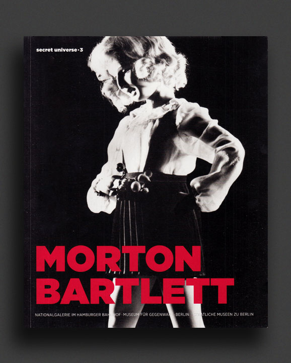
Scarce out-of-print monograph on the work of Morton Bartlett, one of only a couple of books on the artist, published by Collection de l'Art Brut Lausanne and Walther Koenig in 2012 and quickly sold out.
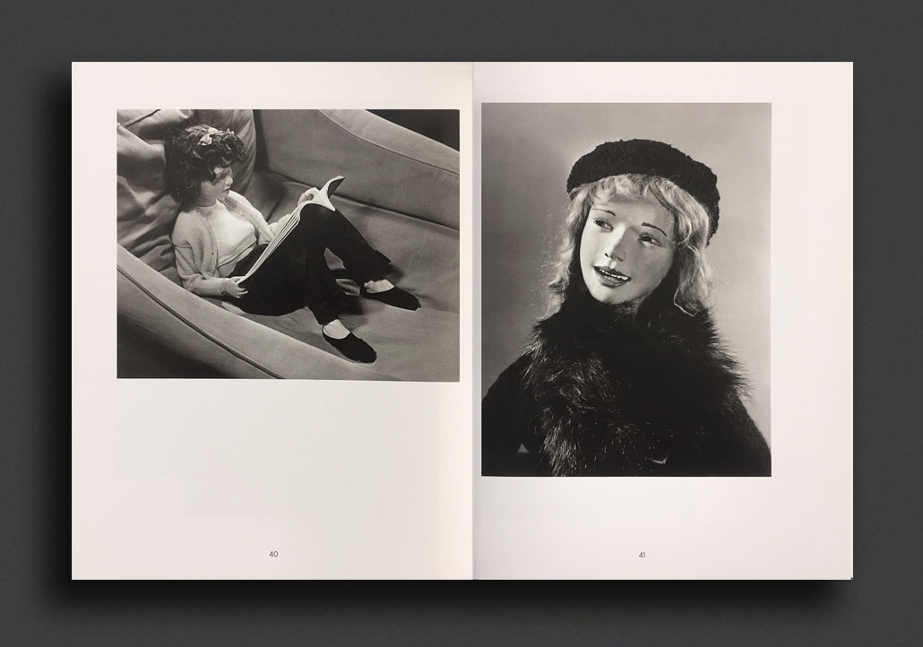
When the freelance photographer and graphic designer Morton Bartlett (1909–1992) died at the age of 83, his relatives found 15 chests among his possessions. Each chest contained a half-life-size doll and its accessories: 12 girls and three boys, a wardrobe of hand-sewn clothes, black-and-white photographs of each doll as well as countless studies and archival materials. Bartlett began designing these dolls in the mid-1930s, studying anatomy books and histories of costume, and learning to sew and mold with clay to make them as true to life as possible. Each doll entailed a huge amount of labor, taking up to a year to complete; Bartlett created costumes and wigs for each one and then staged them in lifelike scenarios and photographed them, documenting a family he had never had and creating a body of work that would remain unexhibited during his lifetime. The third installment in the Bahnhof Museum’s series on outsider artists, this volume examines Bartlett’s extraordinary lifelong obsession.
Edited and with foreword by Udo Kittelmann, Claudia Dichter. Text by Lee Kogan.
As New copy.
1979, English
Softcover, 298 pages, 23 x 15 cm
1st Edition, Out of print title / used / good
Published by
University of Iowa Press / Iowa
Coda Press / Madison
$35.00 - In stock -
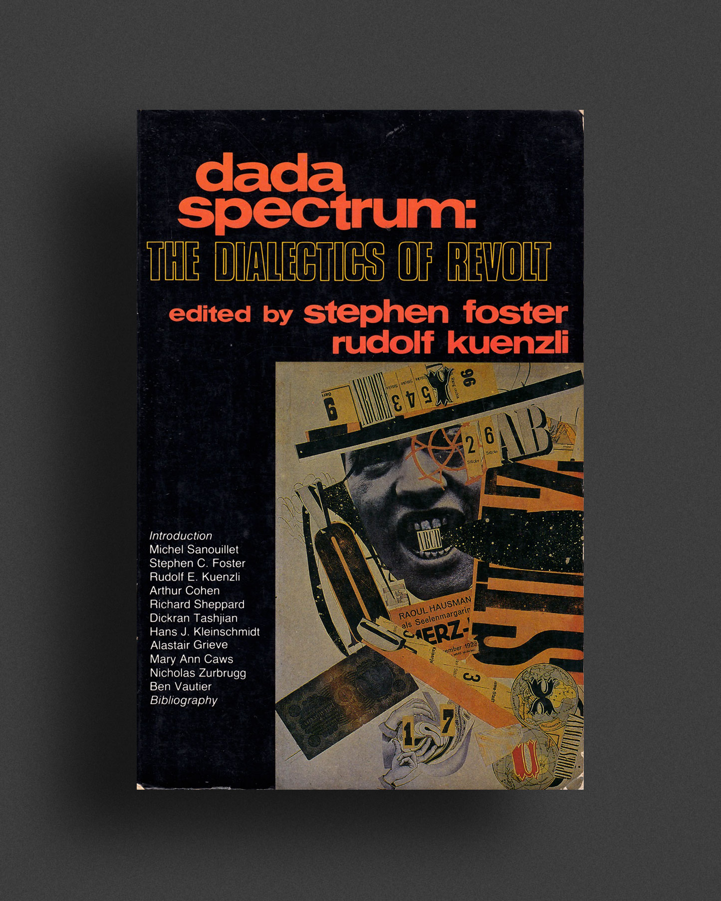
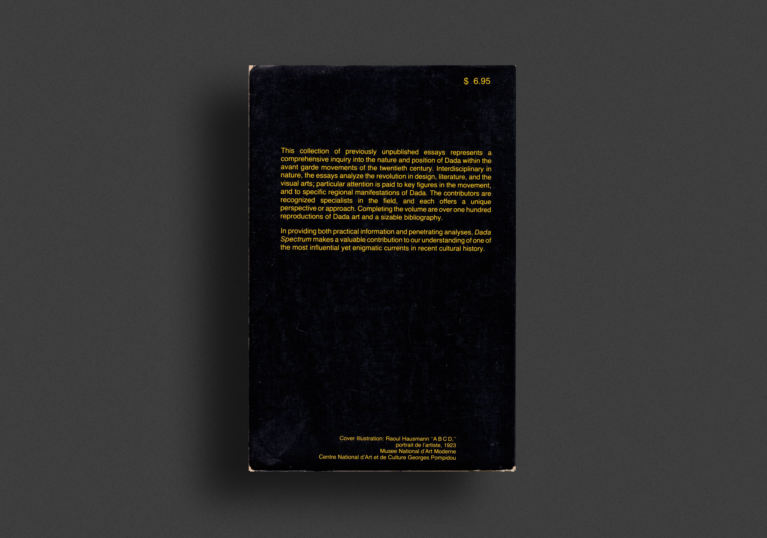
"This collection of previously unpublished essays represents a comprehensive inquiry into the nature and position of Dada within the avant garde movements of the twentieth century. Interdisciplinary in nature, the essays analyze the revolution in design, literature, and the visual arts, particular attention is paid to key figures in the movement, and to specific regional manifestations of Dada. The contributors are recognized specialists in the field, and each offers a unique perspective or approach. Completing the volume are over one hundred reproductions of Dada art and a sizable bibliography.
In providing both practical information and penetrating analyses, Dada Spectrum makes a valuable contribution to our understanding of one of the most influential yet enigmatic currents in recent cultural history."
Contributors: Michel Sanouillet, Stephen C. Foster, Rudolf E. Kuenzli, Arthur Cohen, Richard Sheppard, Dickran Tashjian, Hans J. Kleinschmidt, Alastair Grieve, Mary Ann Caws, Nicholas Zurbrugg, Ben Vautier
Good–VG copy, general wear/age/marking.
1994, English
Softcover, 272 pages, 23.4 x 15.6 mm
Published by
British Film Institute / UK
Indiana University Press / Indiana
$25.00 - In stock -
First 1994 edition.
Paul Willemen (1944—2012) was a Belgian-born British professor, author and essayist. A pioneering figure in the revolution in thinking about the cinema that began in the 1970s, Willemen has contributed to the development of film theory and cultural studies over the past 20 years. This is a collection of his classic but provocative essays, covering a wide range of issues, from pornography and melodrama to Third Cinema and questions of national identity - from the films of Amos Gitai and Nagashi Oshima to theories of postmodernism and an account of subjectivity. Many of the essays originally published in "Screen", "After Image" and "Framework" have also been reworked and updated, but "Looks and Frictions" also includes a number of previously unpublished essays.
Introduction by Meaghan Morris
Near Fine copy.
1997, English
Softcover, 358 pages, 23 x 15.5 cm
1st Edition, Out of print title / used / fine
Published by
Routledge / London
$35.00 - In stock -
First 1997 Edition.
"What happens when white people look at non-whites? What happens when the gaze is returned? Looking for the Other responds to criticisms leveled at white feminist film theory of the 1970s and 1980s for its neglect of issues to do with race. It focuses attention on the male gaze across cultures, as illustrated by women filmmakers of color whose films deal with travel.
Looking relations are determined by history, tradition, myth; by national identity, power hierarchies, politics, economics, geographical and other environment. Travel implicitly involves looking at, and looking relations with, peoples different from oneself. Featured films include Birth of a Nation, The Cat People, Home of the Brave, Black Narcissus, Chocolat, and Warrior Marks. Featured filmmakers include D.W.Griffith, Jacques Tourneur, Michael Powell, Julie Dash, Pratibha Parmar, Trinh T. Min-ha, and Claire Denis."
Fine—As New copy.
2000, German
Softcover, 55 pages, 24 × 28 cm
Published by
Galerie Ascan Crone / Hamburg
$65.00 - Out of stock
Wonderful early artist's book by German artist Kai Althoff, published in 2000 on the occasion of his solo exhibition at Galerie Ascan Crone, Hamburg, and long out-of-print. Illustrated throughout in colour and black and white with Althoff's paintings, drawings, installations and assorted imagery, alongside a text by German painter Michaela Eichwald.
As New.
Kai Althoff (born 1966 in Cologne) is a German visual artist and musician. Borrowing from moments of history, religious iconography, and counter-cultural movements, Althoff creates imaginary environments in which paintings, sculpture, drawing, video, and found objects commingle. Tapping a multitude of sources, from Germanic folk traditions to recent popular culture, from medieval and gothic religious imagery to early modern expressionism, Althoff’s characters inhabit imaginary worlds that serve as allegories for human experience and emotion. His image bank and painterly style also draw on the past, especially early-20th-century German Expressionism, reconfigured by introducing collaged technique.
1977, German
Hardcover (clothbound w. dust jacket), 422 pages, 27.5 x 21 cm
Out of print title / used / very good
Published by
VEB / Dresden
$65.00 - Out of stock
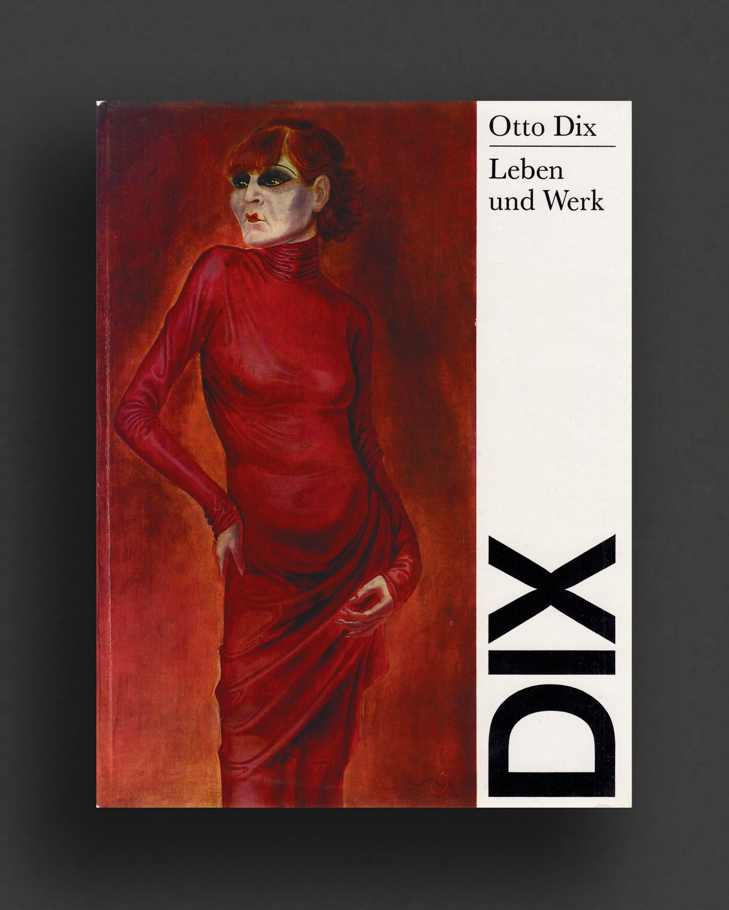
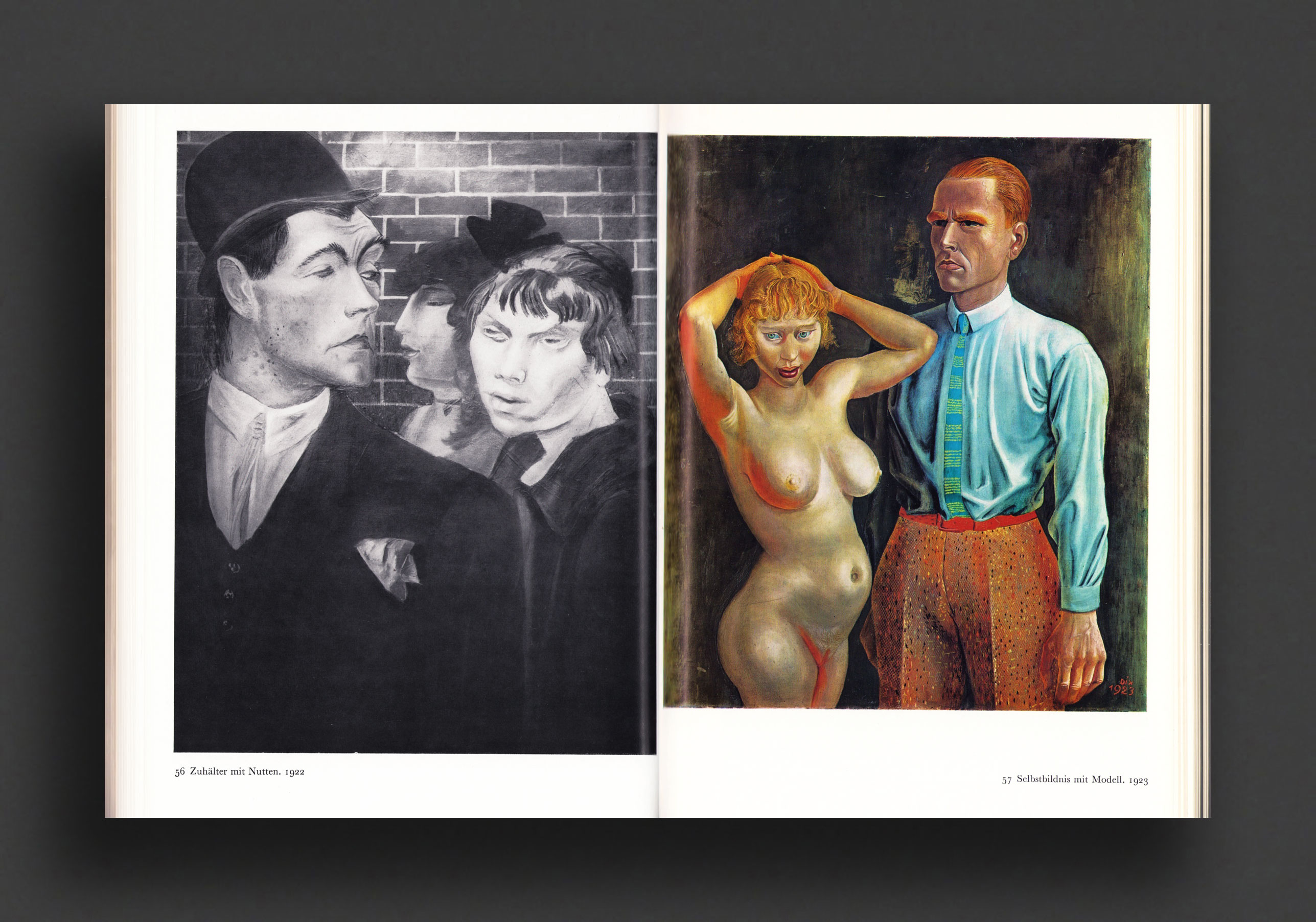
1977 printing of this definitive monographic study of German painter and printmaker, Otto Dix (1891—1969). Written by Fritz Löffler in the original German language, the books presents a large plate section of reproduced paintings and drawings in colour and b/w, including fold-out panels, spanning his entire career. One of the most important artists of the Neue Sachlichkeit (New Objectivity), which also attracted George Grosz and Max Beckmann in the mid 1920s. Dix was noted for his ruthless and harshly realistic depictions of German society during the Weimar Republic and the brutality of war. A veteran haunted by his experiences of WWI, his first great subjects were crippled soldiers, but during the height of his career he also painted nudes, prostitutes, and often savagely satirical portraits of celebrities from Germany's intellectual circles. His work became even darker and more allegorical in the early 1930s, and he became a target of the Nazis, defining Dix as one of Germany's most 'degenerate' artists. Through his art, he had committed a 'violation of the moral sensibilities' of the nation and forced to promise to paint only inoffensive landscapes. His paintings that were considered "degenerate" were discovered in 2012 among the 1500+ paintings hidden away by the son of Hitler's looted-art dealer Hildebrand Gurlitt.
Very Good copy in VG dust jacket, light wear to extremities (preserved under mylar wrap).
1982, Japanese
Softcover, 110 pages, 24 x 22 cm
1st Edition, Out of print title / used / very good
Published by
Itabashi City Museum of Art / Tokyo
$100.00 - In stock -
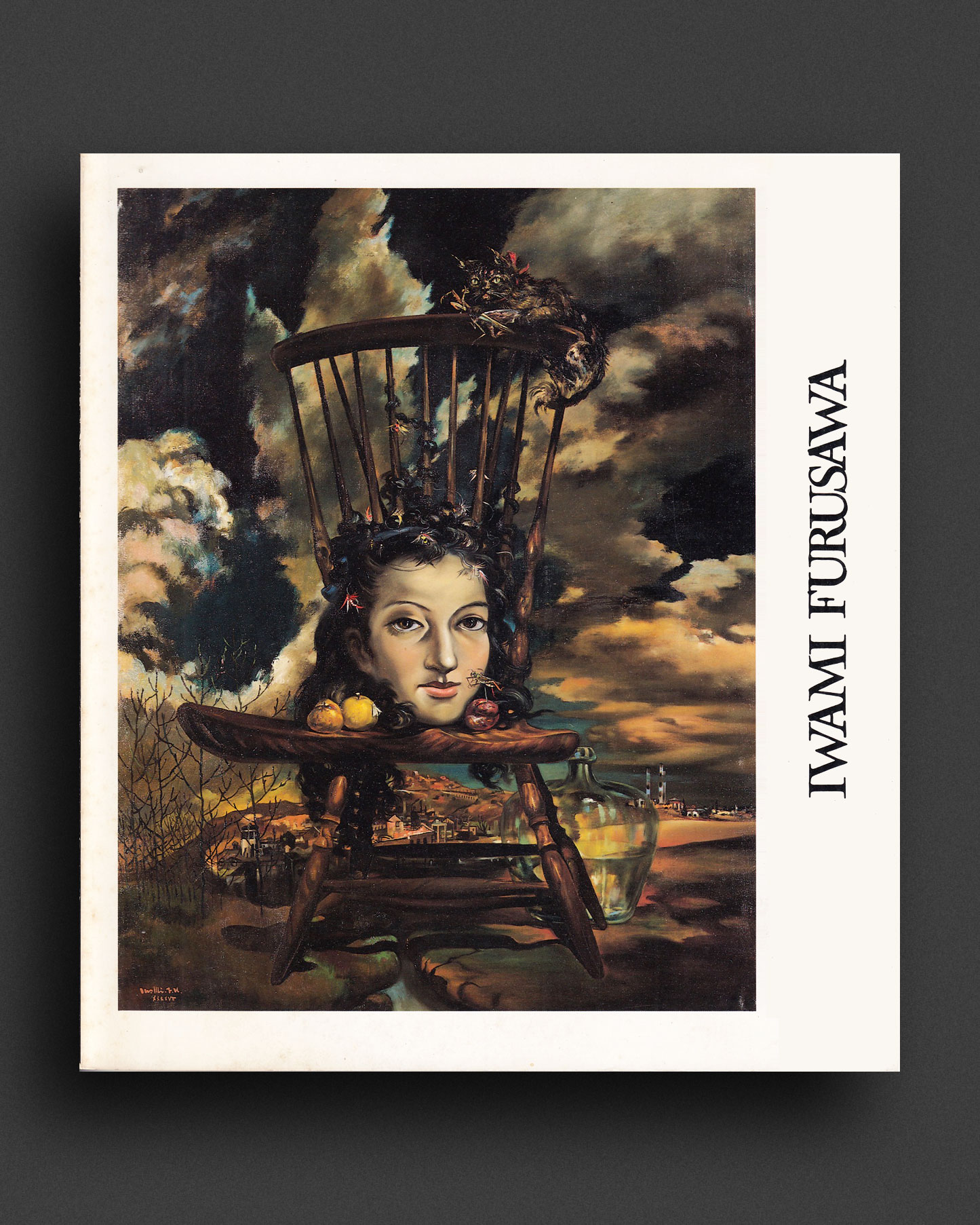
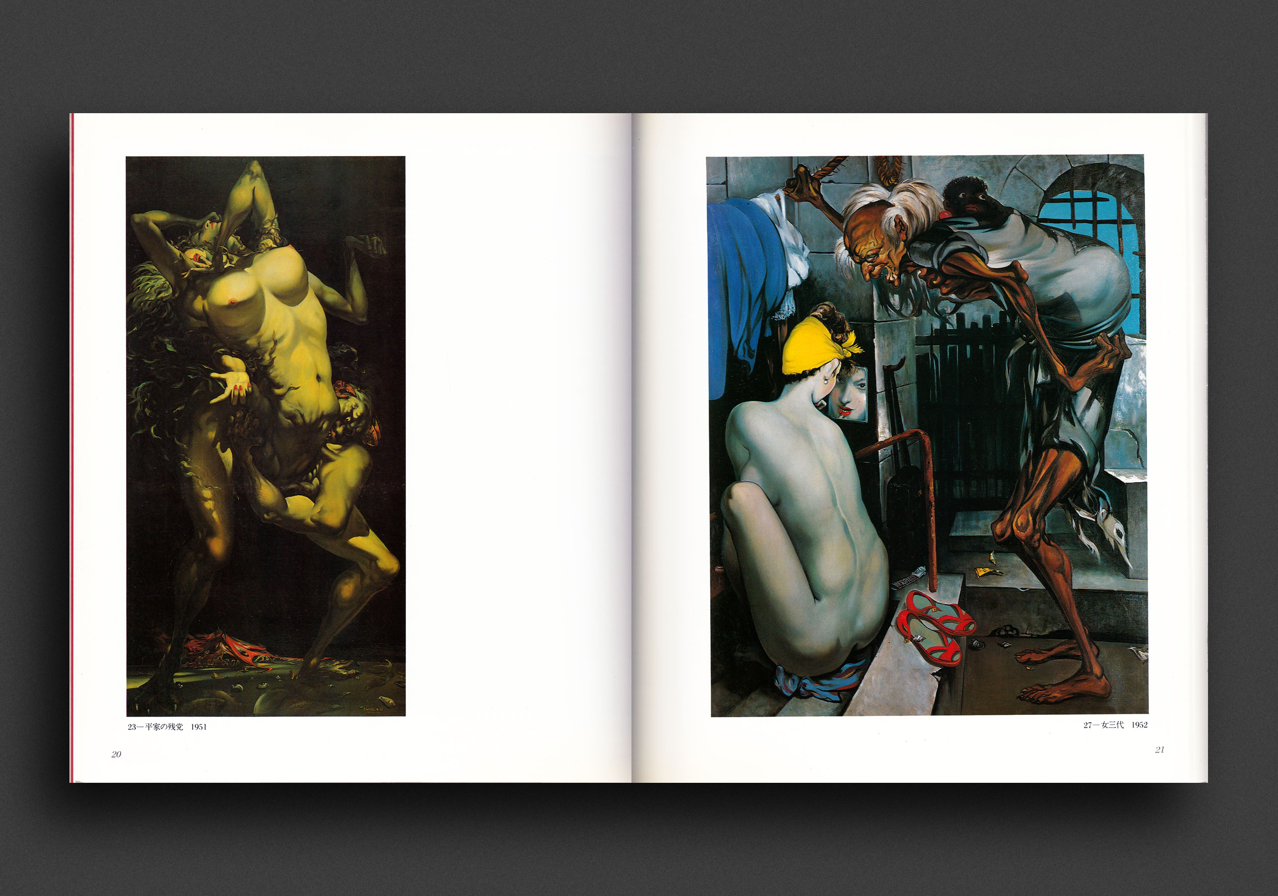
Very scarce 1982 catalogue of Japanese surrealist painter and erotic illustrator Iwami Furusawa (1912–2000), published on the occasion of the major survey exhibition at the Itabashi City Museum of Art, Tokyo, September–October, 1982. Profusely illustrated in lush colour and black and white, reproducing paintings, drawings and prints spanning his entire career. Includes essays, biography, portraits, bibliography and full catalogue of works exhibited.
Iwami Furusawa (1912–2000), born on the island of Kyushu, began his training as a painter in 1928 at the Hongô Institute in Tokyo. In 1936, Furusawa started publishing mangas under the name of Bonsuke Noro. After the end of his artistic studies, he relocated to Nagasaki and became a part of the so-called Ikebukuro Montparnasse, the area where many aspiring artists created their oeuvres. In 1943, the artist was drafted into the Second Sino-Japanese War and became a prisoner of war. Released only three years later, Furusawa went through a traumatic experience that would become an additional ground for his remarkable paintings. After the war, Furusawa made himself the first promoter of surrealism in Japan. The female nude (often the representation of nature in art) became a central figure in his works. One of the most remarkable works combining "Eros and Thanatos" is Nagasaki. In the image, we see a crucified nude wearing bloody thorns with a mushroom cloud in the background. The abbreviation AB2 signifies that this is the second atomic bombing (the first happened over Hiroshima). To some extent, we can compare these Japanese cities to the figure of Christ, regarding bombings as a disastrous atonement for the war crimes of the Japanese forces. The crucified nude may symbolize suffering nature itself. Furusawa was also a book illustrator and prominent printmaker who produced over 300 woodcut prints. He became enormously popular in Japan for his erotic prints. In 1960, he began to transfer his drawings from the 1940s using printmaking techniques. For more than thirty years he worked on the Shuragaki cycle (The bloody meeting with the hungry demon in hell), which he completed in 1993. Subjects like death, hunger, rape, looting and the landscape of China define his most powerful etchings and show the horrors of war. Goya's The Disasters Of War (1810s) was a significant influence on his print-making.
VG copy, light wear to boards, single spine crease, otherwise crisp copy.