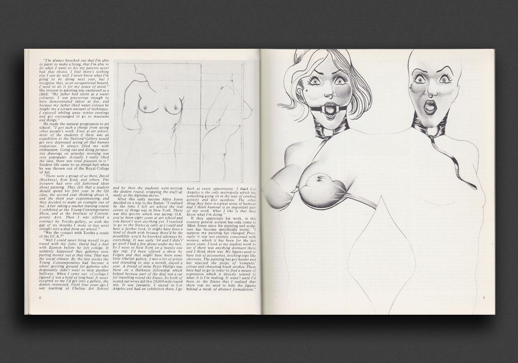
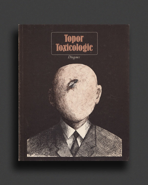
World Food Books' programme is largely produced on Kulin Nation land. We acknowledge the Wurundjeri people of the Kulin Nation as the first and continuing custodians of this land, and pay respect to their Elders past, present, and emerging.
World Food Books is an arts and special interests bookshop in Naarm / Melbourne. Founded in 2010, World Food Books is devoted to the presentation of a rotating, hand-selection of international art, design, literary and counterculture publications with an emphasis on the anti-traditional, the experimental, the avant-garde, the heretic, the marginal.
Presenting new titles alongside rare and out-of-print books, catalogues and journals spanning the fields of modern and contemporary art, design, photography, illustration, film, literature, poetry, cultural theory, philosophy, sexuality, popular and underground culture in its many radical forms, World Food Books wishes to encourage adventurous, thoughtful and open-minded reading, looking, writing, and exchange of publishing and ideas, both current and historical.
As well as our bookshop, located in Melbourne's historical Nicholas Building, all of our inventory is available internationally via our online mail-order service.
World Food Books semi-regularly co-ordinates "Occasions", a programme of exhibits and events at the bookshop and in partnership with other hosts (such as museums and art galleries) that develop out of the activities, relationships and content of the bookshop itself.
World Food Books
The Nicholas Building
37 Swanston Street
Room 5, Level 6
Melbourne 3000
Australia
SHOP HOURS:
Thu–Sat 11–5
WEB-SHOP OPEN 24/7
World Food Books
Postal Address:
PO Box 435
Flinders Lane
Victoria 8009
Australia
Art
Theory / Essay
Architecture / Interior
Graphic Design / Typography
Photography
Fashion
Eros
LGBTQ+
Fiction / Poetry
Weird / Speculative / Science Fiction / Horror
Transgressive / Visceral / Abject
Symbolism / Decadence / Fin de siècle
Film / Video
Painting
Sculpture / Installation
Performance / Dance / Theater
Drawing
Sound / Music
Curatorial
Group Shows / Collections
Periodicals
Out-of-print / Rare
Posters / Ephemera / Discs
Signed Books
World Food Books Gift Voucher
World Food Book Bag
Australian Art
Australian Fiction
Australian Science Fiction / Speculative Fiction
Australian Poetry
Australian Photography
Japanese Photography
Conceptual Art
Minimal Art
Dada
'Pataphysics / Oulipo
Fluxus
Concrete Poetry
Pop Art
Surrealism
Arte Povera
Arte Informale / Haute Pâte / Tachism
Nouveau Réalisme / Zero / Kinetic
Situationism / Lettrism
Collage / Mail Art / Xerox Art
Art Brut / Folk / Visionary / Fantastic
Illustration / Graphic Art / Bandes Dessinées
Furniture
Italian Radical Design / Postmodernism
Textiles
Ceramics / Glass
Counterculture
Protest / Revolt
Philosophy
Psychoanalysis
Anthropology
Anarchism
Socialism / Anarchism / Communism / Capitalism
Literary Theory / Semiotics / Language
Feminism / Women's Studies
Gender Studies / Sexuality
Anthropology
Fetishism / BDSM
Drugs / Psychedelia
Crime / Violence
Animal Rights / Veganism
Occult / Esoterica
Ecology / Earth / Alternative Living
Whole Earth / Crafts
All prices in AUD (Australian dollars)
Pick-Ups
Pick-up orders can be collected in our bookshop during opening hours after order date. Please collect any Pick-up orders within 2 weeks of ordering as we have limited storage space. Orders will be released back into stock if not collected within this time. No refunds can be made for pick-ups left un-collected. If you cannot make it in to the bookshop in this time-frame, please choose postage option.
Return Policy
All sales are final. We do accept returns (for refund or exchange) for items received in error. All our orders are packed with special care using heavy-duty padding and cardboard book-mailers or bubble mailers (for smaller books), using reinforcement where required. We cannot take responsibility for any lost, stolen or damaged parcels.
Insurance
Should you wish to insure your package, please email us directly after placing your order and we can organise this at a small extra expense. Although all standard/express tracked packages are very safe and dependable, we cannot take responsibility for any lost, stolen or damaged parcels. We recommend insurance on valuable orders.
Interested in selling your old books, catalogues, journals, magazines, comics, fanzines, ephemera? We are always looking for interesting, unusual and out-of-print books to buy. We only buy books in our fields of interest and specialty, and that we feel we can resell.
We base these prices on desirability, market value, in-print prices, condition and our current stock levels. We offer cash, store credit, and can take stock on consignment. All
about 25% of the price we expect to get when we sell them, or 30% in store credit. We base these prices on desirability, market value, in-print prices, condition and our current stock levels.
Sell your books any day of the week. You can drop them off and return later. If you have a lot of books, we can visit your Sydney home.
We buy books that we feel we can resell. We offer about 25 % of the price we expect to get when we sell them, or 30% in store credit. We base these prices on desirability, market value, in-print prices, condition and our current stock levels.
Philadelphia Wireman
03 August - 01 September, 2018
World Food Books is proud to announce our next Occasion, the first presentation of sculptures by Philadelphia Wireman in Australia.
The Philadelphia Wireman sculptures were found abandoned in an alley off Philadelphia’s South Street on trash night in 1982. Their discovery in a rapidly-changing neighbourhood undergoing extensive renovation, compounded with the failure of all attempts to locate the artist, suggests that the works may have been discarded after the maker’s death. Dubbed the "Philadelphia Wireman" during the first exhibition of this work, in 1985, the maker’s name, age, ethnicity, and even gender remain uncertain. The entire collection totals approximately 1200 pieces, all intricately bound together with tightly-wound heavy-gauge wire (along with a few small, abstract marker drawings, reminiscent both of Mark Tobey and J.B. Murry). The dense construction of the work, despite a modest range of scale and materials, is singularly obsessive and disciplined in design: a wire armature or exoskeleton firmly binds a bricolage of found objects including plastic, glass, food packaging, umbrella parts, tape, rubber, batteries, pens, leather, reflectors, nuts and bolts, nails, foil, coins, toys, watches, eyeglasses, tools, and jewellery.
Heavy with associations—anthropomorphic, zoomorphic, and socio-cultural responses to wrapped detritus—the totemic sculptures by Philadelphia Wireman have been discussed in the context of work created to fulfil the shamanistic needs of alternative religions in American culture. Curators, collectors, and critics have variously compared certain pieces to sculpture from Classical antiquity, Native American medicine bundles, African-American memory jugs, and African fetish objects. Reflecting the artist’s prolific and incredibly focused scavenging impulse, and despite—or perhaps enhanced by—their anonymity, these enigmatic objects function as urban artefacts and arbiters of power, though their origin and purpose is unknown. Philadelphia Wireman, whatever their identity, possessed an astonishing ability to isolate and communicate the concepts of power and energy through the selection and transformation of ordinary materials. Over the course of the past two decades, this collection has come to be regarded as an important discovery in the field of self-taught art and vernacular art.
Presented in collaboration with Fleisher-Ollman Gallery, Philadelphia, and Robert Heald, Wellington.
Susan Te Kahurangi King
02 February - 10 March, 2018
Susan Te Kahurangi King (24 February 1951 - ) has been a confident and prolific artist since she was a young child, drawing with readily available materials - pencils, ballpoint pens and felt-tip markers, on whatever paper is at hand. Between the ages of four and six Susan slowly ceased verbal communication. Her grandparents William and Myrtle Murphy had developed a special bond with Susan so they took on caring responsibilities for extended periods. Myrtle began informally archiving her work, carefully collecting and storing the drawings and compiling scrapbooks. No drawing was insignificant; every scrap of paper was kept. The King family are now the custodians of a vast collection containing over 7000 individual works, from tiny scraps of paper through to 5 meter long rolls.
The scrapbooks and diaries reveal Myrtle to be a woman of great patience and compassion, seeking to understand a child who was not always behaving as expected. She encouraged Susan to be observant, to explore her environment and absorb all the sights and sounds. Myrtle would show Susan’s drawings to friends and people in her community that she had dealings with, such as shopkeepers and postal workers, but this was not simply a case of a grandmother’s bias. She recognised that Susan had developed a sophisticated and unique visual language and sincerely believed that her art deserved serious attention.
This was an unorthodox attitude for the time. To provide some context, Jean Dubuffet coined the term Art Brut in 1945 to describe work created by self-taught artists – specifically residents of psychiatric institutions and those he considered to be visionaries or eccentrics. In 1972 Roger Cardinal extended this concept by adopting the term Outsider Art to describe work made by non-academically trained artists operating outside of mainstream art networks through choice or circumstance. Susan was born in Te Aroha, New Zealand in 1951, far from the artistic hubs of Paris and London that Dubuffet and Cardinal operated in. That Myrtle fêted Susan as a self-taught artist who deserved to be taken seriously shows how progressive her attitudes were.
Susan’s parents Doug and Dawn were also progressive. Over the years they had consulted numerous health practitioners about Susan’s condition, as the medical establishment could not provide an explanation as to why she had lapsed into silence. Dawn educated herself in the field of homeopathy and went on to treat all twelve of her children using these principles – basing prescriptions on her observations of their physical, mental and emotional state.
Doug was a linguist with an interest in philosophy who devoted what little spare time he had to studying Maori language and culture. To some extent their willingness to explore the fringes of the mainstream made them outsiders too but it was their commitment to living with integrity and their respect for individuality that ensured Susan’s creativity was always encouraged.
Even though Susan’s family supported her artistic pursuits, some staff in schools and hospitals saw it as an impediment to her assimilation into the community and discouraged it in a variety of ways. Her family was not always aware of this and therefore did not fully understand why Susan stopped drawing in the early 1990s. However, rather than dwell on the challenges that Susan faced in pursuit of her artistic practice, they prefer to highlight her achievements. In 2008 Susan began drawing again in earnest, after an almost 20 year interruption, and her work is now shown in galleries around the world.
Susan grew up without television and has been heavily influenced by the comics she read as a child. She is absolutely fearless in the appropriation of recognizable characters, such as Donald Duck and Mickey Mouse, in her work. She twists their limbs, contorts their faces, compresses them together, blends them into complex patterned backgrounds - always imbuing them with an incredible energy. Although Susan often used pop culture characters in her work they are not naive or childlike. These are drawings by a brilliant self-taught artist who has been creating exceptional work for decades without an audience in mind.
Mladen Stilinović
"Various Works 1986 - 1999"
02 February 16 - September 10, 2016
Various works 1986 - 1999, from two houses, from the collections of John Nixon, Sue Cramer, Kerrie Poliness, Peter Haffenden and Phoebe Haffenden.
Including: Geometry of Cakes (various shelves), 1993; Poor People’s Law (black and white plate), 1993; White Absence (glasses, ruler, set square, silver spoon, silver ladel with skin photograph and wooden cubes), 1990-1996; Exploitation of the Dead (grey and red star painting, wooden painting, black spoon with red table, red plate), 1984-1990; Money and Zeros (zero tie, paintings made for friends in Australia (Sue, John, Kerrie), numbers painting), 1991-1992; Words - Slogans (various t-shirts) - “they talk about the death of art...help! someone is trying to kill me”, “my sweet little lamb”, “work is a disease - Karl Marx”; Various artist books, catalogues, monographs, videos; Poster from exhibition Insulting Anarchy; "Circular" Croatian - Australian edition; Artist book by Vlado Martek (Dostoyevsky); more.
Thanks to Mladen Stilinović and Branka Stipančić.
Jonathan Walker
Always Will Need To Wear Winter Shirt Blue + Ochre Small Check Pattern
21 August - 21 September, 2015
Untitled
I am not a great reader of poetry but I always return to the work of Melbourne poet, Vincent Buckley (1925- 1988). Perhaps I find his most tantalising piece to be not a finished poem but a fragment left on a scrap of paper discovered on his desk after the poet’s death.
The poetry gathers like oil
In the word-core, and spreads
It has its music meet,
Its music is in movement.
This fragment is more the shell left behind from a volatile thought than a finished poem. I find the last two lines honest but awkward whereas the first two lines work like an arrow. Most likely he could not find a resolution so it was left. Still, in its present form, it remains an eloquent testimony to the ultimate failure of a medium to express mobile thought and sensation, in Buckley’s case, through verbal language. It’s an important matter because this is something all artists have to deal with regardless of the medium.
I have never written a poem, however, I am forever copying fragments from books on paper scraps in a vain effort to fix certain notions in my head. At first, they function as bookmarks that are sometimes returned to when I open the book. But before long, as they accumulate, they fall out littering the table interspersed with A4 photocopies, bills, books and medications.
To return to Buckley’s fragment, the first two lines very much evoke how I paint nowadays. As you age, detail diminishes and patches of light become more luminous and float. I feel the most honest way of dealing with this is by smearing the oil paint on the canvas with the fingers and working close-up, blind. Only if the patches coalesce into an approaching image can the work gain a life.
-
Jonathan Walker was born in Melbourne, Australia and brought up on a dairy farm in Gippsland. In the 1970’s he studied painting at RMIT and won the Harold Wright Scholarship to the British Museum, London. During the 1980’s he exhibited at Pinacotheca Gallery, Richmond and had work shown at the NGV and Heidi City Art Gallery. Over the same period he designed the cover for the “Epigenesi” LP by Giancarlo Toniutti, Italy and conducted a mail exchange work with Achim Wollscheid, Germany. The work with artists through the post resulted in an article published in the bicentenary issue of Art and Australia 1988. He showed in artist run spaces such as WestSpace in the 90’s and 2000’s, and until 2012, taught painting at Victoria University, which is where we (Colleen Ahern and Lisa Radford) as organisers of the exhibition, among many others, had the privilege of being his student.
Walker’s knowledge was imparted to students through the careful selection of music, literature, and artists found in books that he himself had ordered for the library. Walker’s strategy was the generosity of sharing his vast knowledge with references specific to each student and their context.
Walker’s paintings share a similar focus and intimacy.
This exhibition presents a small selection of recent paintings alongside a publication that includes Walker’s writing. Observational and analytical, Walker’s work is a type of material notation — the time of day, colour and how it is blended, the both specific and fleeting location of a reflection on lino or the question of whether a chair leg should be included in a painting.
Please join us on Friday August 21 between 6-8pm to celebrate the opening of the exhibition.
Curated by Colleen Ahern and Lisa Radford.
B. Wurtz
Curated by Nic Tammens
March 26 - April 4, 2015
B.Wurtz works from a basement studio in his home on Manhattan’s Lower East Side.
This local fact is attested to by the plastic shopping bags and newsprint circulars that appear in his work. As formal objects, they don’t make loud claims about their origins but nonetheless transmit street addresses and places of business from the bottom of this long thin island. Like plenty of artists, Wurtz is affected by what is local and what is consumed. His work is underpinned by this ethic. It often speaks from a neighborhood or reads like the contents of a hamper:
“BLACK PLUMS $1.29 lb.”
“Food Bazaar”
“USDA Whole Pork Shoulder Picnic 99c lb.”
“RITE AID Pharmacy, with us it’s personal.”
“H. Brickman & Sons.”
“Sweet Yams 59c lb."
Most of the work in this exhibition was made while the artist was in residence at Dieu Donne, a workshop dedicated to paper craft in Midtown. Here Wurtz fabricated assemblages with paper and objects that are relatively lightweight, with the intention that they would be easily transportable to Australia. This consideration isn’t absolute in Wurtz’s work, but was prescriptive for making the current exhibition light and cheap. Packed in two boxes, these works were sent from a USPS post office on the Lower East Side and delivered to North Melbourne by Australia Post.
Wurtz appears courtesy of Metro Pictures, New York.
Thanks to Rob Halverson, Joshua Petherick, Sari de Mallory, Matt Hinkley, Helen Johnson, Fayen d'Evie, Ask Kilmartin, Lisa Radon, Ellena Savage, Yale Union, and "Elizabeth".
John Nixon
"Archive"
December 15 - January 20, 2014
The presentation of John Nixon's archive offered a rare showcase of this extensive collection of the artist's own publications, catalogues, posters, ephemera, editions and more, from the mid 1980s onwards, alongside a selection of his artworks.
Organized by John Nixon, Joshua Petherick and Matt Hinkley.
"Habitat"
at Minerva, Sydney (organised by Joshua Petherick and Matt Hinkley)
November 15 - December 20, 2014
Lupo Borgonovo, Janet Burchill & Jennifer McCamley,
Lewis Fidock, HR Giger, Piero Gilardi, Veit Laurent Kurz,
Cinzia Ruggeri, Michael E. Smith, Lucie Stahl, Daniel Weil, Wols
Press Release:
“...It contained seven objects. The slender fluted bone, surely formed for flight, surely from the wing of some large bird. Three archaic circuitboards, faced with mazes of gold. A smooth white sphere of baked clay. An age-blackened fragment of lace. A fingerlength segment of what she assumed was bone from a human wrist, grayish white, inset smoothly with the silicon shaft of a small instrument that must once have ridden flush with the surface of the skin - but the thing’s face was seared and blackened.”
William Gibson, “Count Zero”, 1986
"Autumn Projects Archive"
Curated by Liza Vasiliou
March 6 - March 15, 2014
World Food Books, in conjunction with the Virgin Australia Melbourne Fashion Festival 2014, presented the Autumn Projects archive, consisting of a selection of early examples in Australian fashion with a particular interest in collecting designers and labels from the period beginning in the 1980’s, who significantly influenced the discourse of Australian Fashion.
Curated by Liza Vasiliou, the exhibition provided a unique opportunity to view pieces by designers Anthea Crawford, Barbara Vandenberg, Geoff Liddell and labels CR Australia, Covers, Jag along with early experimental collage pieces by Prue Acton and Sally Browne’s ‘Fragments’ collection, suspended throughout the functioning World Food Books shop in Melbourne.
H.B. Peace
presented by CENTRE FOR STYLE
November 14, 2013
"Hey Blinky, you say chic, I say same"
Anon 2013
H.B. Peace is a clothing collaboration between great friends Blake Barns and Hugh Egan Westland. Their pieces explore the divergences between 'character’ and ‘personality’ in garments....etc
Special Thanks to Joshua Petherick and Matt Hinkley of WFB and Gillian Mears
and a Very Special Thank you to Audrey Thomas Hayes for her shoe collaboration.
Janet Burchill & Jennifer McCamley
"Aesthetic Suicide"
May 10 - June 8, 2013
The first of our occasional exhibitions in the World Food Books office/shop space in Melbourne, "Aesthetic Suicide" presented a body of new and older works together by artists Janet Burchill & Jennifer McCamley, including videos, prints, a wall work, and publications.
During shop open hours videos played every hour, on the hour.
2002, Japanese
Softcover (w. dust jacket and postcard), 40 pages, 26 x 18 cm
1st Edition, Out of print title / used / very good
Published by
Gallery 360 / Tokyo
$50.00 - Out of stock
First Edition of this great Tanaami publication, issued in an edition of 1000 copies in 2002 by Gallery 360 in Tokyo. A vivid overview of the 1960's psychedelic graphic work by the great Japanese artist Keiichi Tanaami. Concert posters, comic strips, pop advertising, record jackets, and protest posters, all wrapped up with fold-out pages and a laid-in postcard. Keiichi Tanaami is one of the leading pop artists of postwar Japan, and has been active as multi-genre artist since the 1960s as a graphic designer, illustrator, video artist and fine artist.
Vert good copy in metallic wraps with publishers pink sticker and laid-in Tanaami postcard.
1981, English / French / German
Hardcover, 236 pages, 24 x 24 cm
Out of print title / used / fine
Published by
The Graphis Press / Zürich
$70.00 - Out of stock
The great "Archigraphia : Architectural and Environmental Graphics", published in 1981 (first in 1978) by the legendary Graphis Press, Zürich. Bound in the iconic Jean-Michel Folon illustrated hardcover this landmark volume from the great Graphis "square books series", edited by Swiss graphic designer Walter Herdeg, forms an extensive international reference of architectural and environmental graphic design projects with chapters on: Traffic and Highway Signage, Pictograms, Visual Guidance Systems, Buildings and Shop Fronts, Supergraphics and Vehicle Graphics with Editor's foreword, chapter introductions, project profiles and a designer/artist/subject/architect index.
Profusely illustrated throughout with 823 b/w and colour examples, and, as per usual for Graphis publications, is handsomely designed and heavily researched, with all texts in English, German and French.
Essays by T. Geismar and P. Kneebone, Jock Kinneir, John Follis, Reinhart Braun, Klaus Herdeg and Stanley Mason.
Features the work of : Shigeo Fukuda, Herb Lubalin, Massimo Vignelli / Vignelli Associates, Design Research Unit, Saul Bass and Associates, Milton Glaser, Wim Crouwel, Masaru Katsumi, Les Mason, Paul Rand, Yoshiro Yamashita, John Follis, Chermayeff & Geismar, Lou Dorfsman, SITE, Georges Huel, William Golden, Gae Aulenti, Renzo Piano, Kenzo Tange, William Turnball, and so many others.
Walter Herdeg was a Swiss graphic designer, noted for his travel posters and work with Graphis Magazine, who was awarded an AIGA medal in 1986.
Very good copy with some wear and previous owners name on front blank page.
1969, English / Japanese
Hardcover (w. dust jacket), 120 pages, 19 x 27 cm
1st Edition, Out of print title / used / good
Published by
Bijutsu Shuppan-sha / Japan
$60.00 - Out of stock
Volume 1 of the great 1969 hardcover series "Graphic Designers in the U.S.A.", art directed by Gan Hosoya. Each of these collectable books showcase four leading American graphic designers (of the total 12 across 3 books) practicing in the 1960s through a large selection of their works beautifully reproduced in full-colour and black and white (120 pages and 163 illustrations). Volume 1 showcases Louis Danziger, Herb Lubalin, Peter Max, and Henry Wolf. Each designer profile is introduced with an English text about their work. Some other texts in Japanese, but almost entirely a visual document.
First edition in original dust-jacket, embossed metallic cloth boards, some wear and chipping to jacket, book very good. Designed and printed in Japan.
1972, English
Hardcover, 160 pages, 29 x 21 cm
1st Edition, Out of print title / used / very good
Published by
Jack Pollard / NSW
$48.00 - Out of stock
First edition of the great hardcover 1972 book art directed and designed by textile artist-designer Fay Bottrell.
'Aspects of Sensibility' profiles 38 prominent designers, studio potters, textile artists, weavers, decorative artists, working in Australia in the 1960s and early '70s through full-bleed landscape spreads of photography by Wesley Stacey, capturing their working environments, details of their work and studios, and text reflections of these artists on their work.
Features Graham Bennett, Lillian Bosch, Douglas Annand, Sandra Leveson, Ken Leveson, Ian Sprague, Kat Bish, Bruce Arthur, Bernard Sahm, Janet Brereton, Kevin Brereton, Jutta Feddersen, Les Blakebrough, Rosalie Gascoigne, Elizabeth Vercoe, Albert Steen, Fay Bottrell, Pru Medlin, Mirka Mora, Peter Travis, Marea Gazzard, Helge Larsen, Darani Lewers, Milton Moon, Isabel Davies, Joan Campbell, Peter Rushforth, Mona Hessing, Hiroe Swen, John Mason, Ewa Pachucka, Victor Greenaway, Heather Dorrough, John Gilbert, Verlie Just, Silver Harris, Col Levy, Vivienne Pengilley, Weatherhead and Stitt.
A very unique and personal book reflecting on the lives of Australian artists and designers working in the early 1970s.
Very good copy, light wear, without dust-jacket.
1969, Japanese
Hardcover (w. dust jacket), 144 pages, 19 x 27 cm
1st Edition, Out of print title / Used*,
Published by
Bijutsu Shuppan-sha / Japan
$70.00 - Out of stock
Volume 3 of the great 1969 hardcover series "Twelve Persons in Graphic Design Today", art directed by Gan Hosoya. Each of these collectable books showcase four Japanese graphic designers (of the total 12 across 3 books) practicing in the 1960s through a large selection of their works beautifully reproduced in full-colour and black and white. Volume 3 showcases Yoshitaro Isaka, Toshihiro Katayama, Tsunehisa Kimura and Tadanori Yokoo. Texts in Japanese, but almost entirely a visual document.
First edition in original dust-jacket, protected by plastic wraps.
2017, English
Hardcover, 192 pages, 241 x 318 cm
Published by
Rizzoli / New York
$70.00 - Out of stock
Fifty years after its founding by Elio Fiorucci in 1967, the iconic Milanese fashion label is entering a new phase of ingenuity. Published to coincide with the fiftieth anniversary of the label and the glittering unveiling of its new collection and retail stores, this book is a tribute to the history of a pioneering brand and a celebration of its colourful future.
Bright, colourful, sexy, and irreverent, Fiorucci came to define more than any other brand the fashion of the 1980s. Famous for scouring the world to bring vibrant elements of global underground culture into their designs, Fiorucci is responsible for defining the extravagant palette of the post-punk era, with neon and fluorescent tones, iridescent spandex and stretch denim, bringing the influences of pop art and pop culture to bear on fashion for the first time. Now relaunched under the direction of impresarios Janie and Stephen Schaffer, Fiorucci continues to surprise, shock, and impress. In the spirit of Fiorucci itself, this delightful book is a bright and intoxicating tour through everything from the first leopard-print patterns to the new designs defining the future of this iconic brand.
This lavish hardcover book has sections dedicated entirely to Fiorucci's posters, logos, graphics, stores, fanzines, and parties, and includes contributions by/interviews with Oliviero Toscani, Maripol, Douglas Coupland, Terry Jones, David Dewaele, Marc Jacobs, David Owen and edited by Sofia Coppola.
2017, English
Softcover (ring-bound), 368 pages, 24 x 33 cm
1st Ed.,
Published by
Spector Books / Leipzig
$86.00 - Out of stock
The mid-1960s witnessed a boom in underground and self-published works in West Germany. Hectographs, mimeographs and offset printing not only allowed for the production of small, low-cost print runs, but also promoted a unique aesthetic. Using wild mock-ups, these messianic amateurs combined typescript aesthetics, handwriting, scribbled drawings, assemblages of collaged visuals, porn photos, snapshots and comic strips, forging a new, wildly free, sensibility in the process. This book is the first to present the underground and self-published works that came out of West Germany in such depth, while also showing the international context in which they emerged – not as an anecdotal history but as an attempt to tap into the aesthetic cosmos of the Do-It-Yourself rebellion. Insomuch, Under the Radar also challenges us to take a new look at the current boom in independent publishing, the risograph aesthetic and more.
An incredible collection and valuable volume for anyone interested in underground publishing history!
1993, English
Softcover, 156 pages, 291 x 291 cm
Out of print title / used / very good
Published by
Pomegranate Artbooks / California
$65.00 - Out of stock
The first two volumes chronicling the unique art and design of Roger Dean met with huge critical and popular success. Views (1975) went straight to number one in the Sunday Times bestseller list and went on to sell over a million copies. Magnetic Storm (1984) sold over 650,000 copies. These new editions, reworked to accompany the publication of the third book in the trilogy, Dragon's Dream, showcase the instantly recognizable work of Roger Dean.
Views showcases the first seven years of Roger Dean's work after his graduation from the Royal College of Art in 1968. It includes paintings and graphics; branding such as the Yes typography and the first Virgin Records logo; groundbreaking stage sets; and album art including iconic early Yes covers such as the award-winning Tales From Topographic Oceans. The new edition streamlines the original square format and retains the combination of concept sketches and brilliantly displayed finished work. Featuring a new foreword, revised typography, and graphic openers and identifying icons, Views showcases and celebrates the art that defined an era.
Roger Dean is internationally acclaimed as an artist and designer whose evocative and visionary images created a new genre. Made popular through the medium of album covers and posters, his work has sold in excess of 100 million copies. Roger became widely known in the 1970s for his album cover designs for Yes—including the classic logo now in the Victoria & Albert Museum in London—and a poll of Rolling Stone readers selected five of his designs in the top twenty best album covers of all time.
1972, Japanese
Softcover (w. dust jacket), 207 pages, 27.7 x 21.6 cm
Published by
Soshisha / Japan
$35.00 - Out of stock
The first Japanese edition of "Living on The Earth", published in 1972. All texts in Japanese.
The title page reads "Celebrations, storm warnings, formulas, recipes, rumors, and country dances harvested by Alicia Bay Laurel."
Originally published in Berkeley, California in 1970, more than thirty years ago, the seminal "Living on the Earth" is for people who would rather chop wood for fire than work behind a desk to pay the electric company. It's for people who want the best recipe for lavender soap or huckleberry jam. It's for people who want to make their own clothing, play guitar, learn woodcarving, gardening, canning and drying food, and natural first aid methods. The book has no chapters; no rigid structures or rules. It grew naturally out of the lessons the author has learned, and which she shares. Living on the Earth is a beautiful book to see and read, as well as a spiritually uplifting work whose simplicity radiates warmth and promotes serenity and goodwill to all those who encounter it. The large format paperback is entirely written in Alicia's cursive script and beautifully illustrated on every page with her line drawings. Alicia's innovative illustration and book design styles have been enthusiastically emulated in dozens of books and greeting cards since it's original publishing, and in 2012 "Living on the Earth" was chosen as one of the 101 most influential American cookbooks of the 20th century. Alicia was just 20 years old when the book was first published, and it would go on to become a New York Times "best-seller" and one of the most influential manuals for natural, conscious living ever created.
2013, English
Softcover, 304 pages, 24 × 17 cm
Published by
Hyphen Press / London
$55.00 $30.00 - Out of stock
Anarchy was a journal of ideas published in London in the 1960s. Although its contributors were many and diverse, Anarchy was essentially the creation of one person, Colin Ward (1924–2010). With this journal, and throughout his work as a writer, editor, and activist, Ward proposed the idea that anarchist principles of mutual aid and autonomous organization outside a centralized state can be achieved here and now. This book gives attention for the first time to the covers of Anarchy, designed mostly by Rufus Segar. These little-known works provided the enticing entry to the plain text pages of the journal. The book reproduces all of the covers in a sequence that suggests, incidentally, something of the history of graphic design in Britain in those years. And it goes beyond the images, with an array of supporting texts that give a full picture of Anarchy and its context.
Contents
Daniel Poyner, Introduction
The covers of Anarchy
Raphael Samuel, ‘Utopian sociology’
Daniel Poyner, A conversation with Rufus Segar
Richard Hollis, ‘Anarchy and the 1960s’
Robin Kinross, An index to Anarchy
‘Autonomy’ doesn’t try to present Segar as some great innovator of graphic design. He wasn’t one and makes no claim to be. What the book sets out to do, and it succeeds magnificently without visual or verbal hyperbole, is to enrich and add nuance to our understanding of a 1960s graphic landscape we might think we know inside out by acquainting us with unfamiliar work that provided an important forward-thinking publication with its public face. Segar believed in the journal’s cause and 40 years later, he reports, he and his wife Sheila are still anarchists.
Rick Poynor, Creative Review, January 2013
2005, Japanese
Softcover (w. dust jacket), 98 pages (w. fold-outs), 42 x 30 cm
1st Japanese edition, Out of print title / used*,
Published by
Pan-Exotica / Tokyo
$140.00 - Out of stock
"The "Necronomicon" is a legendary magical book that is kept in inaccessible places only in a few, incompletely preserved specimens because it could have disastrous consequences if it fell into the wrong hands. It was written down around 730 AD in Yemen by the legendary Abdul Al Azred. It is said to tell of things and events that took place in the gray age, and illustrations of uncanny creatures lurking in the depths of the earth and the seas, one day destroying mankind and striking the world.
Al Azred's "Necronomicon" is a kind of museum of the most wonderful abominations and perversions. The well-known writer HP Lovecraft was the first to report in his "Cthulhu" mythology of this work. Many other science fiction and fantasy writers have quoted this fictional work time and again, but it has only become a visual reality in "HR Giger's Necronomicon"!"
The second volume of this oversized and visually overwhelming collection takes us further through the incredible history of one of the most brilliant fantasy artists of the century. Reproducing Giger's award-winning work for the film ALIEN, his paintings, environments, sculptural works, his work for "The Tourist", collaborations with Blondie's Debbie Harry, his "New York City" series from the late 1970's and much more, all beautifully reproduced in full-colour and black and white, full-bleed spreads, including fold-out pages. Also includes interviews, texts, biography. These Giger folio books have become very desirable, collectable editions in their various printings around the world, the series encompassing the work of one of the world's most unique and influential visionaries.
Published first in 1985 in Europe, this is the first Japanese edition, published by Pan-Exotica.
1st edition, Out of print title / used*
Hardcover, 34 pages, 15 x 15 cm
Published by
William Morrow and Co. / New York
$40.00 - Out of stock
"God", published in 1970, from the iconic series of popular books illustrated by American graphic artist Peter Max with words of Swami Sivananda, Himalayas, who was a Hindu spiritual teacher and a proponent of Yoga and Vedanta. The 4 book series was made up of God/Thought/Peace/Love. Hardcover. First Edition.
"Peter Max (born Peter Max Finkelstein, October 19, 1937) is a German-born American illustrator and graphic artist, known for the use of psychedelic shapes and color palettes as well as spectra in his work. Max's art work was first identified as having been a popular part of the counter culture and psychedelic movements in graphic design during the late 1960s and early 1970s - works in this style appeared on posters and were seen on the walls of college dorms across America. In 1962, Max started a small Manhattan arts studio known as "The Daly & Max Studio," with friend Tom Daly. Daly and Max were joined by friend and mentor Don Rubbo, and the three worked as a group on books and advertising for which they received industry recognition. Much of their work incorporated antique photographic images as elements of collage. Max's interest in astronomy contributed to his self described "Cosmic '60s" period, which featured what became identified as psychedelic, counter culture imagery. Max's art was popularized nationally through TV commercials such as his 1968 "un cola" ad for the soft drink 7-UP. He is known for using bursts of color, often containing much or all of the visible spectrum. His work was both influenced by, as well as widely imitated by, others in the field of commercial illustration. Max then became fascinated with new printing techniques that allowed for four-color reproduction on product merchandise. In 1970, many of Max's products and posters were featured in the exhibition "The World of Peter Max," which opened at the M.H. de Young Memorial Museum in San Francisco. The United States Postal Service commissioned Max to create the 10-cent postage stamp to commemorate the Expo '74 World's Fair in Washington, and Max drew a colorful psychedelic scene with a "Cosmic Jumper" and a "Smiling Sage" against a backdrop of a cloud, sun rays and a ship at sea on the theme of "Preserve the Environment." Max's work has since been recognised through work with everyone from the 1994 World Cup, Yes, The World Series between the New York Yankees and Mets, and Taylor Swift."
1984, English
Hardcover, 48 pages, 23 x 19 cm
1st UK edition, Out of print title / used*,
Published by
Souvenir Press / London
$40.00 - Out of stock
1st UK hardback edition of this wonderful collection of Tomi Ungerer's provocative frog watercolours from the early 1980's. The amphibious "Joy of Sex", this fabulous collection of frog erotica is one of Ungerer's incredible adult books, sitting alongside such classics as The Party (1966), Fornicon (1969) and Tomi Ungerer's Compromises (1970), Totempole (1976), amongst many others.
Tomi Ungerer (born 28 November 1931) is an award winning French illustrator and a writer in three languages. He has published over 140 books ranging from much loved children's books to controversial adult work and from the fantastic to the autobiographical. He is known for sharp social satire and witty aphorisms. He is renowned for his iconic Advertising campaigns and political posters against the Vietnam War and Racial Injustice which were representative of the burgeoning political consciousness in New York in the 1960’s. His political engagement has continued to this day in campaigns against Racism and Fascism, for Nuclear disarmament, Ecology and numerous Humanitarian causes.
1988, English
Softcover, 192 pages, 22 x 28 cm
1st Edition, Out of print title / Used*,
Published by
The Gay Men's Press (GMP) / London
Tom of Finland Foundation / Los Angeles
$140.00 - Out of stock
1st printing of one of the finest collections of the great Tom of Finland, published in 1988 by the Tom of Finland Foundation, Los Angeles, and The Gay Men's Press (GMP), London.
Preface by Tom of Finland with appreciation by Dennis Forbes and Fred Bisonnes. This book covers Tom of Finland's work from 1946 to 1987, depicting page by page throughout his iconic and impeccable erotic graphite drawings of macho leathermen, bikers, cowboys, cops, lumberjacks, hardhats, soldiers and sailors, all in all their glory.
Touko Valio Laaksonen (8 May 1920 – 7 November 1991), best known by his pseudonym Tom of Finland, was a Finnish artist known for his stylized highly masculine homoerotic fetish art, and his influence on late twentieth century gay culture. He has been called the "most influential creator of gay pornographic images" by cultural historian Joseph W. Slade. Over the course of four decades, he produced some 3500 illustrations.
1975, Japanese
Softcover, 200 pages, 24 x 25 cm
1st edition, Out of print title / used*,
Published by
Bijutsu Shuppan Design Center / Japan
$45.00 - Out of stock
1st edition of this Japanese publication on Contemporary Polish Posters, published by the Bijutsu Shuppan Design Center in 1975.
Beginning in the 1950s and through the 1980s, the Polish School of Posters combined the aesthetics of painting with the succinctness and simple metaphor of the poster. It developed characteristics such as painterly gesture, linear quality, and vibrant colours, as well as a sense of individual personality, humour, and fantasy. It was in this way that the Polish poster was able to make the distinction between designer and artist less apparent. Posters of the Polish Poster School significantly influenced the international development of graphic design in poster art. Their major contribution is in their use of the power of suggestion through allusion. Using strong and vivid colours from folk art, they combine printed slogans, often hand-lettered, with popular symbols, to create a concise inventive metaphor. As a hybrid of words and images, these posters created a certain aesthetic tension that projected the art form in this period on European design. In addition to aesthetic aspects, these posters were able to reveal the artist's emotional involvement with the subject. They did not solely exist as an objective presentation, rather they were also the artist's interpretation and commentary on the subject and on society.
To this day, "Plakat Polski" remain as influential as ever on the world of graphic design, typography, illustration and even painting, and are widely collected and exhibited around the world.
Significant artists include Roman Cieślewicz, Wojciech Fangor, Mieczyslaw Gorowski, Tadeusz Jodlowski, Jan Lenica, Jan Mlodozeniec, Józef Mroszczak, Julian Pałka, Franciszek Starowieyski, Waldemar Świerzy, Henryk Tomaszewski, Maciej Urbaniec, Mieczyslaw Wasilewski, Bronisław Zerlek, Maks Bereski-Plakiat.
Illustrated throughout in colour and black and white with a vast array of the finest examples of Polish graphic art.
2003, Japanese / English
Hardcover (w. dust jacket and obi-strip), 80 pages, 19 x 27 cm
Signed, 1st Edition, Out of print title / As New,
Published by
P-Vine Books / Tokyo
$150.00 - Out of stock
Very special Aquirax Uno signed copy of this fantastic hardcover collection of his poster work dating 1959-1975.
Aquirax Uno, also known as Akira Uno (born March 13, 1934) is a Japanese graphic artist, illustrator and painter who was very influential in the 1960s and 1970s. His incredibly unique work is characterized by fantastic visuals, capricious and sensuous line flow, flamboyant (and occasionally grotesque) eroticism, and frequent use of collage and bright colours. Uno was prominently involved with the Japanese underground art of the 1960s–1970s, and is particularly notable for his frequent collaborations with Shuji Terayama and his experimental theater Tenjo Sajiki.
Signed "Aquirax" in gold marker across black front endpaper.
First edition, in "as new" perfect condition w. dust jacket and obi-strip.
1969, Japanese
Hardcover (w. dust jacket), 144 pages, 19 x 27 cm
1st Edition, Out of print title / Used*,
Published by
Bijutsu Shuppan-sha / Japan
$70.00 - Out of stock
Volume 1 of the great 1969 hardcover series "Twelve Persons in Graphic Design Today", art directed by Gan Hosoya. Each of these collectable books showcase four Japanese graphic designers (of the total 12 across 3 books) practicing in the 1960s through a large selection of their works beautifully reproduced in full-colour and black and white. Volume 1 showcases Akira Uno, Kazumasa Nagai, Shigeo Fukuda, and Gan Hosoya. Texts in Japanese, but almost entirely a visual document.
First edition in original dust-jacket, protected by plastic wraps.
1971, English / German / French
Hardcover (cloth-bound), 242 pages, 24 x 30.5 cm
Out of print title / used / very good
Published by
The Graphis Press / Zürich
$65.00 - Out of stock
One of the best of the great Graphis Annual collection. Published in 1971/1972 by The Graphis Press in Zürich, this profusely illustrated, cloth-bound volume continues one of the world's leading design showcases. Each "International Annual of Advertising Graphics" profiles in colour and black and white the best design of everything from book jackets to record covers to television commercials to trade marks and letterheads. All texts are in English, German and French. Edited by Walter Herdeg, this edition features the works of Alan Aldridge, Saul Bass, Herb Lubalin, Push Pin Studio, Dick Bruna, Peter Bentley, Maciej Żbikowski, Raymond Bertrand, Jerzy Flisak, Salvador Dali, Jean-Michel Folon, Milton Glaser, Roy Lichtenstein, Enzo Mari, Peter Max, Pablo Picasso, Paul Rand, Raymond Savignac, Saul Steinberg, Tomi Ungerer, Tadanori Yokoo, Masamichi Oikawa, and hundreds more.
1996, English
Softcover, 238 pages, 23 x 30.5 cm
Out of print title / used*,
Published by
Rizzoli / New York
$70.00 - Out of stock
"The influence of Surrealism on fashion and its ancillary arts lasted decades longer than the movement itself. This catalog, accompanying a 1987 exhibition at Fashion Institute of Technology, explores the extravagances of visual language as social and political comment, a revolution in perception."--The Library Journal.
"The love affair between fashion and Surrealism began in the Paris of the 1920s when Surrealist artists plundered fashion's imagery for their art, raising fashion beyond the level of mere style to an important expression of culture. This text reveals the extravagent and ingenious creations resulting from this collaboration. It ranges from the shocking Surrealist dresses of Schiaparelli and Dali, and photographic experiments with Surrealist techniques by Horst P. Horst, Cecil Beaton and George Hoyningen-Huene to the work of younger fashion designers, including Olivier Guillemin and Vivienne Westwood, who have all brought Surrealist imagery into clothing and accessories."
This bountiful, visually lavish volume, published to accompany a 1987 exhibition at Fashion Institute of Technology, features the garments, paintings, sculptures, illustrations, window displays, fashion advertisements, costume designs and photography of Man Ray, Cecil Beaton, Issey Miyake, Horst P. Horst, Cinzia Ruggeri, Vivienne Westwood, Thierry Mugler, Krizia, Giorgio De Chirico, Meret Oppenheim, Max Ernst, Donatella, Rene Magritte, Comme des Garcons, Enrico Donati, Elsa Schiaparelli, Salvador Dali, Marcel Rochas, Jaques Griffe, Adelle Lutz, Marina Killery, Dominique Lacoustille, Emme, Stephen Jones, Louise Bourbon, Bill Cunningham, Germaine Vittu, Eric Braagaard, Karl Lagerfeld, Candy Pratts Price, Serge Lutens, Antonio, Linda Fargo, Claude Montana, Georgina Godley, Olivier Guillemin, Yves Tanguy, Christian Lacroix, Valentine Hugo, Paul Colin, Francoise Lesage, Yves Saint Laurent, Jean Cocteau, Adam Kurtzman, Herbert Bayer, Mel Odom, Jean-Paul Gaultier, Alfa Castaldi, Leo Malet, Jorge Silvetti, Gabriella Giandelli, Givenchy, Marcel Jean, Jean-Charles de Castelbajac, Michael Roberts, Marcel Vertés, Bert Stern, John Galliano, Danuta Riyder, Paul Delvaux, Manolo Blahnik, Dorothea Tanning, Eileen Agar, Miguel Covarubias, Cristobal Balenciaga, Andre Masson, Leonor Fini, Roman Cieslewicz, Shoji Ueda, Louise Dahl-Wolfe, Bruce Weber, Robert Mapplethorpe, A. M. Cassandre, Peter Lindbergh, Claude Cahun, Jean Arp, and so many more.
1996, Japanese
Softcover, 58 pages, 21 x 30 cm
1st edition, Out of print title / used*,
Published by
Art Gallery Kan / Tokyo
$45.00 - Out of stock
Roland Topor catalogue published in Japan in 1996. Includes examples of Topor's surreal, black humour through many colour and black and white illustrations and etchings, alongside texts, biography and a long interview with Topor, all in Japanese.
Roland Topor was one of the most unique and versatile French artists of the second half of the 20th century, working prolifically as a provocative and spirited illustrator, author, humorist, satirist, play-write, actor, poet, painter, performer, sculptor, and much more. Son of a Parisian painter and sculptor of Polish-Jewish descent, in 1941, Topor's father was arrested and sent to camp Pithiviers. Two years later, the family moved to Savoy, where they baptised their son to hide his real identity. After the war, he studied art at the Institute of Beautiful Arts in Paris. He discovered surrealism, Hieronymus Bosch and the scatological plays of Alfred Jarry, which would influence his work and his attitude to life in general.
In 1958, he published his first work in magazines such as Bizarre and later Elle. Three years later, he joined the anarchic group of artists who created the controversial magazine Hara-Kiri, publishing his surreal juxtapositions of people, animals, plants and objects. Topor seldom used words in his illustrations, leaving all power to the visual. In February 1962, Topor, Alejandro Jodorowsky, Olivier O. Olivier, Jacques Sternberg, Christian Zeimert, Abel Ogier and Fernando Arrabal founded the "Mouvement Panique" ("Panic Movement"). This collective focused on creating absurd and bewildering performances to reject the commercialization of surrealism. The founders created many provocative and surreal works in the next decade before Jodorowsky dissolved the movement in 1973. However, Topor continued making scandalous plays afterwards, including 'Le Bébé de Monsieur Laurent' (1975) and 'Vinci avait raison' (1976).
In print, Topor's history is legendary. In 1964 Topor published his debut novel 'Le Locataire Chimérique' ('The Tenant', 1964), a psychological horror story about a man moving in an apartment where he is gradually pestered into madness by the other inhabitants. The work was adapted to film in 1976 by Roman Polanski and both the book as well as the picture are cult classics to this day. His 1980s pamphlet '100 Bonnes Raisons Pour Me Suicider' ('100 Good Reasons To Commit Suicide') is another example of his taste for black comedy. The most unique and unusual book in Topor's oeuvre must be 'Souvenir' (1972), a kind-of Fluxus obscurity featuring a text with all the sentences scratched out to the point of being unreadable. When the artist was interviewed on Dutch television by Adriaan van Dis to read some extracts from it Topor accepted the request by holding his hand in front of his mouth and mumble through it. In 1966 Topor illustrated 'Topographie Anécdotée du Hasard' (Anecdoted Topography of Chance) by Swiss assemblage artist Daniel Spoerri. Following a rambling conversation with his friend Robert Filliou in 1961, Daniel Spoerri one day mapped the objects lying at random on the table in his room, adding a rigorously scientific description of each. These objects subsequently evoked associations, memories and anecdotes from both the original author and his friends Filliou, Emmett Williams, Dieter Roth and Roland Topor. Considered a "quasi-autobiographical tour de force", incredible book was published in 1966 by the Something Else Press in New York City. Topor added sketches of each object. Acknowledged as one of the most important and entertaining artists’ books of the postwar period, An Anecdoted Topography of Chance is a unique collaborative work by four artists associated with the Fluxus and Nouveau Réalisme movements.
Topor also had an interest in film. He designed the posters of movies such as 'L'Ibis Rouge' (1975), 'Ai no borei' ('The Empire of Passion', 1978) and 'Die Blechtrommel' ('The Tin Drum', 1979). His drawings can also be seen during the opening titles of Fernando Arrabal's experimental film 'Viva La Muerte' (1971) and during the magic lantern sequence in Federico Fellini's 'Il Casanova di Fellini' (1976). He also worked as an actor, appearing in Dusan Makavejev's 'Sweet Movie' (1974) and as Dracula's assistant Renfield in Werner Herzog's horror remake of 'Nosferatu' (1979). The latter film has also immortalized his notorious hysterical and chilling laugh.
Together with René Laloux, he created the animated shorts 'Les Temps Morts' (1964) and 'Les Escargots' ('The Snails', 1965) and the full length animated feature 'La Planète Sauvage' ('Fantastic Planet', 1973). The latter work was based on Stefan Wul's science fiction novel 'Oms en Série' and takes place on a surreal planet where gigantic blue aliens treat humans as pets. 'La Planète Sauvage' won the special jury prize at the Festival of Cannes and has achieved cult status over the years.
Topor was a frequent guest in the philosophical radio show 'Des Papous dans la tête' (1984) at France Culture. Together with his good friend and playwright Jean-Michel Ribes, he wrote scripts for the satirical TV sketch series 'Merci Bernard' (1982-1984) on France 3 and 'Palace' (1988-1989) on Canal +. They wrote the theatrical play 'Batailles' (1983) about people of different social classes stranded on a raft, which was a satirical allegory of capitalism. Another collaborative project was the comedy film 'La Galette du Roi' (1985). In 1975 he recorded an album with his Belgian friend Freddy De Vree called 'Panic (The Golden Years)'. It features Topor being interviewed by De Vree on the Flemish public radio channel BRT 3. Apart from talking he also recites some nonsensical songs, including the Dutch nursery rhyme 'Iene miene mutte' and the tongue twister 'De kat krabt de krullen van de trap.' Topor also wrote two songs, 'Je m'aime' and 'Monte dans mon ambulance', which were set to music by François d'Aime and recorded by Japanese singer Megumi Satsu in 1980.
In the 1980s, Topor published in Le Petit Psikopat Illustré, an alternative review, and also teamed up with Belgian film director Henri Xhonneux to create the cult children's series 'Téléchat', a news show featuring anthropomorphic animals and objects and marionets presenting news. The program received various awards, including the 1984 award for best French broadcast for children and adolescents at the Festival of Cannes. It was also nominated for an Emmy in 1985.
Topor and Xhonneux joined forces again in 1989 to create the film 'Marquis', which was loosely based on the life and work of the notorious Marquis de Sade. The actors performed in animal masks and De Sade's penis was made into a separate puppet with a human face and the ability to talk. Due to the unusualness of its execution it became a cult favorite.
1977, English
Hardcover (w. dust jacket), 700 pages, 21 x 26 cm
1st Edition, Out of print title / used*,
Published by
Watson Guptill Publications / New York
$68.00 - Out of stock
The 56th Annual of Advertising, Editorial, and Television Art and Design. Art Director: Lawence Miller.
This wonderfully designed, huge volume is full of colour and b&w photos and illustrations that present the best of 1977. Contents: The Gold Awards, Newspaper Advertising, Newspaper Editorial, Magazine Advertising, Magazine Editorial, Promotion and Graphic Design, Posters, Books and Jackets, Art and Illustration, Photography, Television. As well as the 1200 entries densely illustrated across the pages of this book, there are feature articles on Saul Bass, Herb Lubalin, and Bradbury Thompson, who were named to the Hall of Fame in 1977. A smart and visually generous series for anyone interested in graphic, editorial, type design and illustration from the 1970s.
1976, English
Softcover (staple-bound), 60 pages, 21 x 14 cm
Out of print title / Used*,
Published by
Betty Dodson / New York
$70.00 - Out of stock
1976 edition of Betty Dodson's "Liberating Masturbation", her first self-published book on self-love that became a feminist classic. Includes the chapters: "The Romaticized Image of Sex", "Sharing Masturbation", "Going Public", "Conciousness Raising", "Becoming Cunt Positive", "Bodysex Workshops", "Masturbation as Meditation"...
Betty Dodson (born August 24, 1929) is an American sex educator. An artist by training, she exhibited erotic art in New York, before pioneering the pro-sex feminist movement, separate from mainstream feminism, which she sees as needlessly political and hostile to men. Dodson’s workshops and manuals encourage women to masturbate, often in groups. Although bisexual herself, she repudiates the labels that define sexuality.
1993, English
Softcover, 160 pages (220 colour and 130 b&w ill.), 25.5 x 30.5 cm
1st Edition, Out of print title / Used*,
$70.00 - Out of stock
1st edition of this major monograph on the iconic work of Polish graphic artist Roman Cieslewicz, published in 1993.
Roman Cieslewicz is one of a handful of graphic artists who have attained worldwide recognition. Over 30 years or more of concentrated activity, he has created posters, book jackets and advertisements which have become modern icons of graphic art.
A Pole who has lived all his professional life in France, Cieslewicz has constantly broken new ground, using imaginative collage, photomontage, and typography in campaigns to sell specific products, in announcements and publicity for all sorts of cultural events, and indeed in making incisive political comments on our times. Best known for a number of unforgettable images, all of which are reproduced in this book, Cieslewicz continues to set the pace in an extremely competitive field. His use of bold colours and basic shapes, combined with his refined hard-edge technique, gives him an unmistakable and immediately recognizable image, while his ability to shock and amuse sets him apart from most of his colleagues.
2009, English
Softcover, 400 pages, offset, 210 x 125 cm.
Published by
Hyphen Press / London
$50.00 - Out of stock
For over ten years Peter Campbell has reviewed art exhibitions for the London Review of Books. His writing is distinctive: often closely descriptive, always inquisitive about technique, it is the product of an independent mind and eye. Easy evaluations are resisted: we are invited to consider the work on show in its present place – ‘at’ the museum or gallery to which the critic has travelled on our behalf. This generous selection of reviews covers a wide range of subjects, from Bellini and Titian to Lucian Freud and Louise Bourgeois, from Hawksmoor to Libeskind. Blockbusting shows are noticed, but so too are exhibitions of unfashionable artists, of photographers and applied artists. Reviews of buildings and pieces on the everyday urban scene add another dimension to this book. Campbell is a typographer and book designer, and is also the draftsman of the London Review’s covers. His writing is of a piece with these accomplishments.